Alpine Drama (+ repost)
by Brian Schrayer
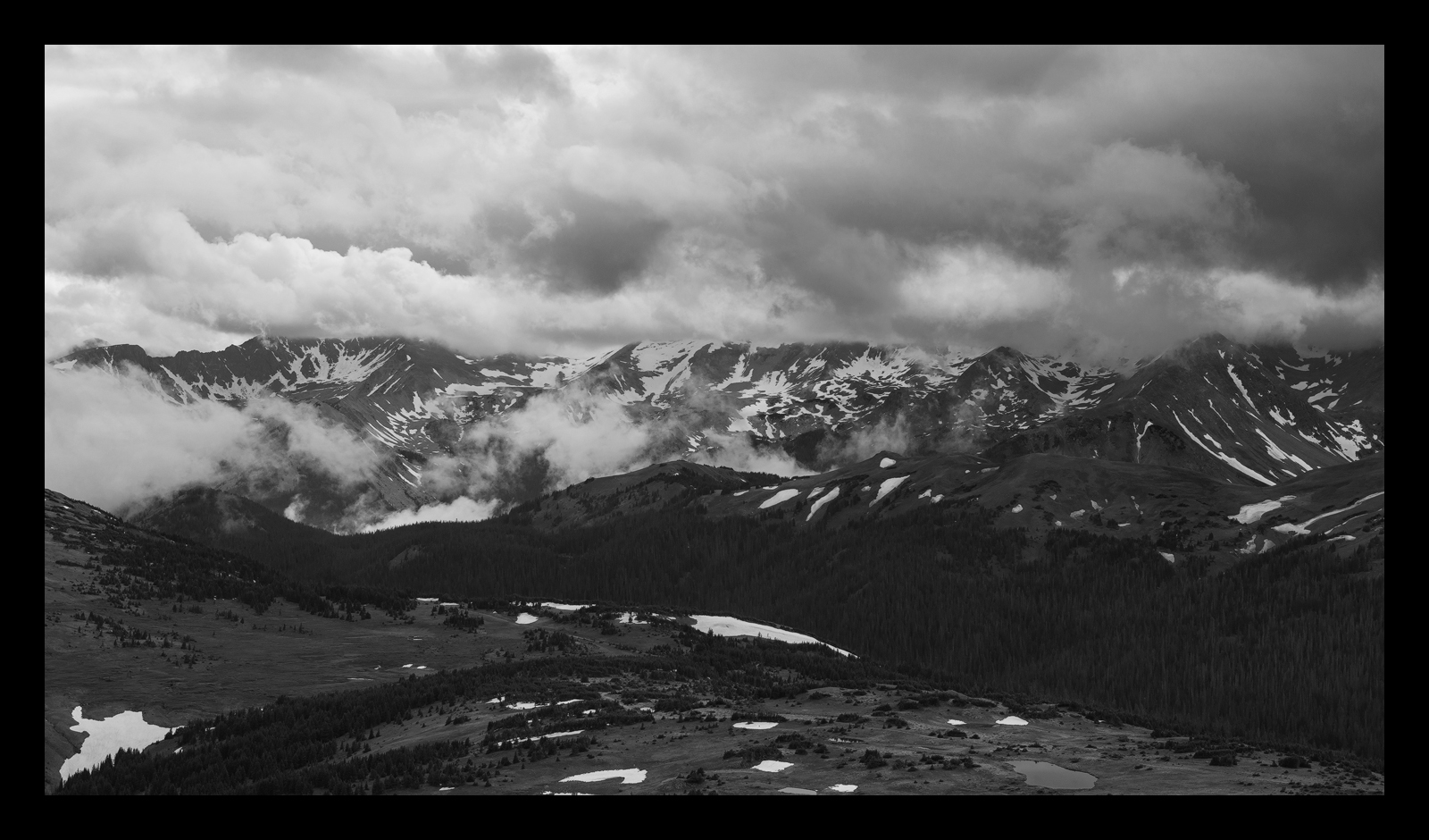
This is a shot that I took over the summer in Rocky Mountain National Park. This is from Trail Ridge Road looking toward the Never Summer Range. I really like the Never Summers in RMNP because of the dramatic peaks. On this afternoon a storm system was moving through and brought some dramatic clouds.
Thank you for your comments on my previous post. As always all comments and critiques are welcome. In particular, I am interested in hearing your thoughts on the processing as I don't do a lot of B&W images.
Capture Info:
70mm
f/8 @ 1/200 sec
ISO 100
Processing Info:
B&W conversion in Photoshop using Red Filter and selectively adjusting color channels
TK's luminosity masks (increase midtone contrast and bring up dark shadows)
Extensive luminosity painting to bring out contrast in clouds, mountains and foreground
Cropped to panoramic format

Comments
6 commentsI brightened this overall, adjusted the black and white points using the levels adjustment and then tweaked some of the luminosity painting. How does this look?
A grand mountain landscape for sure with some good drama in the clouds to make this dynamic and engaging.
I make a note below about the difference in display between the posted and the larger view. In light of that, my comments are on the larger view only.
I think the large view of the repost is much better in terms of overall contrast. I think the original comes across a bit flat and lacking in contrast. I even think in the repost that the mountains and sky could use a little punch; the mountains still seem a little flat, even soft to me. I'm no expert in b&w conversions, although I know there's a gazillion different ways to process and adjust.
I like the scene very much, just think it's needs a little something extra in terms of processing - I just don't know what to suggest.
Lon
PS: A side note for Jim and NPN... this is a good example of how the original 720px versions are NOT displayed the same as the larger views. In both the original and the repost, the posted version is darker/flatter than the larger counter part. They should all appear the same in terms of tonality, brightness, saturation, etc., but often they do not.
I am on a laptop so I cannot get a good feel for the darks and lights, but it does feel just a bit dark, or maybe, as Lon said, it needs more contrast. I almost wonder if the mid-range tones need to be lightened up a bit. I can actually see detail in the dark trees, and that's on this laptop.
I don't do many B&W images, so I cannot help with the processing. The few that I have done and printed I worked on over and over!!
I think the comp is good enough, and you have the range of tones and detail in there, that you may want to play with this a lot to get it just how you want it.