Nature Photographers Network
This is the preserved archive of the original Nature Photographers Network. The community continues at naturephotographers.network.
Big Leaf Over #3 & #4
‹ PreviousLandscape GalleryNext ›

Big Leaf Over #3 & #4

by Lon Overacker

Gallery: LandscapePosted January 29, 2017290 views15 comments
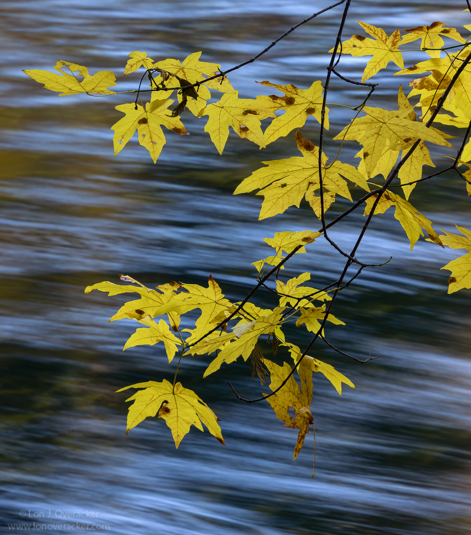
Ok, the 3rd and final image of these big leaf maple leaves hanging over the Merced. A slightly different angle produced sky reflections rather than from autumn trees and warm cliffs.  The blue/cyan is dialed back a LOT, but I still wanted to retain some since it reflects what I recall, and knowing there's a blue bird sky above.

Thanks again for all your comments!

Lon

edit: I originally posted 2 versions.  Some of  you may have seen the 2nd, but I deleted it cause I didn't like how it came out on the web.  I've reworked and posted a final version, which of course is another frame, not just different processing. This one has a longer shutter speed of 1.5 seconds.  The original above is .6s.

Comments

15 comments
Comment posted by Jim Zablotny on January 29, 2017 at 3:01 PM
Hi Lon,

I like the second version with the slightly softer BG and more subtle blues in the BG.  I like how the detached leaf in the lower  RH side--different in color from the rest of the leaves.  Well done.................Jim
Registered on January 17, 2004, 705 Posts, 3594 Comments
Comment posted by Lon Overacker on January 29, 2017 at 3:18 PM
Thanks Jim!  Crud though, I deleted the 2nd version cause I didn't like how it looked.  Guess I'll go back and re-evaluate and post, since you and perhaps others did see that second version.  I'll repost shortly.
Registered on November 24, 2006, 521 Posts, 19147 Comments
Comment posted by Nick Bristol on January 29, 2017 at 3:24 PM
Lon, This one looks very nice too. For me the blue looks fine and I do like this comp. Hard to beat those gold and blue colors. I do like the second one best I think with the softer tone and feel of the water. Nice work for sure and a good series of these.

Nick Bristol
Lone Rock, WI.
Registered on February 1, 2004, 752 Posts, 14140 Comments
Comment posted by Lon Overacker on January 29, 2017 at 3:33 PM
Adding a reworked 4th image.  Sorry if this will be confusing for those who see this post later....  I originally posted 2 images, but quickly deleted the comment and 2nd image, but a couple of you saw both.  Now I'm re-adding a reworked image for consideration.
Feeling skiddish today I guess.
Registered on November 24, 2006, 521 Posts, 19147 Comments
Comment posted by Mark Seaver on January 29, 2017 at 4:05 PM
Lon, this is a great combination of yellow/green leaves against the flowing water background.  The warm leaf colors are set of well by the blue in the water, which looks right to me.  I like the ss of the original post as I feel that the limited blue streaks in the water balance better in terms of how much attention they pull relative to the leaves.  I also like that there's more leafy texture in the reflections off the water.
Registered on January 23, 2011, 1103 Posts, 17270 Comments
Comment posted by Harley Goldman on January 29, 2017 at 4:39 PM
Very well done, Lon. Count me in for the original post. I like the warm spots on the water and just like it better overall. 
Registered on November 19, 2003, 586 Posts, 11271 Comments
Comment posted by Brian Schrayer on January 29, 2017 at 4:50 PM
I actually think that I prefer the original post (at the top of this thread).  I like the warm reflections from the leaves contrasted with the cooler tones.  Most of this impact is lost in the "4th image" posted below.  I also like the compositional rhythm formed by the patterns in the streaks in the original better.  By that I mean that I like that there are groups of streaks with space (and warm light) in between them.  Interestingly though I find myself looking past the leaves in the original post and exploring the water more. 
Registered on May 28, 2004, 114 Posts, 2890 Comments
Comment posted by gary phillips on January 29, 2017 at 9:13 PM
I think I prefer #3, unless of course I'm confusing which is which.  I really like the cool colors in river with the overlay of gold.  I'm getting pretty picky, but I think I would clone the partial branch and single leaf top right.  Hardly noticeable, but I'd remove it none the less.  Beautiful image, Lon.  Each of the versions hold their own.
Registered on October 24, 2013, 185 Posts, 4136 Comments
Comment posted by Dave Dillemuth on January 30, 2017 at 2:39 PM
Another wonderful take of this comp., Lon. The mix of cool and warm tones, sharply defined leaves and blurred background are just terrific. I definitely prefer your first version. I find the SS effect on the water more provides more interesting textures.
Registered on December 10, 2015, 104 Posts, 1112 Comments
Comment posted by Prashant Khapane on January 30, 2017 at 5:57 PM
This is a neat image Lon. Love the combination of colors.
Registered on November 1, 2003, 492 Posts, 4580 Comments
Comment posted by Preston Birdwell on January 30, 2017 at 6:04 PM
I am with those who prefer the image at the top of the thread. I like the luminosity of it and the splashes of warm color in the river.

btw: How much fixatif did you spray on leaves to keep them sharp with that slow shutter? enlightened

Real nice image, sir!
--P
Registered on November 1, 2003, 471 Posts, 5188 Comments
Comment posted by Gerald Emery on February 2, 2017 at 1:57 PM
Lon, Like this shot, my 2 favorite colors for a photo, blue and yellow! I went to Yosemite for a weekend workshop when I switched to digital and attempted to take a similar shot with the dogwood flowers, you were a lot more successful!
Registered on January 2, 2017, 65 Posts, 25 Comments
Comment posted by Vance Gese on February 2, 2017 at 5:07 PM
Simply one amazing image, Lon.  The motion of the water against which the maples are set is really extraordinary.  I do prefer your repost with the longer shutter speed, as for me, the longer streaks of the water highlights gives your image a more abstract, impressionistic feel that to me is more compelling that the original.  Also, the water motion in the repost is better defined to my eye, than the water motion of the original, which looks more out of focus in the upper half of the image.  Just my opinion of course.  Love the color too.  Stunning, and inspiring, work as always, Lon.
Registered on November 13, 2008, 298 Posts, 6629 Comments
Comment posted by Igor Doncov on February 2, 2017 at 5:44 PM
Now tha Vance has formulated I do find myself agreeing with him that the repost is better for the reasons he gives. Which are pretty insightful, I think.
Registered on November 22, 2014, 189 Posts, 2733 Comments
Comment posted by Bill Leggett on February 7, 2017 at 11:45 PM
Meant to comment on this earlier.  Really good stuff, Lon.  The warm bright colors against the softer, cool BG set it off nicely.
Registered on July 21, 2004, 706 Posts, 3233 Comments