Nature Photographers Network
This is the preserved archive of the original Nature Photographers Network. The community continues at naturephotographers.network.
Adrift
‹ PreviousLandscape GalleryNext ›

Adrift

by Harry Lichtman

Gallery: LandscapePosted January 24, 2017236 views14 comments
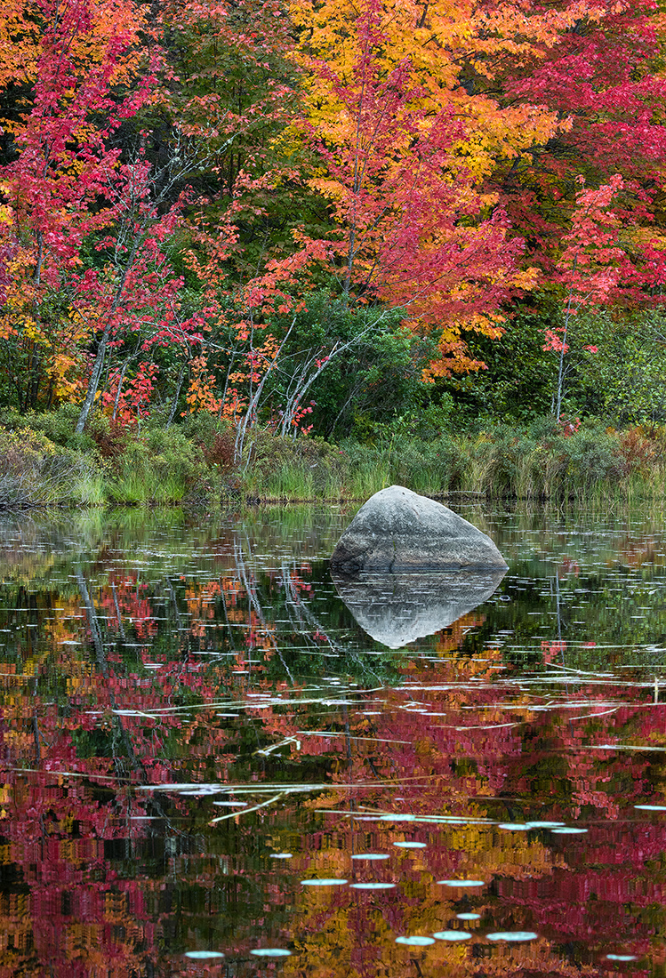
I spent a couple of days paddling along the Androscoggin River on the NH / ME boarder th past fall.  The most peaceful and beautiful waterways I have paddled yet.  I leveled the image using the water line on the rock vs. the edge of the marsh which was curving away.

Nikon D810, 80-400mm @135mm, f22, 1/20th sec.

Comments

14 comments
Comment posted by Allen Brooks on January 24, 2017 at 9:51 AM
Great eye-catching colors.  I like the composition with the curve of the trees, the gentle curve of the river, and the reflections.
Registered on July 27, 2011, 262 Posts, 2597 Comments
Comment posted by Kathy Barnhart on January 24, 2017 at 5:04 PM
This is beautiful, and does reflect the peaceful feeling you found that day. The rock and its reflection, plus the leaves and curving tree trunks add lots of interest. I might consider a crop from the bottom, but it is wonderful as is.
Registered on November 11, 2011, 404 Posts, 1639 Comments
Comment posted by Richard Sandor on January 24, 2017 at 6:46 PM
Harry: I think it would be difficult to find an image with a reflection that would be superior to this one. The colors, processing and curved trees make it special. My only nit would be to tone down or clone away some of the very bright spots at the bottom of the frame. Congrats! Richard
Registered on January 12, 2014, 453 Posts, 1625 Comments
Comment posted by Dave Dillemuth on January 24, 2017 at 8:26 PM
The foliage colors are gorgeous and the comp. is well crafted. I find the lilies and grasses breaking up the reflection add depth and a lot of visual interest. Processing looks spot-on to me. Beautifully presented.
Registered on December 10, 2015, 104 Posts, 1112 Comments
Comment posted by Lon Overacker on January 24, 2017 at 10:57 PM
Harry,

A terrific explosion of autumn color.  The broken reflection is wonderful with the lily pads and reeds; but for me, I don't think this image is about symmetry so much as it is about color and the reality of the upper half. My thought would be a slight crop off the bottom - say to above the first row of lily pads. Not that I want to reduce the reflection, but make this less symmetrical and have the reflection compliment, rather than compete with the top.  Hope that makes sense - and a nitpicky suggestion as it is. ;-)

The only other comment I'm having trouble formulating, but have boiled it down to contrast.  It's almost like this is a little to hard on the contrast.  It's not a sharpening thing like a couple of posts ago.  The colors are bold  and beautiful and I think the saturation is in check.  Just something, and I can only pin it on contrast.  And I short on suggestions on what to change.  this is also very nit picky, but an observation none the less.

I do really enjoy this image and I think the rock/reflection anchors the scene nicely.

Hope my comments made sense!

Lon
Registered on November 24, 2006, 521 Posts, 19147 Comments
Comment posted by Brian Schrayer on January 24, 2017 at 11:38 PM
Well you had me at red (i'm always on the lookout for reds in autumn color).  Beyond that I like the C-shaped arc formed by the trees and their reflection which frames the rock perfectly.  Very nice!
Registered on May 28, 2004, 114 Posts, 2890 Comments
Comment posted by Harry Lichtman on January 25, 2017 at 8:25 AM
Thanks for the observations.

Lon, I do see what you are saying.  I have been trying to apply minimal contrast, if any during RAW processing for these images that have lots of fine detail for the web - seems to be problematic.  This scene was low contrast, even lighting to begin with.  The images appear larger here on NPN at 100% screen size as compared to on my laptop at 100%, which means a bit more choppy on NPN than on my monitor on PS.  Not sure why that would happen.  The sharpening / choppiness for some of my images seems to be a relatively recent thing, as my web sharpening techniques haven't changed much.
Registered on September 17, 2010, 304 Posts, 3507 Comments
Comment posted by Harley Goldman on January 25, 2017 at 6:25 PM
Those are some screaming colors!! Excellent reflection and image works beautifully. 
Registered on November 19, 2003, 586 Posts, 11271 Comments
Comment posted by gary phillips on January 25, 2017 at 9:49 PM
Must have been an incredible day, Harry.  Love the color explosion and the curve of the reflecting trees along the edge.  I'm on the fence about the bright  lily pads along the bottom.  I like that they break up the reflection,  but a bit on the bright side. That's a small nit.............outstanding image.
Registered on October 24, 2013, 185 Posts, 4136 Comments
Comment posted by Mark Seaver on January 26, 2017 at 3:28 PM
These are some awesome colors, Harry.  The boulder makes a great foil for the leaning trees and their colors.  My wife and I once dreamed of paddling the Androscoggin but did a circuit on some Canadian rivers/lakes instead.  Yes, the peace and tranquility are wonderful.
Registered on January 23, 2011, 1103 Posts, 17270 Comments
Comment posted by Ryan Shain on January 26, 2017 at 9:21 PM
Hi Harry,

I love this one from you, and the large version is much better imho. I am not sure what is going on with the contrast/choppiness issue, but it I have noticed in some fo you images as you have mentioned. It is minor stuff on here because I know a print would look fantastic from you.

The entire scene has so much interest from front to back, and those colors are divine. Excellent Autumn scene bro!!!!
Registered on February 20, 2007, 226 Posts, 4571 Comments
Comment posted by Aaron Feinberg on January 27, 2017 at 6:14 PM
Quite lovely.
Registered on October 26, 2009, 399 Posts, 2789 Comments
Comment posted by Igor Doncov on January 27, 2017 at 7:19 PM
I particularly like the colors and composition of the lower half of this image. I wonder if you would consier a composition tha includes all of the river, the rock, and all the green on the opposite bank below the red foliage. That simpler comp seems a bit stronger to me.
Registered on November 22, 2014, 189 Posts, 2733 Comments
Comment posted by Harry Lichtman on January 27, 2017 at 7:37 PM
Igor - i like your idea - would simplify the comp.  Wish I had thought of this at capture. I think I was overwhelmed by all of the color.
Registered on September 17, 2010, 304 Posts, 3507 Comments