Nature Photographers Network
This is the preserved archive of the original Nature Photographers Network. The community continues at naturephotographers.network.
Repost x 2
‹ PreviousLandscape GalleryNext ›

Repost x 2

by Harry Lichtman

Gallery: LandscapePosted January 18, 2017213 views12 comments
Large View Available

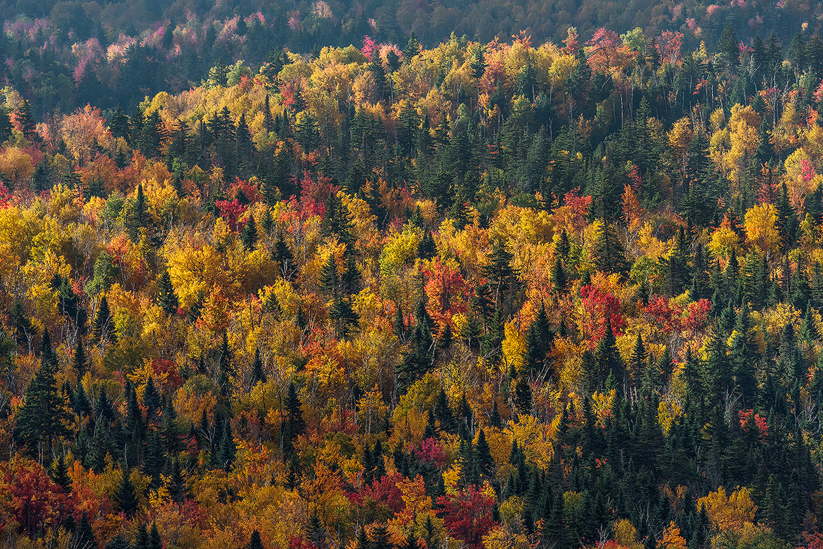
The elevated view from many of NH's White Mountains gives some great views to the forest canopy below.  I camped out on a ledge in northern NH to catch the raking light at sunset, then sunrise over the colorful tree tops.  Also experienced my first snow squall of the year as a bonus.

Nikon D810, Nikor 80-400 @ 310mm, f 9.5

Comments

12 comments
Comment posted by Skip Layman on January 18, 2017 at 11:22 AM
I really like the kaleidoscope of color.  It may just be me, but on my computer this shot gives an impression of being over sharpened.
Registered on November 1, 2003, 558 Posts, 1704 Comments
Comment posted by Harry Lichtman on January 18, 2017 at 12:10 PM
Thanks Skip, I agree does look a little crunchy. I think I need glasses!
Registered on September 17, 2010, 304 Posts, 3507 Comments
Comment posted by Harry Lichtman on January 18, 2017 at 4:35 PM
Left Click Image for Larger View

I tried reducing the contrast of the image prior to sharpening this time to see if it looks better.
Registered on September 17, 2010, 304 Posts, 3507 Comments
Comment posted by Lon Overacker on January 18, 2017 at 6:31 PM
Harry,

A grand and classic autumn scene.  I love that you've compressed and isolated this with the long lens.  And just as I recently commented on a previous image, simple is almost always better. this is simple, yet a very strong message of autumn.

I like the band up top allowing the upper stand of color to stand out and not just merge with the top of the frame. Well done and composed. Love the colors and contrast.

I would agree with Skip that this does appear crunchy. That was my first reaction before reading comments.  Easy enough to fix I suppose. ;-)

Lon
Registered on November 24, 2006, 521 Posts, 19147 Comments
Comment posted by Dave Dillemuth on January 18, 2017 at 8:58 PM
Beautiful mix of colors. The evergreens provide create nice contrast to the yellows, oranges and reds. The repost is a marked improvement (does not look over-sharpened) but it looks a bit dark on my monitor vs the first post. I might raise the white point a bit.  
Registered on December 10, 2015, 104 Posts, 1112 Comments
Comment posted by Harry Lichtman on January 18, 2017 at 9:14 PM
Thanks Dave - I  have found these highly detailed and maybe too contrasty images a challenge to sharpen for the Web.  I was on the edge of clipping highlights in the original file, so I was hesitant to brighten. I have another shot I'll post and try and keep it a bit brighter, maybe selectively brighten.
Registered on September 17, 2010, 304 Posts, 3507 Comments
Comment posted by Igor Doncov on January 18, 2017 at 9:39 PM
A thought on this that you may or may not agree.

Due to atmospheric conditions the lower part of the image is sharper than the upper part. If this had included the distant mountains and perhaps sky the cause would register to the viewer and it would work. But this is largely an abstract of colors and the variation of intensity from bottom to top is not working that well. I can see great comps at the bottom but they require some radical cropping. For me thats the weakest aspect of this image. I like the intensity of the colors even if they be greater than reality. 
Registered on November 22, 2014, 189 Posts, 2733 Comments
Comment posted by Harry Lichtman on January 19, 2017 at 7:36 AM
Thanks for your thoughts Igor.  The higher sun angle created less contrast in the upper portions, but the inclusion of sky would have created more exposure problems and no mountains to speak of - more rolling hills.  I think the appearance of over saturation is due to the contrast I introduced during processing.  The side lighting produce some extremely vibrant colors.  I exposed for the brightest yellows to hold detail, so the shadows needed to be boosted and contrast added so it didn't appear washed out. I think I try reprocessing the image from scratch to address some of the problems.
Registered on September 17, 2010, 304 Posts, 3507 Comments
Comment posted by Bill Chambers on January 19, 2017 at 3:06 PM
Beautiful scene Harry.  Lovely light in this and the colors really sparkle.  My only suggestion would be to perhaps burn the more distant trees/mountain at the top so it competes less with the main viewing area.  Not a lot, but enough the lessen it's impact.  Otherwise, gorgeous image.

I  actually prefer the contrast in the original but agree it appears a little oversharpened.
Registered on April 10, 2005, 753 Posts, 21216 Comments
Comment posted by gary phillips on January 19, 2017 at 8:33 PM
I'll tell you Harry, I miss these fall scenes greatly.  Our  fall is intense but short lived.  I too like the contrast in the original, sans sharpening.  Must have been a sweet place to spend the night and wake up to that view.
Registered on October 24, 2013, 185 Posts, 4136 Comments
Comment posted by Harry Lichtman on January 19, 2017 at 9:00 PM
Click on Image for Larger View

Thanks to all of you for your comments- I reprocessed the image from scratch and the biggest change was the reduced contrast in the original RAW processing.  It kept the image smoother from the start, less saturated, and crunchy looking.  Also, some adjustment to the cyan, blues specifically in the top most portion to darken it more and reduce the haziness / brightness of the area while still keeping detail.  I very much appreciate all of the feedback.  I look back at the original post, and say, what was I thinking!
Registered on September 17, 2010, 304 Posts, 3507 Comments
Comment posted by scott lanz on January 20, 2017 at 8:54 PM
Third one's the charm, Harry. No nits; looks great.
Registered on November 14, 2003, 840 Posts, 12902 Comments