Nature Photographers Network
This is the preserved archive of the original Nature Photographers Network. The community continues at naturephotographers.network.
Milkin' the Merced
‹ PreviousLandscape GalleryNext ›

Milkin' the Merced

by Lon Overacker

Gallery: LandscapePosted January 12, 2017350 views11 comments
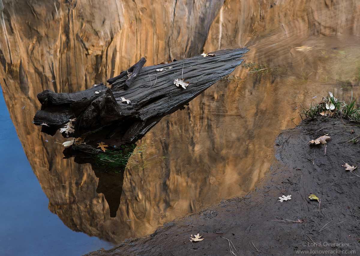
Which means I was going to move on to another subject, but might as well finish off my 30 min visit to the Merced on this evening. This was when Kyle and I first arrived. El Cap was still in full sun, although the shadow was at the bottom of the wall, which meant there wasn't much time left.  Of course the reflection/water toned down the brightness since the BFR was still in full sun and I also brought down the brightness some. Also, this means the was less color/saturation.

I was really bummed when I got back and looked at the file as there were a few boot prints in the mud.  So I gave mother nature a hand and pretended the river rose and washed away the prints. angel  This time the reflection is orientated naturally.... enlightened

This is a two-image focus stack.  Your comments, critiques and suggestions are most welcome!  Thanks!

Lon

 

Comments

11 comments
Comment posted by Igor Doncov on January 12, 2017 at 10:28 AM
I really like this image very much, Lon. I've shot images such as this but was never satisfied. Aside from a beautiful abstract the sense of the log superimposed over a river image makes it intriguing. It's like a new reality of 2 worlds existing in the same place at the same time, a dream world. But what makes it work (as opposed to my attempts) unexpectedly is the shoreline on the bottom right which keeps you anchored with the true reality. That section, which artistically seems the least important, is to me an important element that grounds the whole thing. So aside from being a 'beautiful' image, this also has a different element and that counts for a lot in my book. 

I also noticed that the two worlds are further defined by sharpness. The log and shoreline are razor sharp and the other world is more vague. 
Registered on November 22, 2014, 189 Posts, 2733 Comments
Comment posted by Harley Goldman on January 12, 2017 at 5:38 PM
I really like the reflection and image. I might be inclined to crop off the right side to remove the clump of grass. For some reason, I find my eye going to that clump and staying there. You were viewing this BFR without PFB? 
Registered on November 19, 2003, 586 Posts, 11271 Comments
Comment posted by scott lanz on January 12, 2017 at 8:28 PM
I like this as well, Lon. A different and "earthy" Yosemite image because of the colors and the mud. Well seen.
Registered on November 14, 2003, 840 Posts, 12902 Comments
Comment posted by Gerald Emery on January 13, 2017 at 12:26 PM
I can't walk by a reflection either! I like it.
Registered on January 2, 2017, 65 Posts, 25 Comments
Comment posted by Richard Teller on January 13, 2017 at 5:05 PM
I am almost tempted to not comment on this image. I am always very impressed with your images. For some reason this one does not resonate with me. For some reason my eye keeps stopping at all to the mud on the right hand corner. 
Registered on August 23, 2010, 1162 Posts, 6692 Comments
Comment posted by Lon Overacker on January 13, 2017 at 6:09 PM
Thanks for the comments so far folks!

Mr. H., yeah, there's always a crop and I can see that grass being a magnet.  Actually, I didn't pick up on this myself for the longest time - even after all the time spent processing, but now I see how the log is visible underneath the water all the way up to the corner!  Subtle, but there.  May not be enough to overcome the grass.

@Richard. Please Richard, I would much rather someone post an honest comment, then none at all.  When I say (and I'm assuming most everyone) that we appreciate all comments, suggestions, etc., it's meant.  We all can't be expected to like or respond to every image.  And please, I hope no one posts a positive comment that they don't really believe is true.

Of course there are images that don't appeal to me, but I do try and find some aspect or element that I do like.  And hopefully we can all be honest with our critiques - certainly without being rude or inconsiderate.

thanks for taking the time to comment.

ps. obviously there's a reason why I posted 20 images before this one... angel enlightened
 
Registered on November 24, 2006, 521 Posts, 19147 Comments
Comment posted by Floyd Hopper on January 13, 2017 at 7:11 PM
With all said and done on comments, so far, evey one has a "certain take". Compete in Camera clubs and one would understand. I like the image.  The supper imposed log gives the image a "3D" efffect.  I feel the mud and leaves and the reflection makes this a "fine art" image.
Registered on May 1, 2009, 652 Posts, 762 Comments
Comment posted by Mattia Oliviero on January 14, 2017 at 5:34 AM
I like a lot the reflection (with the light) and the trunk, Lon. I am a little bit confused about the mud, too. I do not know if it is due to its position in the frame, or more likely because the mud does not look like very attractive to me. Here are my doubts, sorry for not being too helpful. Maybe I will come back later to see what is changed in my opinion. 

Mattia
Registered on August 24, 2016, 43 Posts, 254 Comments
Comment posted by Harry Lichtman on January 14, 2017 at 11:54 AM
Lon - I commend you for working this part of the park, but this comp just isn't doing it for me.  Like you said, the best part of the lighting was in the reflected portion so there isn't any of the lighting that I saw in your previous posts from this area.  Had there been more colorful leaves on the mud area, it might have improved things but it just looks a little drab to me.  I think that the prior posts were just so good, this feels like a little let down but still solid.  
Registered on September 17, 2010, 304 Posts, 3507 Comments
Comment posted by Marylynne Diggs on January 14, 2017 at 3:11 PM
I'm glad you didn't move on, Lon.  I love this.  It has a mind-bending element to it, and like the idea of driftwood floating up toward the rock, etc.  Colors are fab as well.
ML
Registered on December 14, 2010, 122 Posts, 1034 Comments
Comment posted by Chris Chamberlain on January 14, 2017 at 4:01 PM
I like it. I think it's cool. The colors while subdued are still pleasing to look at. The light while not crazy is still nice to look at. It's worth the stop to notice in my opinion. I might not choose it if buying a large print for my wall. But can definitely see it as a postcard, greeting card, in a calendar or a book.
Registered on March 13, 2007, 500 Posts, 8365 Comments