Nature Photographers Network
This is the preserved archive of the original Nature Photographers Network. The community continues at naturephotographers.network.
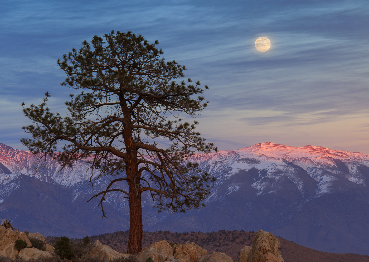
Sherwin Grade Moonrise
‹ PreviousLandscape GalleryNext ›

Sherwin Grade Moonrise

by Dave Dillemuth

Gallery: LandscapePosted January 7, 20173,348 views12 comments
I posted several other images of this tree/moonrise last year. However, digging through the dozens of Raw files from this evening, I've come up with a couple of alternates that I think I prefer. Sorry for the redundancy but would value your thoughts on this alternate version. Thanks.

5D2, 70-200 f/4 IS L @180mm

Comments

12 comments
Comment posted by Lon Overacker on January 7, 2017 at 3:59 PM
Gorgeous Dave!  I guess since this is the moonrise, those must be the White Mountains and not the Sierra? :-)  The comp is fantastic as well with all the elements balanced nicely.  The colors and the last light on mountain tops is exquisite.

The only small nit/suggestion would be the bottom of the frame.  I'm torn about either wanting more rock, or none at all.  I couldn't recall the exact images from before, so I went and looked.  I think all of those had slightly more rock included at the bottom. And I think "Blue Ethers" is my fave, although perhaps with some cropped off the top.

I love the comp and colors in this one. Wondering if you have more at the bottom?

Lon
Registered on November 24, 2006, 521 Posts, 19147 Comments
Comment posted by Igor Doncov on January 7, 2017 at 4:15 PM
Well, after Lon's comment I had to peak at your earlier work. That may not have been fair to this one. This is a really beautiful simple composition with all the elements well defined and separate. The sky with the wispy clouds across the moon is what really makes this image for me. But the sunlight on the mountains is wonderful and you have the right amount of darkness in the tree IMO. I don't feel a need for a greater base below the tree. All is well balanced now.
Registered on November 22, 2014, 189 Posts, 2733 Comments
Comment posted by scott lanz on January 7, 2017 at 5:38 PM
I also went back and looked at your previous versions, Dave. This is clearly my favorite. Nicely balanced comp and the light is sublime. devil
Registered on November 14, 2003, 840 Posts, 12902 Comments
Comment posted by Jim Zablotny on January 8, 2017 at 10:11 AM
Hi Dave,

I like this one and the comp is fine as is. From a creative viewpoint adding or removing bottom features may help or reduce the effectiveness of the comp.  I do like it as presented.  The color of the mountains is awesome and it is a well crafted image.............................Jim
Registered on January 17, 2004, 705 Posts, 3594 Comments
Comment posted by gary phillips on January 8, 2017 at 1:29 PM
Yep, went back and looked and they are all good, Dave.  I think it's pretty cool that after this amount of time, you can go back and find one more image that, im my opinion, is the best of the lot.  Sure, a bit more on the bottom would be nice, but everything else is just right.  Very nice, Dave.  The bonus of going back through your gallery made my day.  Excellent.
Registered on October 24, 2013, 185 Posts, 4136 Comments
Comment posted by Richard Teller on January 8, 2017 at 7:06 PM
Nice composition, sweet light, and great layers. The tree gives a nice anchor point to the image. I like it.
Registered on August 23, 2010, 1162 Posts, 6692 Comments
Comment posted by Ryan Shain on January 8, 2017 at 8:33 PM
Hi Dave,

I went back to have a look at your other images with this tree and moon in them, and I really like how you framed up the tree and moon together in the presentation. The image has such a wonderful balance about it, Love all the elements here Dave! The color palltette is so soft, a wonderful image to enjoy. 
Registered on February 20, 2007, 226 Posts, 4571 Comments
Comment posted by Kathy Barnhart on January 8, 2017 at 9:03 PM
This is my favorite of the bunch, Dave, and I, too, enjoyed looking at your wonderful gallery. I like the colors in this, and the balanced comp. It is so quintessential Sierras (even though I believe we are looking at the White Mountains.) My second choice is Blue Ethers, but it really has a different feel. The warm colors and comp make this one my fave.
Registered on November 11, 2011, 404 Posts, 1639 Comments
Comment posted by Harley Goldman on January 9, 2017 at 5:22 PM
Beautiful, Dave. Love the sky and the moon coming through the clouds. I agree a bit more bottom would be nice, but very, very minor. Love this as presented. 
Registered on November 19, 2003, 586 Posts, 11271 Comments
Comment posted by Aaron Feinberg on January 10, 2017 at 5:32 AM
Epic everything.

aF
Registered on October 26, 2009, 399 Posts, 2789 Comments
Comment posted by Jeffrey Sipress on January 10, 2017 at 12:47 PM
Love it Dave. Belongs on a calendar (or a gallery wall!).
Registered on February 17, 2004, 236 Posts, 1197 Comments
Comment posted by Chris Chamberlain on January 11, 2017 at 11:56 PM
Elegant and beautiful. Really nice!
a little tight at the bottom, perhaps.
Registered on March 13, 2007, 500 Posts, 8365 Comments