Nature Photographers Network
This is the preserved archive of the original Nature Photographers Network. The community continues at naturephotographers.network.
Riffles  1&2
‹ PreviousLandscape GalleryNext ›

Riffles 1&2

by Lon Overacker

Gallery: LandscapePosted December 9, 2016208 views11 comments
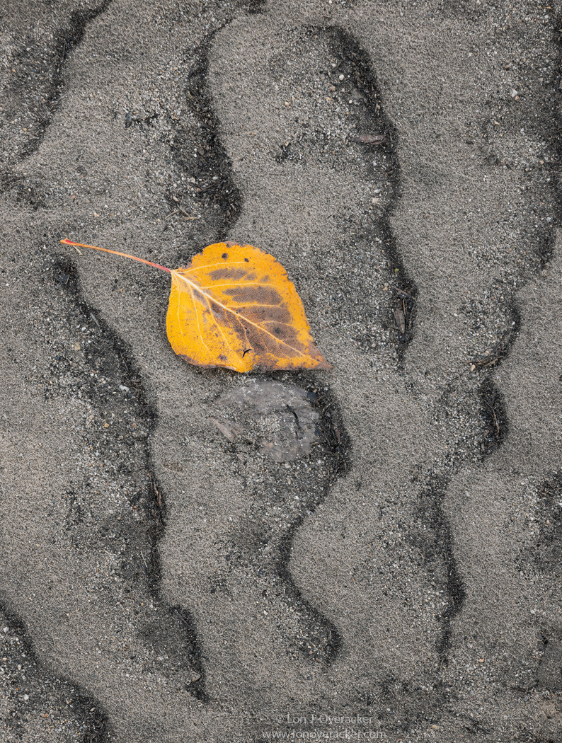
I've already mentioned a few times how we got to experience something in Yosemite Valley that we hadn't really seen before. An early November storm brought 3" of rain witch kickstarted the waterfalls and caused the Merced to swell.  And as quick as it comes, within just a few days the waters receded.  These images and the previous leaf scapes were only possible because the water levels receded and left all this in it's wake.  first the frosted little leaf scapes... but as I turned from there, I came across the mud-flats and sand bars of the Merced; the "riffles" creating patterns in the sand and mud that I literally spent a few hours exploring - and even returned another day to continue exploring. (Needless to say I have many more leaf/sand/pattern images that I won't be sharing...)  This area along the Merced was just west of the Swinging bridge and borders the eastern edge of Leidig Meadow.

Of course in my self-depricating style I'll say that there's nothing to original with a lone leaf composed like these are.  But I was more fascinated with trying to find the patterns and leaf combos that were pleasing with good comps.  And I'm very happy to report that all these are "found" and not placed. ;-)

As always, your thoughts, critiques and suggestions are welcome!

Thanks!

Nikon D800
Tamron 24-135mm
both images 2-image focus stacks

Comments

11 comments
Comment posted by Lon Overacker on December 9, 2016 at 2:36 AM
Different leaf, different day, same concept.
Registered on November 24, 2006, 521 Posts, 19147 Comments
Comment posted by Peter Richter on December 9, 2016 at 6:56 AM
Lon, this is a very appealing framing of the scene to me. I especially like the juxtaposition of the colored leaf and the almost monochromatic riffles.

Maybe introducing a second area of interest or focal point would be an option in order to create some kind of dynamic balance. But that would lead to a totally different image of course.

Peter

PS: I was referring to the first image
Registered on November 10, 2010, 218 Posts, 2723 Comments
Comment posted by Harley Goldman on December 9, 2016 at 8:55 AM
Both are really well done. I prefer the first, but really there is no need to pick a winner. I like both. Maybe pop the yellows a bit in the second one? Minor stuff. Good work. 
Registered on November 19, 2003, 586 Posts, 11271 Comments
Comment posted by scott lanz on December 9, 2016 at 9:10 AM
Very nice, Lon. I prefer the first image because I like the bg color a bit more, the bg pattern a bit more, and the subject vs. bg size ratio a bit more. However, there is an outline of a leaf in the first just below the leaf which is noticeable. Looks like maybe you removed a leaf but its "leafprint" remained? Maybe some cloning there to minimize that?
Registered on November 14, 2003, 840 Posts, 12902 Comments
Comment posted by Preston Birdwell on December 9, 2016 at 11:41 AM
While I like both a lot, Lon, the first one gets my nod. The composition really hones in on the the curves of the ripples and the leaf. The detail is excellent and I like the sand ripples. The leaf looks a little on the orange side to me. You might consider reducing the red and increasing the yellow just a bit.

Lon, this is not a nit per se, but you might experiment with bring up the neutral grey just a bit for a little more luminosity in the sand.

Scott, that small area below the cottonwood leaf is a stone; at least I think it is. I believe it would be difficult to clone it out. To me, it does not cause a major distraction to me.
--P
Registered on November 1, 2003, 471 Posts, 5188 Comments
Comment posted by Igor Doncov on December 9, 2016 at 2:25 PM
The first image is really nice, Lon. Despite the leaf's prominence it's the background that really makes this image. The fact that the wavy lines don't run off the screen but stop near the borders makes this composition much stronger. It's like the argument whether to crop off the grass on Harry Lichtman's birch image. I personally like the color of the leaf as is, regardless whether it looks natural. I would try to enhance the texture of that sand so that the lighter grains pop more, whether with NIK's texture or the PS clarity slider. 

I'm a little surprised that you had to do a focus stack since it looks as though it's all on one plane. Guess that deceiving. BTW, that really does look as though a stuck leaf had been removed from the sediment, but I won't tell anyone. 
Registered on November 22, 2014, 189 Posts, 2733 Comments
Comment posted by Lon Overacker on December 9, 2016 at 5:50 PM
Thanks for the comments thus far.  I do have a version that brings out a little more brightness in the sand thanks to some previous feedback.  So still some tweaks I could make there.  I like the color of the leaf and of course is completely subjective.

Interesting and kudos to those who picked up on the "impression" below the main leaf.  You're close.
It's certainly not a rock... and it's not an impression or imprint of a leaf removed.... it's actually a leaf.  quite a bit more decomposed and slightly buried in the sand, but definitely an actual leaf. ;-) Posting a close up.

@Peter - good point/suggestion about a secondary point of interest. Interesting because I have several other variations and combinations, including ones with multiple leaves, patterns, etc.  There was a WIDE variety of opportunities and I spent a couple hours exploring the riverbed and shores of the Merced.

thanks again folks!  You all have keen eyes!

Lon
Registered on November 24, 2006, 521 Posts, 19147 Comments
Comment posted by David Schoen on December 9, 2016 at 6:15 PM
These are unique landscapes created by laminar and turbulent flow of water over a riverbed.  They are ever-changing and after the next storm will look completely different.  Your image captures a moment in time both for the riverbed and the leaf.  These little abstract River scapes are really pretty cool.  The next time you take photographs river rapids think about what's happening below the rapids and what happens when the water levels drop and the river is gone. 
Registered on November 6, 2006, 1213 Posts, 4587 Comments
Comment posted by Mark Seaver on December 9, 2016 at 10:12 PM
Two outstanding comps emphasizing beautifully the colors and the textures, Lon.  Both are great, but I prefer the extra drama in the original post due to the darker grey color and the stronger definition in the sand patterns.
Registered on January 23, 2011, 1103 Posts, 17270 Comments
Comment posted by Nick Bristol on December 10, 2016 at 9:05 AM
Great job with this, Lon. Your comp works great (as usual) and I love the color combination. The lines and textures are working beautifully together here. I like the first one alot! devil

Nick Bristol
Lone Rock, WI.
Registered on February 1, 2004, 752 Posts, 14140 Comments
Comment posted by Tony Kuyper on December 11, 2016 at 7:48 PM
Simple and elegant.  I like photos that are this easy to view and appreciate.
Registered on November 1, 2003, 364 Posts, 22328 Comments