Nature Photographers Network
This is the preserved archive of the original Nature Photographers Network. The community continues at naturephotographers.network.
Windswept  +1 RP
‹ PreviousLandscape GalleryNext ›

Windswept +1 RP

by Dave Dillemuth

Gallery: LandscapePosted December 3, 20164,116 views14 comments
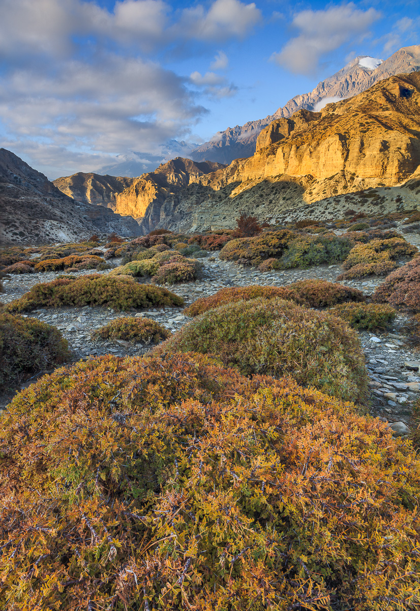
Captured last month in the Upper Mustang region of Nepal. This remote region of the Nepalese Himalayas is infamous for the strong winds that regularly buffet the landscape each afternoon.

5DSR, 24-105 f/4 IS L @ 24mm, .75 GND. Three image blend for focus and exposure.

Comments

14 comments
Comment posted by scott lanz on December 4, 2016 at 8:19 AM
Beautiful image of a gorgeous landscape, Dave. Excellent combination of elements with really nice light. The multicolored bushes in the foreground lead right to the mountains, and the clouds balance things nicely.  
Registered on November 14, 2003, 840 Posts, 12902 Comments
Comment posted by Paul Breitkreuz on December 4, 2016 at 8:48 AM
Dave, very nicely done with the contrasting light here. It does have a foreboding look to this remote spot. As much as the peaks in the back are the pinnacle of the scene, the main attraction for me are these huge scrub brush scattered along this drainage area. The colorful bushes really are a neat addition to this sparse terrain.
Registered on February 25, 2006, 525 Posts, 8448 Comments
Comment posted by Nick Bristol on December 4, 2016 at 12:03 PM
Dave, Nice work on this! I like this comp with the bushes right up front with the nice color, textures and detail. Great looking sky and light on the background mountains. A great looking image!

Nick Bristol
Lone Rock, WI.
Registered on February 1, 2004, 752 Posts, 14140 Comments
Comment posted by Lon Overacker on December 4, 2016 at 1:22 PM
Dave,

Indeed a great looking landscape.  the play of light and clouds in the mountains and sky is wonderful.  I too like the brush - whatever that is, scattered on the landscape.

For me, this does not give me the impression of wind at all.  Granted, you were there and it's a place noted for the winds as you mention, but without you telling us, I wouldn't have known.  Now that's no big deal, but I'm viewing looking for something to tell me it's wind swept.  Of course, that's a problem with titles, and not the imagery.

Having said that, I might be inclined to crop some of the bottom bush. For me at least, it's about the repeating pattern and colors of these plants, rather than the details. If that makes sense.

I can imagine the solitude there.

Lon
Registered on November 24, 2006, 521 Posts, 19147 Comments
Comment posted by Preston Birdwell on December 4, 2016 at 1:57 PM
I really like color and detail in this, Dave. Like Lon, I do not get the impression of a windy day, but is in no means intended to detract. I really like the bushes and the perspective, but I do agree with Lon's crop suggestion. The light here is wonderful.
--P
Registered on November 1, 2003, 471 Posts, 5188 Comments
Comment posted by Sairam Sundaresan on December 4, 2016 at 2:28 PM
I really love this, Dave! I like the repeating foliage in the foreground and the light hitting the peaks behind is really sublime :)
Registered on March 14, 2013, 100 Posts, 643 Comments
Comment posted by Marylynne Diggs on December 4, 2016 at 4:24 PM
Hi Dave,
What a wonderful scene.  I'm definitely pulled into and through the image.  I would be inclined to crop a bit off  the bottom (so the bottom bush just touches the edges of the frame and comes closer to the next bush in its "thickness" reaching into the distance).  In my opinion (and this is taste), it dominates too much as is. I'm wondering too what a tish of a crop off the top would do.  I am pulled to the one spot of blue at 11 oclock.  It's a welcome blue, but sometimes I like the clouds to create a vignette. You could do that here, but that's really a matter of taste as well.

Of course, take this all with a grain of salt. It's a lovely image and very engaging.
Registered on December 14, 2010, 122 Posts, 1034 Comments
Comment posted by Ed Lowe on December 4, 2016 at 8:23 PM
I love the way you filled the frame from front to back, Dave. The light on the peaks is gorgeous as are he clouds in the sky and the colorful brush is very unique looking. My only suggestion; and this is just a personal preference; would be to crop about 1/2 of that FG brush as I think it is a little dominant. Either way great work.

Ed
Registered on February 7, 2004, 414 Posts, 7115 Comments
Comment posted by Igor Doncov on December 5, 2016 at 12:15 AM
Wow, the large version is really beautiful. My first thought was that the fg just takes up too much space for what it contributes, but the large version really shows off that fine texture. The lighting is marvelous here and the shadows have just the right amount of exposure. Very nicely done.
Registered on November 22, 2014, 189 Posts, 2733 Comments
Comment posted by Harley Goldman on December 5, 2016 at 5:54 PM
Beautiful colors and scene, but the image looks a little bottom heavy to my eye. My path through the scene gets bogged down there a bit. I would consider cropping off the bottom? Lovely light and mountains. 
Registered on November 19, 2003, 586 Posts, 11271 Comments
Comment posted by Dave Dillemuth on December 5, 2016 at 7:58 PM
As always, thanks for all the insightful suggestions. 

After playing with the file, I cropped a bit off the bottom and it does seem to create a better balance and flow. In this version I also added a touch of Orton to the foreground. 
Registered on December 10, 2015, 104 Posts, 1112 Comments
Comment posted by John Williams on December 8, 2016 at 12:52 AM
Beautiful shrubs (Bring me a shrubbery!) leading to that grand background. Nice light on those cliffs. I think I prefer the original here. The cropped version feels "tight" to me.
Registered on September 6, 2007, 221 Posts, 5985 Comments
Comment posted by Nick Bristol on December 8, 2016 at 7:28 PM
Dave, Back to look at the repost and it is very nice, but I like the original best. Cheers, Nick
Registered on February 1, 2004, 752 Posts, 14140 Comments
Comment posted by Marylynne Diggs on December 9, 2016 at 3:55 PM
Put me down for the original too.  Not sure whether it's the orton effect or the cropped shrub, but it does seem to have less drama.
ML
Registered on December 14, 2010, 122 Posts, 1034 Comments