Nature Photographers Network
This is the preserved archive of the original Nature Photographers Network. The community continues at naturephotographers.network.
Happy Isles scenic
‹ PreviousLandscape GalleryNext ›

Happy Isles scenic

by Lon Overacker

Gallery: LandscapePosted December 1, 2016274 views15 comments
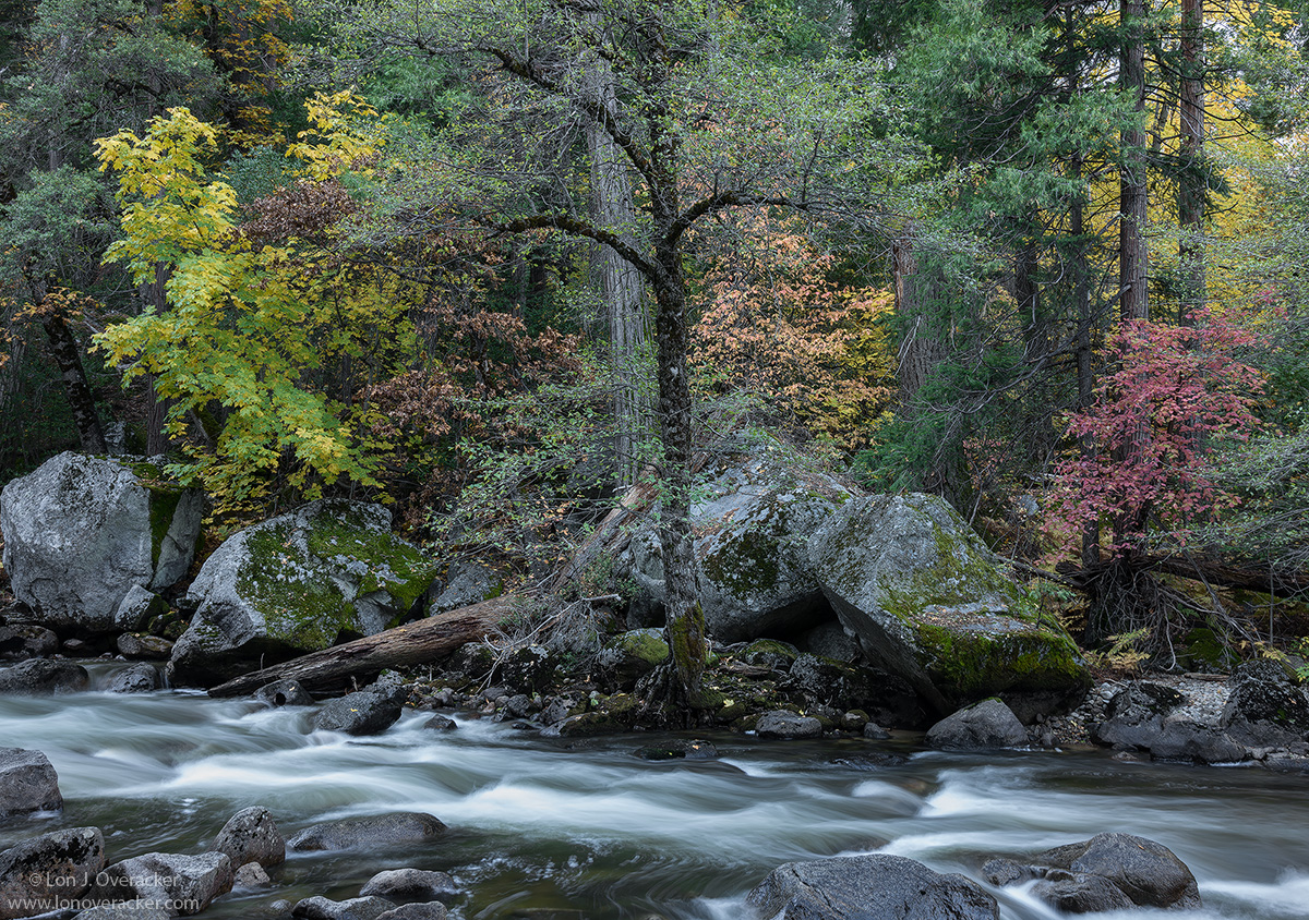
It's a short and lovely walk to Happy Isles from the campground.  We seem to go here every year and most of the time return empty handed.  But as I've mentioned before, this year the high water flow in November afforded a few new opportunities. Initially early in the morning it was quite windy. But I stuck around long enough for things to settle down and take some shots.

I'm going to include another similar one for consideration as well.  The second one is a 4-image stitched pano.  I'm not as happy with the water in this one, but heck, just happy I was able to get a stitched pano!  ;-)

Your thoughts on either or both would be greatly appreciated.  thanks so much for your comments and observations on my previous post.

Thanks!

Nikon D800E
Tamron 24-135mm

Comments

15 comments
Comment posted by Lon Overacker on December 1, 2016 at 3:41 PM
The pano
Registered on November 24, 2006, 521 Posts, 19147 Comments
Comment posted by Nick Bristol on December 1, 2016 at 3:55 PM
Lon, The pano is very nice and I like that composition very much, but the real winner here for me is the first image. I love the brighter tones in that one and the water looks fantastic. I like that comp very much as well. Both are beautiful and very well done. 

Nick Bristol
Lone Rock, WI.
Registered on February 1, 2004, 752 Posts, 14140 Comments
Comment posted by Preston Birdwell on December 1, 2016 at 4:15 PM
Your wait for the wind in the morning chill was worth it, Lon. While I do like tha pano, the original post works best for me because it targets the truly important elements. The processing is spot on, and the water looks perfect.

In the pano, the water looks flat to me. I would suggest bringing up the lights, there. Also, the reddish fallen log on the right is bugging me a bit.

I love the various trees in the Autumn dress!
--P
Registered on November 1, 2003, 471 Posts, 5188 Comments
Comment posted by Igor Doncov on December 1, 2016 at 5:37 PM
Oh, this is such a great picture Lon. It's your best from the weekend so far. What a great eye to see this composition. I can't think of a single way to improve this. Just an excellent image. I think it's time for Nick to start looking in the rear view mirror. hah. And no, the pano doesn't come close to the original.
Registered on November 22, 2014, 189 Posts, 2733 Comments
Comment posted by Harley Goldman on December 1, 2016 at 5:44 PM
This turned out really nice, Lon. I thought the wind would never die up there. I prefer the cropped version. Predictably, I would make the blue/cyan far more neutral, but that is always a personal preference. And you knew I would say it, but I said it anyway. sad I really like it. 
Registered on November 19, 2003, 586 Posts, 11271 Comments
Comment posted by Lon Overacker on December 1, 2016 at 6:33 PM
Thanks folks for the comments so far.

Yup Harley, I knew it was coming.. sad  After I posted the image I could see it too.  What is interesting is that it looks more pronounced in the smaller version - at least to me. I'm wondering if anyone else picks that up?

I'm in agreement with folks so far on the pano.  The one thing that I do like with the pano is that I was able to hide the plain, gray trunk of the pine behind the oak.  In the original framed image, that trunk behind the oak bugs me - a little.

Thanks Preston on the suggestion on the reddish log in the pano.  Originally it was too bright and a distraction. I did burn it down, but I think bringing down the red/saturation will help too.  thanks.

Glad you like it Igor and thanks for the comments.  Interestingly though, while I like the image, I don't find it to be all that creative. The subject matter is obvious and I didn't really need to do much thinking here.  I just liked the scene.  Of course, I think we all feel this way: We're out in places we love; it's beautiful, peaceful and quiet - all except the rumbling noise of the water rushing over the granite boulders.  I could have sat here for hours...
Registered on November 24, 2006, 521 Posts, 19147 Comments
Comment posted by Navin Sarma on December 1, 2016 at 7:22 PM
Very nice subdued and calming scene. I really like the original post, how the composition is hugged by the colorful trees. The centered tree works well I think because of the varied interest that fills the rest of the frame. Very nice work 
Registered on July 17, 2011, 233 Posts, 1373 Comments
Comment posted by scott lanz on December 1, 2016 at 8:49 PM
I also prefer the original, Lon, both both are really nice. I think I prefer the original due, at least in part, to its processing - brighter water and brighter overall. The water texture and color is particularly attractive in the original. The one thing I did notice in the original, however, were the side by side trees in the center of the image. I do like the way you hid the back tree in the pano. 
Registered on November 14, 2003, 840 Posts, 12902 Comments
Comment posted by Daniel Rappaport on December 1, 2016 at 11:07 PM
I like the first view best, just because for all that's going on, I see it most as a portrait of the central tree.
Registered on September 9, 2009, 294 Posts, 2006 Comments
Comment posted by Bill Chambers on December 2, 2016 at 11:20 AM
Gorgeous - both of them.  Actually, I prefer the pano composition best, but I prefer the post processing of the first image best.  It seems to have better contrast and color rendition, and the whites are much truer.  Correct the processing in the pano and print that baby.  Excellent shutter speed in both.
Registered on April 10, 2005, 753 Posts, 21216 Comments
Comment posted by Ken Smith on December 2, 2016 at 12:16 PM
I like the brighter processing of the first...but the comp of the pano is better, imho.  The first comp with the centered tree obscures the view of the ponderosa behind it and thereby clutters the scene, I think.  
Registered on September 5, 2008, 449 Posts, 2444 Comments
Comment posted by Prashant Khapane on December 2, 2016 at 4:00 PM
The first post is much better. It is always difficult to get a pano when things are moving. Lovely palette.
Registered on November 1, 2003, 492 Posts, 4580 Comments
Comment posted by Ed Lowe on December 3, 2016 at 4:51 PM
The original is the clear winner for me, Lon. Your SS choice created some lovely details and lines in the flowing water and the subtle transition of autumn color in the trees is very striking. The large version shows off all the wonderful details and textures in this isolated scene. I am thoroughly enjoying this.

Ed
Registered on February 7, 2004, 414 Posts, 7115 Comments
Comment posted by Paul Breitkreuz on December 3, 2016 at 5:59 PM
That first one is the immediate draw for me, Lon. However, the pano was a nice piece of work too. I could see that one at full size being an excellent print. I might play with a bit of warming on both views, but ALL that stuff is subjective, and thankfully our own personal tastes in the end.

btw; did you verify your nodal point(s) when photographing the collection of pano images?......sad
Registered on February 25, 2006, 525 Posts, 8448 Comments
Comment posted by Dave Dillemuth on December 3, 2016 at 8:51 PM
Wow, this is superb, Lon. The soft lighting and muted tones work beautifully and the foliage has wonderful, delicate feel. Processing looks spot-on. Personally, I greatly prefer the first version with the primary focus on the foliage.
Registered on December 10, 2015, 104 Posts, 1112 Comments