Nature Photographers Network
This is the preserved archive of the original Nature Photographers Network. The community continues at naturephotographers.network.
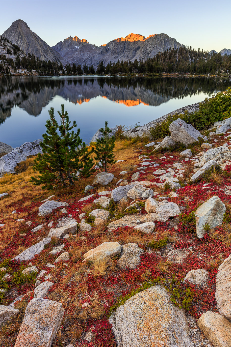
Crimson and Gold + RP
‹ PreviousLandscape GalleryNext ›

Crimson and Gold + RP

by Dave Dillemuth

Gallery: LandscapePosted November 21, 20164,298 views14 comments
Captured last month at Bullfrog Lake in Kings Canyon N.P. I was hoping for some nice clouds but had to settle for the fall colors in the high altitude grasses and ground cover. Appreciate your thoughts/comments.

5DSR, 16-35 f/4 IS L @ 20mm, .75 GND  
5 image stack for focus and exposure.

Comments

14 comments
Comment posted by Brian Schrayer on November 21, 2016 at 10:40 PM
This is beautiful, Dave.  I really like the reds and golds in the foreground.  The mirror-like reflection with just a hint of light on the peaks is really nice as well. 
Registered on May 28, 2004, 114 Posts, 2890 Comments
Comment posted by Richard Teller on November 21, 2016 at 10:42 PM
I like the colors, the foreground and the light. Nice reflection. I have looked at this for a while and my mind keeps asking what is past the left edge of the picture, like something has been cut off.
Registered on August 23, 2010, 1162 Posts, 6692 Comments
Comment posted by gary phillips on November 21, 2016 at 11:07 PM
Love the colors here, Dave.  You have put together some outstanding alpine images lately.  I might suggest a square crop to just below the rock a third of the up from the bottom.  Might not be any improvement, but to my eye the image balances a little better without so much foreground. Real nice as is.
Registered on October 24, 2013, 185 Posts, 4136 Comments
Comment posted by Marylynne Diggs on November 21, 2016 at 11:29 PM
Great colors and texture in the rocks.  i too feel something is amiss about the tightness on the left.  Here is my guess...the peak to the left of the tallest one is not very attractive?  Or maybe the shoreline curves in a way that interrupts the compositional flow?  One option, though I would hate to lose the foreground rock, is to go square.  Square has a way of centering our attention and would redirect us away from that left edge.
Registered on December 14, 2010, 122 Posts, 1034 Comments
Comment posted by Dave Dillemuth on November 22, 2016 at 12:15 AM
Thanks for the valuable input. I can see the point made on the left edge. Fortunately, I have a little more space on the left by removing the crop. I'm not sure if this helps but i think it does... 
Registered on December 10, 2015, 104 Posts, 1112 Comments
Comment posted by Dave Dillemuth on November 22, 2016 at 12:16 AM
Registered on December 10, 2015, 104 Posts, 1112 Comments
Comment posted by Harley Goldman on November 22, 2016 at 10:20 AM
Nice color and scene. Definitely the repost for me. I was going to suggest cropping the bottom, as the foreground rocks dominate too much for me in the original, but the repost balances things out nicely.  Some nice fall color, on the ground. 
Registered on November 19, 2003, 586 Posts, 11271 Comments
Comment posted by Igor Doncov on November 22, 2016 at 10:48 AM
I never saw an issue with the left edge but agree with many that a crop off the bottom would improve this image, a removal of just above the top edge of the largest rock on the bottom. I just think that a wider 4x4 look would show this off better than the current one. 
Registered on November 22, 2014, 189 Posts, 2733 Comments
Comment posted by Nick Bristol on November 22, 2016 at 11:36 AM
Dave, A beautiful scene with wonderful colors. The second one seems to flow better for me with a bit more room on the left and bottom. The second one with a bottom crop would also work nicely I think. Nice job with the stacking as well.
How do you like the 5DSR? Been thinking about that.

Nick Bristol
Lone Rock, WI.
Registered on February 1, 2004, 752 Posts, 14140 Comments
Comment posted by Ed Lowe on November 22, 2016 at 12:59 PM
The repost is definitely the winner for me, Dave as the elements feel a little better balanced. The fall colors of the ground cover are gorgeous and the warm light starting to light up the peaks is very striking. I also like the mirror like reflection and the placement of those evergreens in the scene. Beautifully done.

Ed
Registered on February 7, 2004, 414 Posts, 7115 Comments
Comment posted by Lon Overacker on November 22, 2016 at 2:54 PM
Dave,

This is a wonderful near-far alpine landscape.  I like the image as originally presented.  I also think the repost is just as valid; in fact I think the foreground rocks provide better framing as the bottom anchor to the scene.  The only thing I can suggest might be a slight burning of the foreground rock and ground cover - about the bottom 20% or so?  A very minor tweak.

The first(last?) light on the peaks is a nice final touch to this beautiful scenic.

Lon
Registered on November 24, 2006, 521 Posts, 19147 Comments
Comment posted by Marylynne Diggs on November 22, 2016 at 5:37 PM
The repost feels way better to me.  I'm still curious about a more square crop, but of course, that changes everything.  This is a treat to look at.
Registered on December 14, 2010, 122 Posts, 1034 Comments
Comment posted by Chris Chamberlain on November 23, 2016 at 9:01 PM
Very nice alpine scene! I would go with the original in terms of color, and the repost for the crop.

Chris
Registered on March 13, 2007, 500 Posts, 8365 Comments
Comment posted by Preston Birdwell on November 24, 2016 at 11:29 AM
Dave, this is  wonderful Sierra scene. Honestly, I prefer the original image, both in terms of color and contrast, and the framing. I do think a slight burn of the foreground rocks would draw more attention to the central part of the image. Being an old Sierra back country climbing bum, I really enjoy your images from a place I have long called home.
--P
Registered on November 1, 2003, 471 Posts, 5188 Comments