Nature Photographers Network
This is the preserved archive of the original Nature Photographers Network. The community continues at naturephotographers.network.
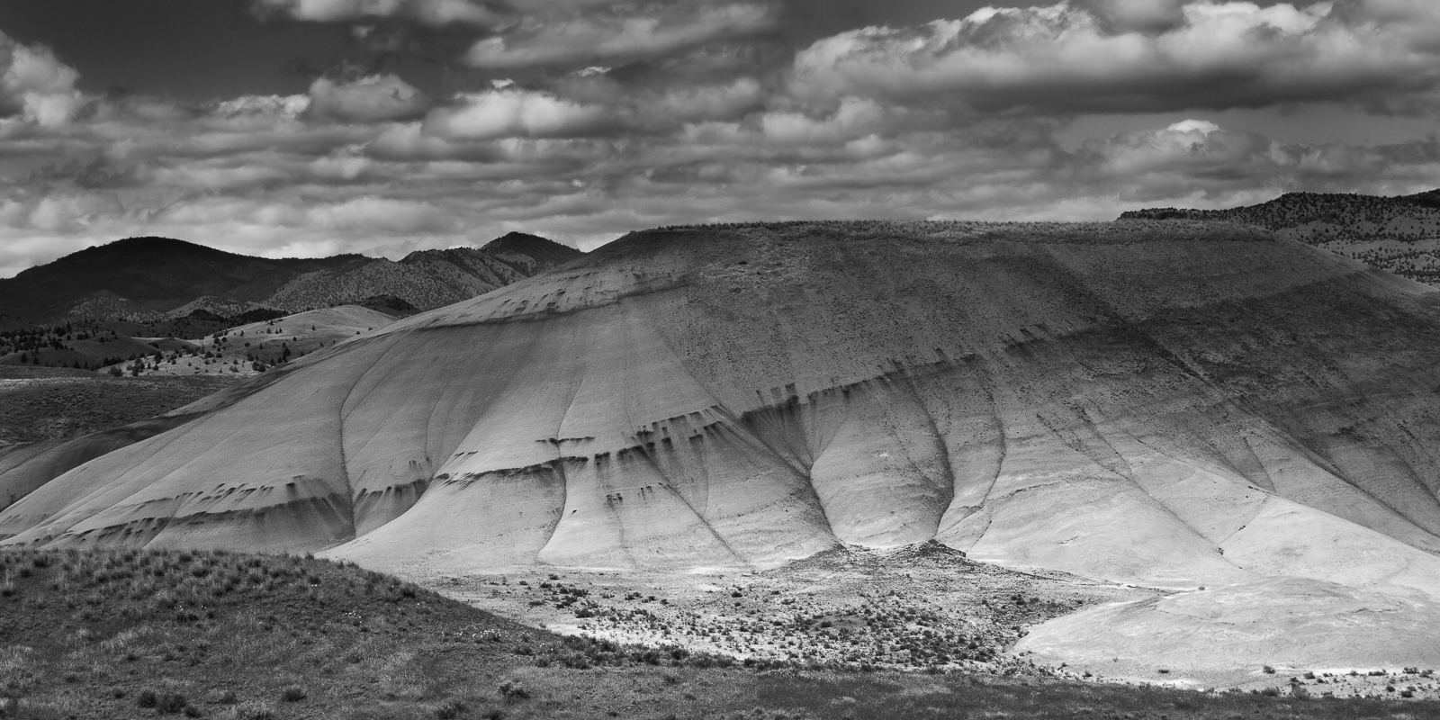
Painted in B and W +++
‹ PreviousLandscape GalleryNext ›

Painted in B and W +++

by Marylynne Diggs

Gallery: LandscapePosted November 20, 20162,124 views13 comments
Hi Folks,
I'm trying to get my head back in the game with photography and processing.  I've been a bit absent the last month or two as the usual school year burdens came down.  With Thanksgiving, Winter Break, and a Marc Adamus workshop approaching in February, it's time to get back into a groove.

Of course, I've been into Black and White lately (not ideal given my workshop choice, but it's where I'm reentering this Fall).  I thought I would try a new take on the Painted Hills in Eastern Oregon.  I'm interested, as always, in any and all suggestions, feedback, including yawns of apathy ;-).

Canon 5DM3 with 24-105mm at 32mm
ISO 125, 1/500, f/8
Processed in Nik Silver Efex and LR

Comments

13 comments
Comment posted by Preston Birdwell on November 20, 2016 at 6:21 PM
I think you nailed this, Marylynne. The tones look wonderful and I like the shapes of the hills. The nice sky is an added bonus and really ties everything together. Nicely done!
--P
Registered on November 1, 2003, 471 Posts, 5188 Comments
Comment posted by gary phillips on November 20, 2016 at 10:36 PM
Very nice Marylynne.  I like the dappled light and the cloudy sky.  I kinda wish there was a bit more of it.   Other than that a fitting b/w for the Painted Hills.  Oh yeah,, too bad you have to go back to worksad
Registered on October 24, 2013, 185 Posts, 4136 Comments
Comment posted by Marylynne Diggs on November 20, 2016 at 10:59 PM
Thanks, guys.  Gary: did you mean a bit more sky?  
And yeah, that whole "day job" thing sucks during the school year.  It's a binge and purge life for sure.  I'll still take 2.5 months off in summer in exchange for 14 hour days the rest of the year, but man am I looking forward to this next weekend!  I need it.
 
Registered on December 14, 2010, 122 Posts, 1034 Comments
Comment posted by Igor Doncov on November 20, 2016 at 11:12 PM
There's a wonderful organic shape to this hill as it fills the frame. It's almost reptilian. I don't think I've ever seen these painted hills done in black and white, but you've shown how good it can be. My only suggestion may be to increase contrast/clarity/texture in that main hill, particularly in the shadow area. It could 'glow' a tad more than it does now. Like the distant hills on the left.
Registered on November 22, 2014, 189 Posts, 2733 Comments
Comment posted by Brian Schrayer on November 21, 2016 at 12:11 AM
I like this a lot.  While this is a location that I would normally associate with color photography, this has a great tonal range throughout and the lines and textures work well in B&W.  The panoramic format works well also.  I also like that you have included more of the surrounding landscape to give this context. 
Registered on May 28, 2004, 114 Posts, 2890 Comments
Comment posted by Marylynne Diggs on November 21, 2016 at 11:09 AM
Thanks, everyone.  I brushed in some fine structure in the shadow areas at the top of the main hill and lifted the shadows there just a tish.  Let me know if this achieves the result imagined (if you can tell from the smaller file). 
Registered on December 14, 2010, 122 Posts, 1034 Comments
Comment posted by Lon Overacker on November 21, 2016 at 1:18 PM
Marylynne,

This scene and image does very well with the b&w presentation. This hasn't been mentioned, so maybe it's just me. To me, it's as if there was a grad/gradient applied here - either on camera or in post, where the bottom of the hill brighter, relative to the top and the sky.  Of course very possible given the puffy-cloud day, but it has the appearance of having a grad line (although not completely straight as one would expect.)

If it's not an issue for you or anyone else, then just chalk it up to me being nitpicky... ;-)  I might think about burning down the lower slope in the LR and maybe even brightening the sky/clouds a tad - if you can do that without losing the nice contrasts that are already present.

Lon
Registered on November 24, 2006, 521 Posts, 19147 Comments
Comment posted by Igor Doncov on November 21, 2016 at 1:32 PM
I agree with Lon about the sky, Marylynne. Instead of having a dramatic AA look, which is what I think you're going for, they have a heavy dreary look. If you can change that it would improve the overall feel of the image. But that may be a tall order.
Registered on November 22, 2014, 189 Posts, 2733 Comments
Comment posted by Marylynne Diggs on November 21, 2016 at 7:50 PM
Thanks Lon and Igor.  There was a big difference in the light on the lower flanks of the hill (hole in a cloud) compared to the top.  I did darken the sky because tonally it was not greatly different from the hill tops (although of course in color the blue contrasts with the tans and greens).   I burned the lower right and lifted the sky a bit.  Let me know if you like it better and whether I went far enough.

Thanks as always....my work always improves with your input.
ML
Registered on December 14, 2010, 122 Posts, 1034 Comments
Comment posted by Dave Dillemuth on November 22, 2016 at 7:56 PM
This is excellent, Marylynne. I like your framing and the mottled lighting is beautiful. Final repost looks great.
Registered on December 10, 2015, 104 Posts, 1112 Comments
Comment posted by Lon Overacker on November 22, 2016 at 8:06 PM
Marylynne,

Subtle changes, but I like the results and think an improvement.  yeah, I figured it was natural light - a "hole in the clouds" as you mentioned... just the way it played out seemed more like a grad than natural.  Not a huge deal. Thanks for taking the time to re-work.
 
Registered on November 24, 2006, 521 Posts, 19147 Comments
Comment posted by Marylynne Diggs on November 26, 2016 at 1:46 PM
Here is one last version of this scene.  This is a different frame, with slightly less light and shadow from the quick moving clouds, and with more sky.  Just curious whether people like this one better.
Registered on December 14, 2010, 122 Posts, 1034 Comments
Comment posted by Igor Doncov on November 26, 2016 at 5:11 PM
This is the sort of sky I would have liked for the earlier posts. I just like the light heartedness of this last image. This is my favorite image. Those clouds look and feel like clouds. Someone wrote that realistic clouds are the hardest thing to achieve. It may be possible that you could add a bit of drama to them and still maintain the optimism they now provide. Thanks for putting all this work into it.
Registered on November 22, 2014, 189 Posts, 2733 Comments