Nature Photographers Network
This is the preserved archive of the original Nature Photographers Network. The community continues at naturephotographers.network.
Life Flow + RP + 4Igor :-) ...
‹ PreviousLandscape GalleryNext ›

Life Flow + RP + 4Igor :-) ...

by Mark James Ford

Gallery: LandscapePosted November 11, 2016169 views17 comments
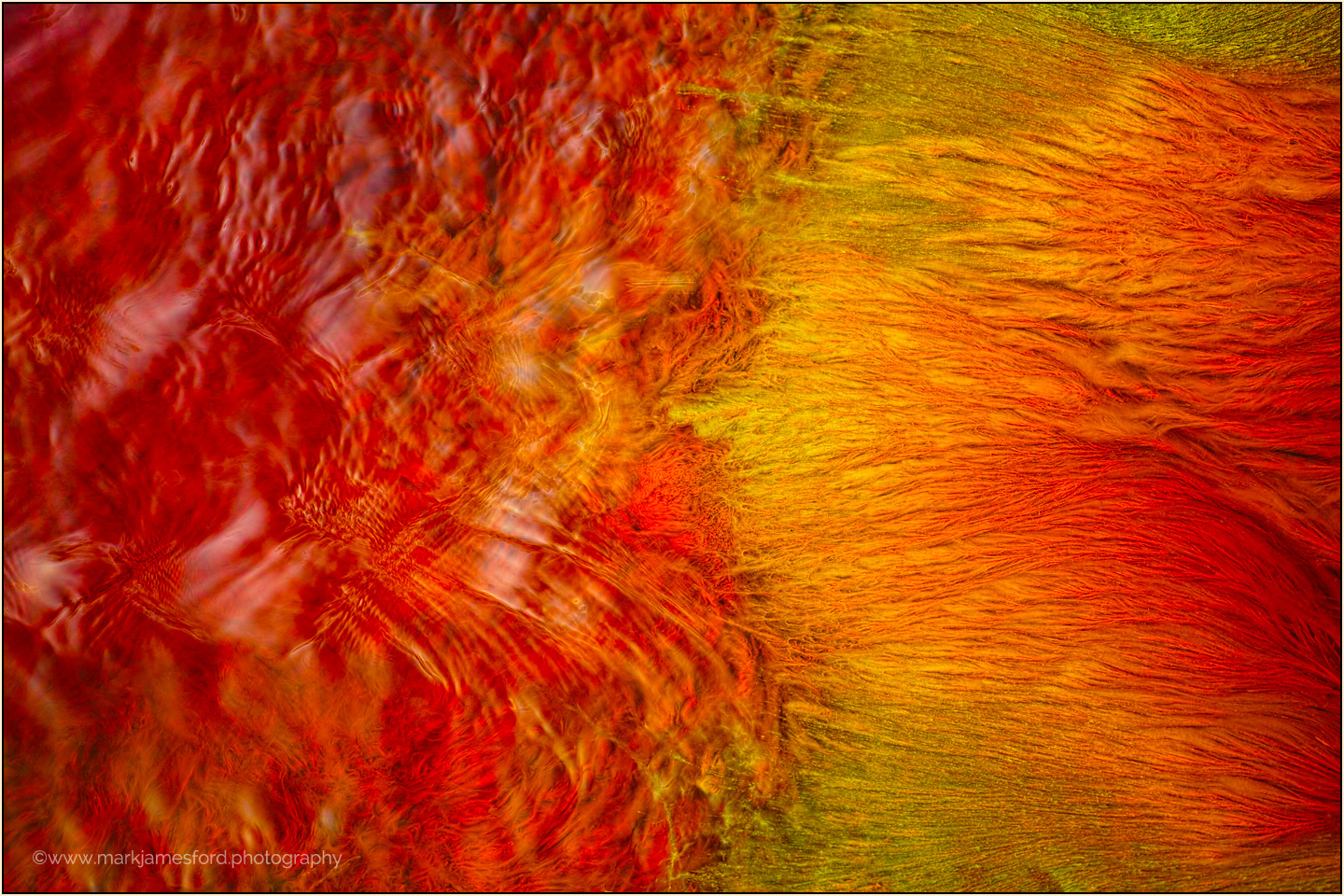
Here is another shot from the Rio Tinto (this time a little less abstract) which explores the boundaries between the flow and structure within the water itself and the macro-structures produced by the microorganisms that are able to live in the water. 

The Sigma DP3 Merrill was my first 'Foveon Camera' and, not withstanding that it is probably the last and best incarnation of the
Merrill sensor, I return to it gladly whenever such a detail motif presents itself. 

Sigma DP3 Merrill, ISO 100, F2.8, 1/20 sec. The flow was extremely uniform at this particular point so that i could use the relatively slow shutter speed that i wanted for the water movement without losing detail within the structures on the river bed.

A short article about the trip to the Rio Tinto can be found on my website HERE.



Comments

17 comments
Comment posted by Ana on November 11, 2016 at 5:11 PM
What a neat abstract (and what a great location too).  In addition to the color I'm enjoying the mossy softness under the water.  There's a great realism about it; this photo more than most makes me wish I could reach in and move the frame and investigate what's under all the edges.  I think I could also enjoy this vertically.
Registered on February 10, 2004, 191 Posts, 1446 Comments
Comment posted by Igor Doncov on November 11, 2016 at 6:40 PM
My recent surgeries are greatly influencing my interpretation and feel of this abstract. At a more objective level I find the colors and dynamics in the right half to be more attractive than the left and would prefer that that side dominate the composition. I like those distinct feathery reds and yellows more than the more vague swirls on the left. I suppose the idea was to play one off the other. An appealing alternative would be the right half of the image on it's side, right side up and left side down. That's my initial gut reaction to this. 
Registered on November 22, 2014, 189 Posts, 2733 Comments
Comment posted by Ed Lowe on November 11, 2016 at 9:30 PM
I am not sure what I am viewing, but it is very engaging and I love the warm colors, Mark. For some reason this resonates better with me with a 90 degree CCW rotation. Either way this is beautifully done.

Ed
Registered on February 7, 2004, 414 Posts, 7115 Comments
Comment posted by Mark James Ford on November 12, 2016 at 3:50 AM
Well, well, well, sometimes you don't see 'the wood for the trees' - Thank you very much for your feedback - knowing that i had taken the shot in landscape mode I never thought to explore the 90° rotation!

 
Registered on January 16, 2015, 60 Posts, 430 Comments
Comment posted by Mark James Ford on November 12, 2016 at 3:55 AM
Igor, I hope you are recovering well and I appreciate your objectivity ... I thought I would add this image which i probably wouldn't have posted otherwise, which explores more the structures that you found most interesting - Before posting, I also explored here various rotations but in the end decided that for this motif the landscape was the better version ... 
Registered on January 16, 2015, 60 Posts, 430 Comments
Comment posted by scott lanz on November 12, 2016 at 7:35 AM
All fine abstracts and variations, Mark. My personal favorite is the third, in the landscape orientation, with more of the textures on the right and more of a 1/3 -1/3 -1/3 comp. devil
Registered on November 14, 2003, 840 Posts, 12902 Comments
Comment posted by Harry Lichtman on November 12, 2016 at 8:15 AM
I think the last crop is more effictive.  The motion seems more uniform and those lighter areas on the left werected more of an eye draw. engaging shot.
Registered on September 17, 2010, 304 Posts, 3507 Comments
Comment posted by Preston Birdwell on November 12, 2016 at 6:40 PM
Wonderful color and nice details. The vertical composition is my favorite, but all three are very nice.
--P
Registered on November 1, 2003, 471 Posts, 5188 Comments
Comment posted by SandyRichardsBrown on November 13, 2016 at 3:28 AM
I'm also not sure what I'm seeing, but the third version seems most pleasing to me. Love the colours and "fibers" -
Great work!
Sandy
Registered on November 24, 2003, 3937 Posts, 12909 Comments
Comment posted by Igor Hoveijn on November 13, 2016 at 12:37 PM
The horizontal is already quite remarkable, but the vertical is even better. Great find of these incredible forms and structures. If you are tired of suggestions ignore the following. Cropping the vertical from below to almost square: one third of red chaos below and two thirds of flames on top could also work well. The third image is entirely different and deserves a separate posting imho.
Registered on November 2, 2015, 18 Posts, 192 Comments
Comment posted by Harley Goldman on November 13, 2016 at 6:14 PM
Great colors and shapes, quite a nice abstract. I think the Igor version is my favorite, but I see many images within the original, which is pretty nice in itself. 
Registered on November 19, 2003, 586 Posts, 11271 Comments
Comment posted by Mark Seaver on November 14, 2016 at 10:09 PM
Quite the "LED Glow" here, Mark.  The story behind this river is quite amazing and sad, but the colors are awesome.  This works very well as an abstract.  I'm amazed at how different and much more dramatic the vertical looks.
Registered on January 23, 2011, 1103 Posts, 17270 Comments
Comment posted by John Williams on November 15, 2016 at 10:10 PM
All are great, but I love that vertical. Sweet abstract!
Registered on September 6, 2007, 221 Posts, 5985 Comments
Comment posted by Kah Kit Yoong on November 17, 2016 at 2:15 AM
I thought the crop you presented last would have been the best but I think I prefer the original and vertical versions best. Fascinating colours and textures.
Registered on September 27, 2006, 636 Posts, 10682 Comments
Comment posted by Stuart Williams on November 17, 2016 at 3:35 AM
i love the rotated version - and i'd be inclined to slice a little off each side for complete visual satisfaction in my eye!
Registered on December 7, 2007, 247 Posts, 4792 Comments
Comment posted by Nick Bristol on November 17, 2016 at 6:29 PM
Amazing image, Mark. The warm (more like hot) colors are impressive and I really like how they flow. The second image rotated from the original seems to work best for me. So interesting to see this. Wonderful capture.

Nick Bristol
Lone Rock, WI.
Registered on February 1, 2004, 752 Posts, 14140 Comments
Comment posted by Marylynne Diggs on November 18, 2016 at 1:09 PM
Wow!  Love the second two in this thread especially.  The vertical comp is my favorite, and I like the alternative shot as well.  Nice work!
ML
Registered on December 14, 2010, 122 Posts, 1034 Comments