Nature Photographers Network
This is the preserved archive of the original Nature Photographers Network. The community continues at naturephotographers.network.
Breaking Bad BW
‹ PreviousLandscape GalleryNext ›

Breaking Bad BW

by scott lanz

Gallery: LandscapePosted October 12, 2016245 views12 comments
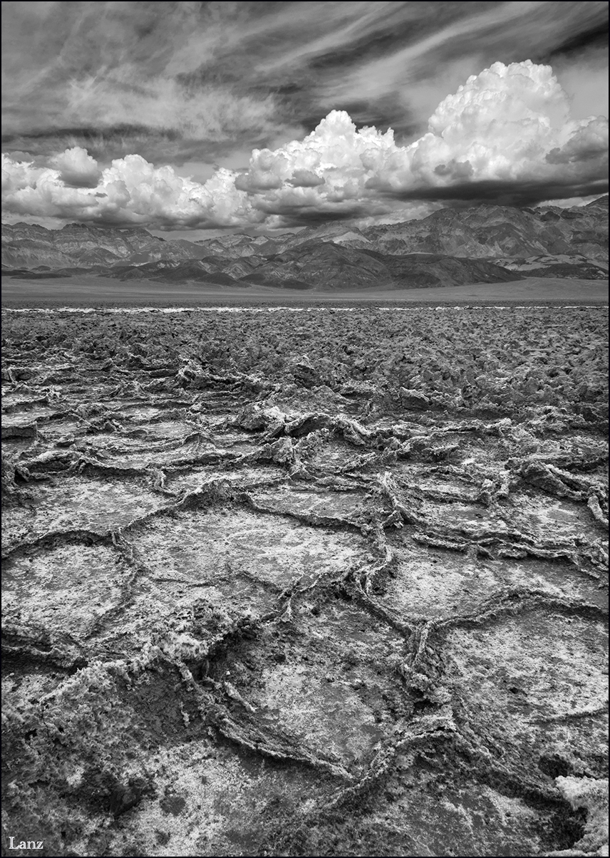
Rather than post a BW version of the previous image, as suggested by several commenters, I thought I'd post this alternate vertical comp with a little different foreground converted to B&W. This was shot midday, but the clouds were great and this was the best foreground I could find without venturing too far down the west side road under threatening skies in my rental car. Not "attractive" per se, but I was attracted to the starkness of the death valley landscape under stormy skies. It began to storm a few minutes after I shot this. D600, 14-24 @ 24, f20. Suggestions and other comments welcome.

Comments

12 comments
Comment posted by Jeffrey Sipress on October 12, 2016 at 11:21 AM
Scott, I love that place, and this is a very interesting image from there.  A bit much on the contrast for me but it is dramatic.  I hope you didn't drive your car over this stuff!
Registered on February 17, 2004, 236 Posts, 1197 Comments
Comment posted by scott lanz on October 12, 2016 at 11:45 AM
Thanks, Jeffrey. No, this was taken right off the west side road. I did see where vehicles go off the road and over the playa on the other side of the road from where this was shot but I would never do that. There are signs prohibiting it that are apparently ignored. surprise
Registered on November 14, 2003, 840 Posts, 12902 Comments
Comment posted by Walt Sterneman on October 12, 2016 at 1:18 PM
Interesting comp Scott. I like the brooding sky. I'm wondering if you get down a little lower if you could get the cool formations near foreground and eliminate some of the not so interesting mid-ground?
Registered on March 24, 2010, 73 Posts, 1268 Comments
Comment posted by Mark James Ford on October 12, 2016 at 1:56 PM
Hi Scott, really like this BW version. Contrast is spot on for me and I think having the lighter salt line going across the image separates the mid-ground from the start of the background nicely - shooting from lower down would loose this. Plenty to look at in this broody image.  There are of course many potential variations on the composition with more sky etc. etc. but none would necessarily be any better than this very good image!  I myself might have toyed with being a little right to bring the very heavy cloud a little more into frame but that would have lost the nice diagonal lines going through the image ... On the same lines the image is a true neutral BW - I prefer (for my own images) slightly cool BW finishes and actual I wonder due to the broodiness of the image whether a slight cross-process (= a hint of blue in the shadows and a hint of yellow in the highlight) would enhance this feel.  Definitely a location i would like to see for myself one day! Great post!
Registered on January 16, 2015, 60 Posts, 430 Comments
Comment posted by scott lanz on October 12, 2016 at 2:04 PM
Mark, thank you for your detailed review and suggestions. Being quite new to BW conversions, I especially appreciate your advice on your B&W processing. Very helpful. Thanks again for your time.   crying
Registered on November 14, 2003, 840 Posts, 12902 Comments
Comment posted by Ian Wolfenden on October 12, 2016 at 4:19 PM
I like the composition, Scott, with the high horizon line, the wavy diagonals and the rich textures in the landscape.  I wonder if those remarkable clouds might be just a touch less structured with less strong greys to balance the otherwise lovely tones - for me the clouds compete for attention with the land. 
Registered on May 18, 2007, 1108 Posts, 7647 Comments
Comment posted by Harley Goldman on October 12, 2016 at 5:42 PM
Works real well for me. I like the high contrast and what a great popping sky. Good call on the conversion, too. 
Registered on November 19, 2003, 586 Posts, 11271 Comments
Comment posted by Nick Bristol on October 12, 2016 at 7:00 PM
Scott, I like this shot and also the b&w conversion. The vert comp works great for me and the impact of the image is quite impressive.  Cool stuff!!

Nick Bristol
Lone Rock, WI.
Registered on February 1, 2004, 752 Posts, 14140 Comments
Comment posted by Igor Doncov on October 12, 2016 at 8:20 PM
Oh yes, this really rocks. B&W was the way to go. Lots of contrast here which adds a lot of drama and tension.And those clouds look fabulous. Just a great all around image. Great job.
Registered on November 22, 2014, 189 Posts, 2733 Comments
Comment posted by Dave Dillemuth on October 14, 2016 at 11:35 AM
Very dramatic image, Scott. A lot to feast the eyes upon...the textures and layers are incredible. Processing Looks good.
Registered on December 10, 2015, 104 Posts, 1112 Comments
Comment posted by Mark Seaver on October 14, 2016 at 1:11 PM
Stark and stunning, Scott.  The high contrast really sets off the details and the variety of textures.  Looks like a perfect way to take advantage of the conditions.
Registered on January 23, 2011, 1103 Posts, 17270 Comments
Comment posted by Bill Fach on October 22, 2016 at 7:59 AM
Scott: Well seen, composed and processed. Ominous and compelling.>=))>
Registered on November 1, 2003, 1805 Posts, 26981 Comments