
Nature Photographers Network
This is the preserved archive of the original Nature Photographers Network. The community continues at naturephotographers.network.
Landscape - 2nd HM
‹ PreviousEPA 2016 GalleryNext ›

Landscape - 2nd HM

by Igor Doncov

Gallery: EPA 2016Posted September 27, 2016697 views32 comments

God saw that the light was good, and he separated the light from the darkness.
 

Let There be Light +3

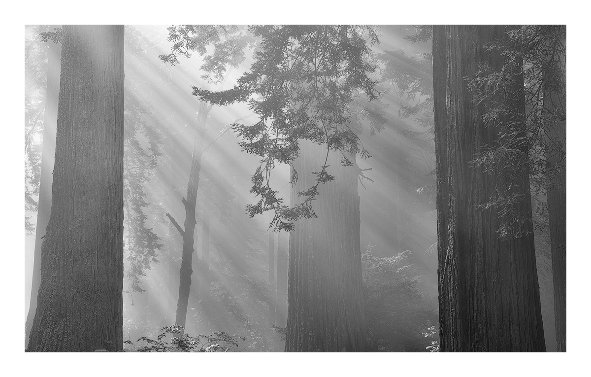
It was in the 90's in Eureka, but Crescent City was cool and comfortable. The fog at Redwood State Park lifted each day at around 10 AM and that was the magic time. Sunlight strayed through the mist leaving beautiful shadows in it's wake. I spent several days shooting this subject, each day getting a clearer picture of what is special about this place.

I actually intended to film this in color. The idea was to create high toned images of trunks emerging from the mist. However, after working on this a bit and after thinking about Bruce Barnbaum's thoughts I decided to go B&W. That medium is sort of new to me so I'm interested in what you think.

Canon 6D, 24-105mm@60mm, f8.0, iso 100, 1/15 secs, tripod, TK sharpening, Silverfox processing

Comments

32 comments
Comment posted by Bill Chambers on September 27, 2016 at 1:59 AM
This is a very powerful image Igor, a definite success in my book.  As to whether B&W is the correct choice, I would love to see it in color as well before I make that decision.  Excellent composition, as is usual for you.  Processing in B&W is very nice, but I might consider increasing contrast just a tad.
Registered on April 10, 2005, 753 Posts, 21216 Comments
Comment posted by Dave Dillemuth on September 27, 2016 at 11:55 AM
Wow, this is magnificent, Igor. Very well composed and those god beams are spectacular. I agree with Bill on both comments... like to see this one in color as well and for this B&W rendering the blacks look a little week so I would adjust the black point and/or raise the contrast. 
Registered on December 10, 2015, 104 Posts, 1112 Comments
Comment posted by Igor Doncov on September 27, 2016 at 12:16 PM
I'm confused. The object here was to show ephemeral light. I never wanted this to be contrasty nor have strong blacks. This from Outdoor Photography seems to talk about my intentions:  
Setting blacks is partly subjective, partly an art, partly a science. There are no rules that will work for every photo. In fact, some scenes, such as a foggy landscape, won’t have blacks at all. However, you generally need to do something with the blacks so your image will look its best.


Registered on November 22, 2014, 189 Posts, 2733 Comments
Comment posted by Igor Doncov on September 27, 2016 at 12:35 PM
Maybe you guys are right. What do you think? In some ways I like this more and in some ways not:
Registered on November 22, 2014, 189 Posts, 2733 Comments
Comment posted by Eva McDermott on September 27, 2016 at 12:38 PM
This is very ethereal and well done Igor.  I love the quality of light you have captured here.
Registered on January 4, 2009, 1015 Posts, 13229 Comments
Comment posted by Harley Goldman on September 27, 2016 at 1:23 PM
Excellent image. I think I like the repost and it still preserves the mood of the first. The highlights to their job in both. I like this one a lot, in either version. 
Registered on November 19, 2003, 586 Posts, 11271 Comments
Comment posted by Igor Doncov on September 27, 2016 at 1:24 PM
Here is the color version. It actually doesn't look too bad this morning. I didn't want those branches to be too dark because they were contradicting the mood of the image, so I lightened them up. 

 
Registered on November 22, 2014, 189 Posts, 2733 Comments
Comment posted by Dan Kearl on September 27, 2016 at 2:32 PM
I was going to suggest more contrast and then I see the repost addresses it.
I like the image a lot, these are hard to do and the comp works well with the framing trees.
I prefer the B & W.
Registered on September 2, 2013, 209 Posts, 1514 Comments
Comment posted by Bill Chambers on September 27, 2016 at 3:06 PM
I understand your views fully Igor, and I never suggested a large bump in contrast, just a tiny one, and I think the repost hit it right where it needs to be (for my tastes, anyway).  The beams looks a bit more "powerful", if that makes sense, and the added contrast seems to give it a greater sense of depth.  After viewing the color image, I think you made the correct decision to go with B&W.  There's very little color in the image and what does exist seems to draw attention away from the story you're trying to tell.  Print this baby large and hang proudly.
Registered on April 10, 2005, 753 Posts, 21216 Comments
Comment posted by Marylynne Diggs on September 27, 2016 at 4:11 PM
Put me down for the b&w also.  I like both of them, but I am partial to the one with a little more contrast.
ML
Registered on December 14, 2010, 122 Posts, 1034 Comments
Comment posted by Mark Seaver on September 27, 2016 at 4:19 PM
Igor, I think your original post fits with your described intent very well.  The crepuscular rays look great and the way the trees fade into the distance (with the closest one clearly on the right) provides a fine, ethereal feeling.
Registered on January 23, 2011, 1103 Posts, 17270 Comments
Comment posted by Igor Doncov on September 27, 2016 at 4:24 PM
I really wasn't happy with the level of sharpening of all this images, so I cranked it up more and I think it improves it. Hopefully the added sharpening will not be lost during the upload.

Yes this is noticeably better. But you have to click on it to see the difference. Please see LARGE version. I felt it was important to have those central branches well defined, and the same goes for the tree on the right side.

 
Registered on November 22, 2014, 189 Posts, 2733 Comments
Comment posted by Reno DiTullio on September 27, 2016 at 6:28 PM
Love this Igor, the lighting, a very subtle presentation, no need for color.
Registered on November 14, 2003, 130 Posts, 1644 Comments
Comment posted by gary phillips on September 27, 2016 at 11:26 PM
Igor. this is outstanding to my eye.  The repost hits the nail on the head and the last repost even more so.  There is no doubt in my mind that B/W is the very best way to convey the message here.  Just a classic view that needs no color or any other description. I agree that the black point is really up to the artist, and the presentation should be what you feel it should be.  There is a point where other folks suggestions are just that, and the subjective nature of what we do cannot ever please everyone.  I think I would burn slightly the leaf cluster on the bottom of the frame against the right tree and maybe the leaves mid frame against the same trunk.  Very minor and I've really been enjoying your latest post.
Registered on October 24, 2013, 185 Posts, 4136 Comments
Comment posted by Jake Alletson on September 27, 2016 at 11:54 PM
There has been a great deal of comment on this beautiful image but I would like to add in a little more.  The B/W in either version was a good choice but how about darkening the bottom 2/3 of the trunk of the tree on the left but just a little.  I think that it might balance the darker trunk on the right.  This will be a wonderful print anyway.
Registered on May 3, 2016, 12 Posts, 163 Comments
Comment posted by Dave Dillemuth on September 28, 2016 at 11:27 AM
Final repost looks great. Well done!
Registered on December 10, 2015, 104 Posts, 1112 Comments
Comment posted by Walt Sterneman on September 28, 2016 at 1:09 PM
You did a really nice job on this Igor. I usually have a very hard time finding any photo I like better in B&W than color. I guess the color just suits my eye better normally. But with your photo I do like the B&W version better. And I think you have nailed the processing with your last effort. Nice job and thanks for opening my eye to the B&W.
Registered on March 24, 2010, 73 Posts, 1268 Comments
Comment posted by Preston Birdwell on September 28, 2016 at 1:42 PM
Igor, the last repost works best for me. The tonal range look very nice, indeed, without being overbearing. You have struck a good balance, here. B&W is definitely the best choice for this image. Well done!
--P
Registered on November 1, 2003, 471 Posts, 5188 Comments
Comment posted by Igor Doncov on September 28, 2016 at 2:20 PM
Walt Sternemann. I'm sort of like you in that I shunned B&W, even though my favorite old masters all shot that way. I've got a couple more B&W I will be posting soon that I think work better in that medium. I'll be curious to see what you think. 
Registered on November 22, 2014, 189 Posts, 2733 Comments
Comment posted by Ken Smith on September 28, 2016 at 9:23 PM
Igor, a lovely post.  I am mostly unable to affirm one b/w is best.  I like them all.  The mist and light dancing in the woods is superb.  If anything, part of me wants more on the left and right sides.   The lens distortion is a tough one to work with too. You were probably near the 24 mm on the zoom and pointing slightly upward.  Where you to photoshop the converging lines and strainghten them, it would pinch too much of the trunks.  This shot was well done and worth your returning each day. 
Registered on September 5, 2008, 449 Posts, 2444 Comments
Comment posted by Igor Doncov on September 28, 2016 at 9:59 PM
Ken, this was shot at 60mm and I think it was eye level. I actually thought of shooting at a longer focal point to get the trees vertical but decided this was good enough. 

These shots are actually fairly rushed which doesn't give you enough time to make sure about everything. At first it is all fog. Then one edge of the fog starts to lift and the sun peers through causing shafts of light through the trees. The intensity of these rays depend on the thickness of the fog. It's constantly changing becoming lighter and lighter. So there is a brief period of optimum time. During this time you need to make a composition with the rays as they are. It's a bit stressful. You have to be prepared and lucky. 
Registered on November 22, 2014, 189 Posts, 2733 Comments
Comment posted by Mark James Ford on September 29, 2016 at 1:54 PM
Hi Igor, you have clearly put a lot of effort into getting the best out of this image and it really was worth it!  The final BW version is spot on - great atmosphere - like it!
Registered on January 16, 2015, 60 Posts, 430 Comments
Comment posted by Doug Koepsel on September 29, 2016 at 4:59 PM
Igor, my preference goes to the last version with the increased sharpening.  I also like the lighter contrast over the darker B&W, and the B&W renditions over the color.  You caught some nice light rays.
Registered on April 1, 2010, 196 Posts, 1592 Comments
Comment posted by Nick Bristol on September 29, 2016 at 5:07 PM
Igor, This is one outstanding image. Great composition and absolutely wonderful feel. The rays of light add such a beautiful touch and I could look at this for a long while and just keep enjoying it. I like the black and white very much and love the processing of the final image. Love this! devil Nick

I just returned from a trip in Upper Michigan a couple of hours ago so glad this one didn't slip past me.
Registered on February 1, 2004, 752 Posts, 14140 Comments
Comment posted by Silvia Richter on October 2, 2016 at 2:22 PM
Igor, the final version is spot on to my eye. There is an inimitable elegance to this image and the b&w conversion makes for a most interesting kind of abstraction for me.

Silvia
Registered on February 27, 2011, 18 Posts, 167 Comments
Comment posted by Bill Fach on October 7, 2016 at 9:13 PM
Igor: Let there be light indeed! Spectacular scene superbly captured and your final rework is superb. Congrats on the WP.>=))>
Registered on November 1, 2003, 1805 Posts, 26981 Comments
Comment posted by SandyRichardsBrown on October 8, 2016 at 12:42 PM
Congrats on a great WP - really masterful work!
The final re-work is perfect, to my eyes.
Sandy
Registered on November 24, 2003, 3937 Posts, 12909 Comments
Comment posted by Igor Doncov on October 8, 2016 at 1:41 PM
Thank you Sandy. I wish that I could replace the initial version with the final because of the lack of sharpness. I may have to repost it just to get it into my portfolio. 
Registered on November 22, 2014, 189 Posts, 2733 Comments
Comment posted by Ryan Shain on October 12, 2016 at 2:02 PM
Hi Igor,

I have been browsing through some images since I have been back, and this one stopped me in my tracks.There is such an elegance about this capture, and you have such beautiful vision in seeing this image. The final repost works wonderfully for myself, and I think those trees look pretty darn straight.  The mood of the fog lifting as the sun rays gently illuminate the forest is priceless, and great conversion!!!

Congrats on the WP!!!!!
Registered on February 20, 2007, 226 Posts, 4571 Comments
Comment posted by Igor Doncov on October 12, 2016 at 2:21 PM
Thanks Ryan. And congratulations on your wedding!
Registered on November 22, 2014, 189 Posts, 2733 Comments
Comment posted by Albert Darmo on October 23, 2016 at 7:11 PM
Hi  Igor crying     I've   been  away  from   N P   for  a  while.   i'm  83  and  my  eyes  are  giving  out .  so  i  took  a  vacation.  now  i'm  back,     and   just  recently  started  to  comment again.      today  when  i  looked  at previous   WP's  i  saw  your  winner image.  i  was  amazed    at    this    excellent  inspired  photography  devil


Albert  Darmo       Canada
Registered on November 25, 2008, 1386 Posts, 11978 Comments
Comment posted by gary phillips on January 18, 2017 at 12:10 AM
Excellent in every way, Igor.  I have appreciated your thoughtful comments all year and enjoyed your posts immensely.  Congrats on the well deserved EPA.  Bravo. 
Registered on October 24, 2013, 185 Posts, 4136 Comments