Gallery: LandscapePosted September 3, 2016152 views8 comments
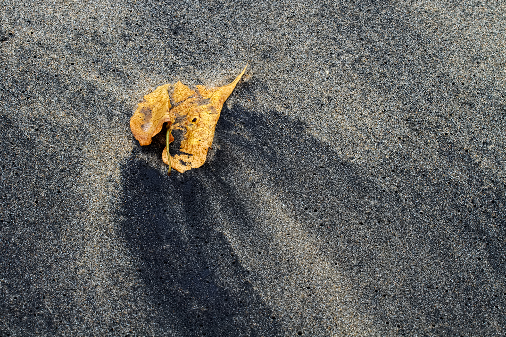
By the beach ..when the waves withdrew..
7D, 70 200 @70
Balan Vinod
Comments
8 comments
Comment posted by Kathy Barnhart on September 3, 2016 at 2:43 PM
I like this melancholy image of a washed up leaf on the shore. Lots of texture and just enough shadows in the sand to add interest. the simplicity is wonderful.
Registered on November 11, 2011, 404 Posts, 1639 Comments
Comment posted by Igor Doncov on September 3, 2016 at 7:24 PM
I would crop some from the bottom and some from the left. That would make the leaf occupy a larger portion of the canvas, which may or may not improve this. The leaf has some interesting texture which could be promoted in that manner. I like the muted colors here.
Registered on November 22, 2014, 189 Posts, 2733 Comments
Comment posted by Vance Gese on September 4, 2016 at 12:03 AM
Love the delicate detail of the leaf and the beautiful texture and tones in the sand. Simple, yet a wonderful image. Nice.
Registered on November 13, 2008, 298 Posts, 6629 Comments
Comment posted by Richard Teller on September 4, 2016 at 4:03 PM
I like the very simple composition of this image. The contrast in color and texture between the leaf and sand is very good and the lines in the sand below the leaf draw the eye to the center of interest. Well seen and photographed.
Registered on August 23, 2010, 1162 Posts, 6692 Comments
Comment posted by Preston Birdwell on September 4, 2016 at 4:10 PM
This does have a melancholy mood to it. There is a lot of nice detail and texture. I am wondering if Igor meant crop from the right, rather than left? I do think this would look nice cropped from the right so that the brighter diagonal stripe begins near the lower right corner. Does that make sense? The leaf has saturation and detail.
--P
Registered on November 1, 2003, 471 Posts, 5188 Comments
Comment posted by gary phillips on September 4, 2016 at 11:43 PM
I enjoy your Macro work, Balan, and this fits very nicely with those images. You have a marvelous eye and this is really well seen.
Registered on October 24, 2013, 185 Posts, 4136 Comments
Comment posted by Mark Seaver on September 5, 2016 at 10:45 AM
Looks great, Balan. You've got lots of detail in a very clean, well balanced comp. I agree with Kathy that there's a gentle sense of melancholy...like being on a quiet beach in late fall.
Registered on January 23, 2011, 1103 Posts, 17270 Comments
Comment posted by Doug Koepsel on September 5, 2016 at 10:51 PM
Nice placement of the leaf in the composition. The curved and angle of the dark sands around the leaf are good to create flow. the darks spots on the left edge in the ULC area minor nit. I wonder how this would look in B&W as the leaf may be nearly white and a nice attractant.
Registered on April 1, 2010, 196 Posts, 1592 Comments

Comments
8 comments--P