Nature Photographers Network
This is the preserved archive of the original Nature Photographers Network. The community continues at naturephotographers.network.
Elegant Cascades (Repost)
‹ PreviousLandscape GalleryNext ›

Elegant Cascades (Repost)

by Brian Schrayer

Gallery: LandscapePosted August 1, 2016206 views8 comments
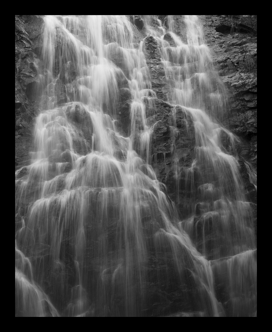
This is an image that I took last summer at Crabtree Falls along the Blue Ridge Parkway in North Carolina.  This waterfall has a lot of great lines as the water drops down the wall.  Since the image was mostly monochromatic, I went with a B&W conversion to emphasize the lines and textures. 

All comments and critiques are welcome.

Image Capture:
100 mm
1/8 sec @ f16 (for desired shutter speed more than DOF)
ISO 100

Processing:
B&W Conversion in Photoshop using Red Filter
Midtone contrast adjustment using luminosity masks
Cropped to 8X10 format due to distracting log in the bottom of the frame

 

Comments

8 comments
Comment posted by Igor Doncov on August 2, 2016 at 2:02 AM
Wonderful lyrical repeatitive composition. Complex, yet all the components are holding well together. For some reason it reminds me  of hair, beautifully dropping down to one's shoulders. There is good separation in the strands of 'hair' and the cliff has good dark texture. The only suggestion I would make is to darken the whites at the very top so that they don't dominate so much and draw you out of the picture. It would be best if the whitest whites were at the same tones as the lower ones. Just an impression.
Registered on November 22, 2014, 189 Posts, 2733 Comments
Comment posted by Ronald Murphy on August 2, 2016 at 8:24 AM
Great photo. Perfect shutter speed for me.
Registered on March 13, 2012, 279 Posts, 975 Comments
Comment posted by Dave Dillemuth on August 3, 2016 at 8:20 PM
Very nice waterfall abstract. B&W processing looks good although I think I would brighten the Whites a bit.
Registered on December 10, 2015, 104 Posts, 1112 Comments
Comment posted by Brian Schrayer on August 3, 2016 at 11:24 PM
I worked on the processing a little more on this image to get a bit more tonal separation with luminosity painting.  I like the result a lot better.  All comments and critiques are welcome.  crying 
Registered on May 28, 2004, 114 Posts, 2890 Comments
Comment posted by Igor Doncov on August 4, 2016 at 6:52 AM
The original was considerably better IMO. It has a diaphanous quality where the new image is harsh and contrasty.
Registered on November 22, 2014, 189 Posts, 2733 Comments
Comment posted by Eva McDermott on August 4, 2016 at 8:40 AM
I really like the silky texture of the water Brian.  I like your original post best.  Wonderful B&W in either case.
Registered on January 4, 2009, 1015 Posts, 13229 Comments
Comment posted by Doug Koepsel on August 4, 2016 at 10:15 PM
My original thought was that the water in the first post needed to be whiter.  In the repost, it seems the rock has been darkened too much.  Maybe just a change in white point was needed and not an increase in contrast or black/mid points.
Registered on April 1, 2010, 196 Posts, 1592 Comments
Comment posted by Brian Schrayer on August 5, 2016 at 8:30 AM
Thank you all for the helpful comments.  I will keep working on this one.
Registered on May 28, 2004, 114 Posts, 2890 Comments