Nature Photographers Network
This is the preserved archive of the original Nature Photographers Network. The community continues at naturephotographers.network.
Old Fern
‹ PreviousLandscape GalleryNext ›

Old Fern

by John Williams

Gallery: LandscapePosted June 23, 20163,870 views11 comments
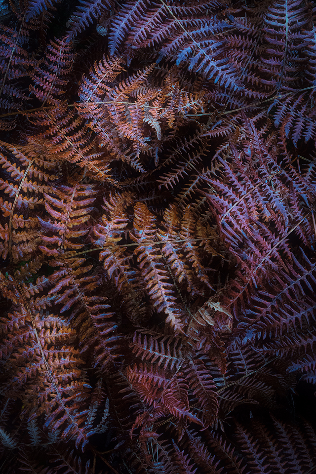
This is one from 2013 that I've been meaning to get to. I shot a white card with this, and the true color is much warmer. I elected to go with what the camera chose for a white balance setting because I liked the blue tones.

This was the first trip I took with the 7100, and I have no clue why I used an ISO of 3200. Maybe I was just experimenting with the settings??
 
Nikon D7100
Nikon 12.0-24.0 mm f/4.0 at 24 mm (36mm equiv.)
1/60 sec. at f/22 and ISO 3200

Comments

11 comments
Comment posted by Michael Lowe on June 24, 2016 at 12:22 AM
Excellent work. Very good choice to go with the cooler WB for some very nice contrast
devil
Registered on February 11, 2004, 777 Posts, 5252 Comments
Comment posted by scott lanz on June 24, 2016 at 11:55 AM
I like the pattern and the tones, John. Certainly would not have guessed iso 3200.
Registered on November 14, 2003, 840 Posts, 12902 Comments
Comment posted by Ed Lowe on June 24, 2016 at 11:58 AM
This is one of those images that needs to be viewed large to really appreciate, John. I really like the mix of warm and cool tones in the scene along with the angled lines of the ferns. Beautifully done.

Ed
Registered on February 7, 2004, 414 Posts, 7115 Comments
Comment posted by Kathy Barnhart on June 24, 2016 at 1:05 PM
This is beautiful, mostly because of the colors but also for the detail and lines. You made a good choice to stick with the blue tones. A lovely abstract.
Registered on November 11, 2011, 404 Posts, 1639 Comments
Comment posted by Richard Sandor on June 24, 2016 at 6:37 PM
John: really like the warm and cool tones ln the same image. The orientation of the ferns is excellent as well. I think the image could be improved just a bit with a crop of about 15 to 20 per cent from the bottom. Fine otherwise. Richard
Registered on January 12, 2014, 453 Posts, 1625 Comments
Comment posted by gary phillips on June 24, 2016 at 7:33 PM
Really sweet, John.  Love the luminous light on the ferns.  The large view is just outstanding.  I would guess a vignette was applied, and if so, done very well.
Registered on October 24, 2013, 185 Posts, 4136 Comments
Comment posted by Harry Lichtman on June 24, 2016 at 9:04 PM
Cool is cool! Beautiful effect the WB setting evokes.  Your selective highlighting of the ferns gives an a 3D effect to the image. Real eye grabber, excellent job.
Registered on September 17, 2010, 304 Posts, 3507 Comments
Comment posted by Nick Bristol on June 26, 2016 at 4:49 PM
John, I like that you stayed with the blue tones because that really adds a nice touch to this beautiful image. The light is wonderful and nice work with the composition.

Nick Bristol
Lone Rock, WI
Registered on February 1, 2004, 752 Posts, 14140 Comments
Comment posted by Mark Seaver on June 27, 2016 at 9:52 AM
The blues in the darker areas do provide some extra interest here, John.  I like the graphic view here and how the leaves come in at different angles.  The added brightness of the darker areas in the larger is a big plus.
Registered on January 23, 2011, 1103 Posts, 17270 Comments
Comment posted by Dave Dillemuth on June 28, 2016 at 9:46 PM
Gorgeous image. Excellent comp. and really like the processing you've done which makes this into a work of art. Great work!
Registered on December 10, 2015, 104 Posts, 1112 Comments
Comment posted by Kah Kit Yoong on June 29, 2016 at 3:20 AM
Well seen, the composition is really pleasing with the geometric patterns. I like the mix of warmth and coolness, although might personally go for more selective areas of cooling to further the contrasts.
Registered on September 27, 2006, 636 Posts, 10682 Comments