Gallery: FloraPosted June 15, 2016189 views12 comments
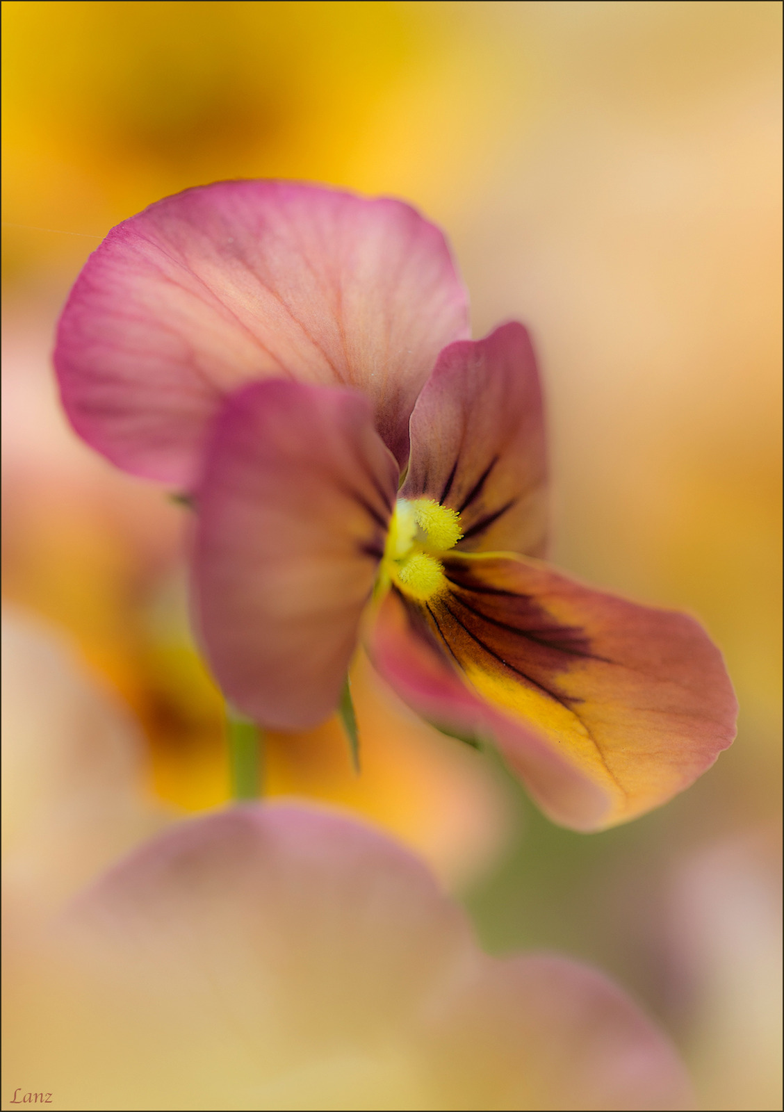
A viola stands out from the crowd. Fellows Riverside Gardens, D600, 150 macro, f5.6, iso 400, 1/1000. Suggestions, questions, and other comments welcome.
Comments
12 comments
Comment posted by Philip Hodgkins on June 15, 2016 at 1:46 PM
Lovely! I like everything here. I have no nits, but I am curious as to how a landscape would look.
Registered on July 24, 2006, 2741 Posts, 12349 Comments
Comment posted by Bill Fach on June 15, 2016 at 6:17 PM
Scott: Excellent isolation and a delightful capture. Most wonderful.>=))>
Registered on November 1, 2003, 1805 Posts, 26981 Comments
Comment posted by Kathy Barnhart on June 15, 2016 at 7:02 PM
Gorgeous colors and soft focus, with just the right amount in the center in focus for my taste. Love the curves, the bokeh, just everything about this.
Registered on November 11, 2011, 404 Posts, 1639 Comments
Comment posted by scott lanz on June 15, 2016 at 7:14 PM
Here you go, Phil. I wondered the same thing when I shot this, so I took it both ways. I like the three circle washes in the LLC of the vertical, but I like the empty space on the right provided by the horizontal. Which do you prefer?
Registered on November 14, 2003, 840 Posts, 12902 Comments
Comment posted by Barb Pflaum on June 15, 2016 at 9:16 PM
Beautiful colors and soft focus! I prefer the vertical version. I, too, like the three circle washes in the LLC of the vertical version. The horizontal version is nice too, but I think I would prefer that the dark golden brownish circle in the lower half of the empty space on the right to be a little lighter.
Registered on January 14, 2009, 316 Posts, 2724 Comments
Comment posted by Bill Fach on June 15, 2016 at 11:04 PM
Scott: While I tend to see in portrait mode and capture a majority of my shots that way I do prefer the repost. Super images either way. >=))>
Registered on November 1, 2003, 1805 Posts, 26981 Comments
Comment posted by Yun Gao on June 15, 2016 at 11:37 PM
Scott, Beautiful wash color and sharp where it needs to be. I prefer the vertical version, but only very slightly. I agree with Barb’s comment. Lovely works!
Registered on September 11, 2012, 267 Posts, 1621 Comments
Comment posted by Mark James Ford on June 17, 2016 at 1:29 PM
Hi Scott, the vertical version does it for me - excellent composition and placement of focus giving a real dreamy feel to the image ... like it!
Registered on January 16, 2015, 60 Posts, 430 Comments
Comment posted by Giuseppe Guadagno on June 17, 2016 at 4:37 PM
Scott I prefer the original vertical version. I appreciated the choice of sharpness in the lines in the petals instead in the vital center. Beautiful image.
Registered on February 3, 2007, 827 Posts, 5052 Comments
Comment posted by Alberto Patiño on June 17, 2016 at 8:34 PM
I much prefer the landscape version, Scott. I think that the extra space on the right and cropping most of the petal at the bottom makes the subject stand out much more. Regardless, the sort colors and focus are gorgeous.
Registered on December 2, 2014, 278 Posts, 1736 Comments
Comment posted by Philip Hodgkins on June 17, 2016 at 9:01 PM
I like both, Scott, equally well almost. If someone beat me about the head and shoulders forcing a choice, I would go with the landscape.
Registered on July 24, 2006, 2741 Posts, 12349 Comments
Comment posted by Larry Lynch on June 23, 2016 at 10:59 PM
I too like your original version. The colors, light, and comp are all superb!! A flower guy too!!! Can't beat that combo!!! :)
Registered on September 16, 2006, 773 Posts, 9940 Comments


Comments
12 comments