Nature Photographers Network
This is the preserved archive of the original Nature Photographers Network. The community continues at naturephotographers.network.
Lone Cloud + 2 reposts
‹ PreviousLandscape GalleryNext ›

Lone Cloud + 2 reposts

by Igor Doncov

Gallery: LandscapePosted June 5, 2016240 views15 comments
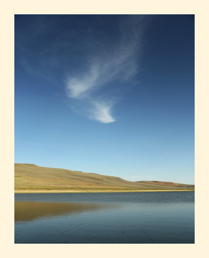
I was fascinated with this cloud when I first saw it last week. I waited for it to drift towards the horizon for the shot I had in mind. This is Oregon's Mann Lake on the east side of the Steen Mountains. This is a bit new for me so I'm interested in feedback.

Canon 6D, 24-105@32mm, ISO 100, F8.0, 1/60 sec, tripod, CPL, 2 sec self timer

Comments

15 comments
Comment posted by Doug Koepsel on June 5, 2016 at 3:59 PM
I like the simplicity of this.  Aside from a few dark things floating in the water bottom right, no nits.
Registered on April 1, 2010, 196 Posts, 1592 Comments
Comment posted by Dan Kearl on June 5, 2016 at 7:29 PM
A cool minimalist scene and nice even light. I think you need a bit more of a cloud for it to work better...
Registered on September 2, 2013, 209 Posts, 1514 Comments
Comment posted by Dave Dillemuth on June 5, 2016 at 8:41 PM
I really like this - a very beautiful, simple composition. I agree with Doug on cloning out those dark spots floating in the water.
Registered on December 10, 2015, 104 Posts, 1112 Comments
Comment posted by gary phillips on June 5, 2016 at 11:16 PM
I like this, Igor. Around here they call them spirit clouds.  Your minimalist approach is very appealing to me.  It has that lonely empty country feel that works well.  If it were mine, I would convert it to mono, and really give that cloud a bit more prominence without overpowering the image. I would also clone the back bits.  
.
Registered on October 24, 2013, 185 Posts, 4136 Comments
Comment posted by Harley Goldman on June 6, 2016 at 10:20 AM
I am very much enjoying the simplicity, which works very well. My first thought was exploring a conversion to B&W and see how that works compared to the color. It may well take the simplicity a step further?
Registered on November 19, 2003, 586 Posts, 11271 Comments
Comment posted by Igor Doncov on June 6, 2016 at 10:36 AM
The B&W version suggested. I darkened the sky still further to make the cloud more noticeable.
Registered on November 22, 2014, 189 Posts, 2733 Comments
Comment posted by Igor Doncov on June 6, 2016 at 10:37 AM
Since I darkened the sky for the B&W version I thought I would show the same in color. The cloud is more prominent but the sky is starting to look unrealistic, to me.
Registered on November 22, 2014, 189 Posts, 2733 Comments
Comment posted by Harley Goldman on June 6, 2016 at 10:43 AM
Count me in for the B&W version. 
Registered on November 19, 2003, 586 Posts, 11271 Comments
Comment posted by gary phillips on June 6, 2016 at 11:55 AM
Yep count me in on the conversion.  I think there are some tones in the color that could be massaged out in the mono, particularly in  the shoreline and far hills.  I like what your seeing.
Registered on October 24, 2013, 185 Posts, 4136 Comments
Comment posted by Marylynne Diggs on June 6, 2016 at 12:43 PM
My first thought at the thumbnail was b/w conversion, but for me there is something lacking in the b/w.  I think the reflection of the hill needs to be darker or lighter (and the hill itself as well) to get a better separation from the water.  The color contrast of earthtone and blue work in the color, and we lose that contrast when it goes b/w.

Regardless, this is a nice, simple image, and it's well worth tinkering some more.
ML
Registered on December 14, 2010, 122 Posts, 1034 Comments
Comment posted by Igor Doncov on June 6, 2016 at 5:20 PM
You're right Marylynne. The image was constructed for color and just converted to B&W. The land was actually brighter but toned down in order not to clash with the cloud. Same with the water. The B&W needs to be reworked but a rework would be dramatic and that's not what I'm after. This is supposed to have a surrealistic sense to it. 
Registered on November 22, 2014, 189 Posts, 2733 Comments
Comment posted by Ian Wolfenden on June 8, 2016 at 10:36 AM
I would stick with the first version ( the b&w does not have the contrast in the fg, which looks a little flat there to me ).  In the colour version the variety of pale tones in the water and ground are delightful and the image as a whole is beautifully simple and yet evocative.
Registered on May 18, 2007, 1108 Posts, 7647 Comments
Comment posted by Tom Falley on June 8, 2016 at 1:34 PM
A great minimalist vision. What do you see in the clouds?  Been through that country a number of times. Much like the Arctic Tundra in there is  near and far and not much in between. The horizon feels tilted, but I realize that the shore recedes into the distance. 

Cheers:   Tom
Registered on November 21, 2014, 189 Posts, 454 Comments
Comment posted by Igor Doncov on June 8, 2016 at 3:58 PM
I see the delicate graceful beauty of a bride's wedding veil. And I like it offset by a simple stark landscape. 
Registered on November 22, 2014, 189 Posts, 2733 Comments
Comment posted by Nick Bristol on June 9, 2016 at 11:08 AM
Igor, Really nice work on this and I'm enjoying it very much. It does have a wonderfully simple feel that is very effective here, and by simple I mean in looks and calming feel...not that it was easy to do. It took a good eye to see and then a perfect composition to make it work. The original color post is by far the best here for my taste. For me the b&w conversion looses so much of the wonderful tones that help make this quite special. Excellent work! Nick
Registered on February 1, 2004, 752 Posts, 14140 Comments