Nature Photographers Network
This is the preserved archive of the original Nature Photographers Network. The community continues at naturephotographers.network.
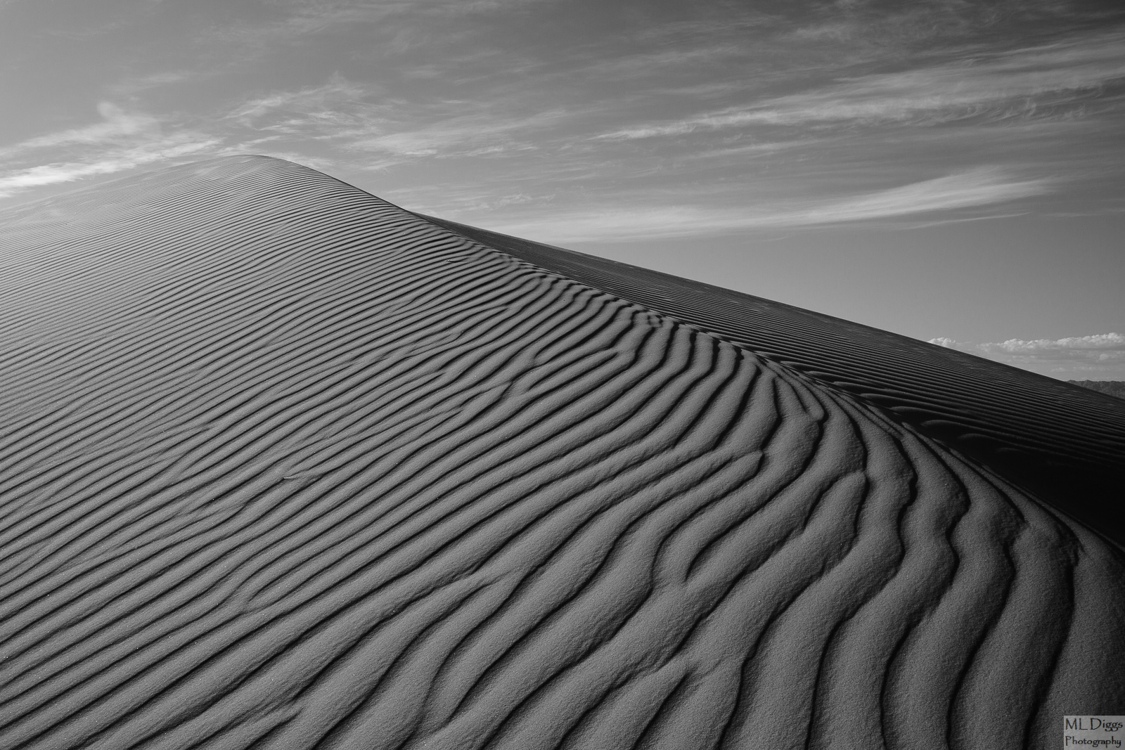
Repo of Algodones Dunescape #3
‹ PreviousLandscape GalleryNext ›

Repo of Algodones Dunescape #3

by Marylynne Diggs

Gallery: LandscapePosted May 24, 20162,013 views17 comments
Thanks for the feedback on my previous Algodone Dunescapes (one was posted in M&N because of footprints).  In this one, I wanted to try black and white.  I did this in part because of some moire pattern at the top of the dune, but I also just wanted to focus on light and shadow and texture.  I'll share the color version if folks like.

5DM3 with 24-105mm at 24mm
ISO 125, f/11, 1/320s
Processed in LR only

As usual, I'm interested in feedback of all kinds, including suggestions for cropping, processing, and my personal favorite, honest expressions of lack of interest.

 

Comments

17 comments
Comment posted by gary phillips on May 25, 2016 at 12:21 AM
This is another very nice dune image, Marylynne.  I love the texture of the sand and , of course, I think b/w is the right choice for the image.  I have a couple of suggestions.  First there are some bright spots in the sand top left.  Secondly, I think I would burn the top of the dune a little to give it some definition against the sky.  Thirdly, I would crop from the right to remove the ridge line in the background so that only the dune remains.  If you did none of these things it is still works really well.
Registered on October 24, 2013, 185 Posts, 4136 Comments
Comment posted by Igor Doncov on May 25, 2016 at 1:32 AM
Nice work, Marilynne. I wouldn't crop anything here. The overall design is good. If anything I would darken the sky in the left side of the image to get tonal separation from the sunlit side of the dune which has almost the same tonal value in that area as the sky. I think you have a very good sky to go with this dune because that cloud streak duplicate the lines on the dune but in a subtler manner.
Registered on November 22, 2014, 189 Posts, 2733 Comments
Comment posted by Paul Breitkreuz on May 25, 2016 at 9:11 AM
Marylynne, I really like this image a lot. Although I agree about the brightness in the upper left area and the thoughts for adjustment there, I also find it excellent as being presented here. Technically maybe not right in away, but I was actually drawn to the image by the bit of uniqueness and the lack of definition in that transition area. The sand patterns or blowing sand there almost adds to a view of blending with the small cloud cover in that area. With that said I'm sure it would not have the same presentation or look in color.
The sand tier with the dune patterns along with the angle of view is perfect IMO........laugh
Registered on February 25, 2006, 525 Posts, 8448 Comments
Comment posted by scott lanz on May 25, 2016 at 9:53 AM
Excellent, Marylynne. I love the way the dune transcends to the sky. My thoughts on the far end of the dune are similar to Paul's. I like the way the dune blends into the clouds/sky. Makes it looks more like the dune goes to the sky, like a stairway to the heavens, if you know what I mean. So, I like it just as is, but that's not to say I would not not change my mind if I saw a version with that area processed differently.  
Registered on November 14, 2003, 840 Posts, 12902 Comments
Comment posted by Dave Dillemuth on May 25, 2016 at 11:18 AM
Beautiful image, Marylynne. B&W rendering works great to bring out the line and textures. I agree with the comments to try to coax out a bit more tonal separation between the sky and the dune in the top left.
Registered on December 10, 2015, 104 Posts, 1112 Comments
Comment posted by Richard Teller on May 25, 2016 at 11:31 AM
This has a very nice abstract look to it. I think Garry gave some good observations, but as he said this is a fine image just the way it is. 
Registered on August 23, 2010, 1162 Posts, 6692 Comments
Comment posted by Roel Wijtmans on May 25, 2016 at 11:37 AM
Another beautiful dune photo! The patterns are mesmerizing, I really like them. A nice detail is how the cloud in the ulc seems to follow the line of the dune as well.
Registered on September 30, 2012, 116 Posts, 2257 Comments
Comment posted by Reno DiTullio on May 25, 2016 at 12:06 PM
I like it just the way it is, Marylynne, excellent bw treatment and the "stair-step" sand ripples really accentuate the beauty of this dune.  Well done.
Registered on November 14, 2003, 130 Posts, 1644 Comments
Comment posted by Harley Goldman on May 25, 2016 at 1:13 PM
A real nice dune image. I would be inclined to concur with Gary's suggestions, but like he said, it works great as is. 
Registered on November 19, 2003, 586 Posts, 11271 Comments
Comment posted by Mark Seaver on May 25, 2016 at 4:30 PM
A wonderfully inviting look at the texture in this dune, Marylynne.  For me, the touch of land at the right edge adds a sense of place that I like.  I'm enjoying the challenge of separating the dune tip from the sky and the fact that it looks almost like the sky is reflecting in the dune near the top.  I do wonder how processing for some extra contrast near the dune's top would look.
Registered on January 23, 2011, 1103 Posts, 17270 Comments
Comment posted by D.A. Edwards on May 25, 2016 at 5:49 PM
Sweet image, Marylynne. I can see both ways of interpreting the ULC as working so might as go with this one! I like the lines on the shaded side of the dune, too. This would work well in this week's WC.
Registered on October 8, 2014, 226 Posts, 1187 Comments
Comment posted by Marylynne Diggs on May 25, 2016 at 7:10 PM
Thanks, everyone.  I'll get rid of those bright spots.  Man, I already go rid of a dozen or so.  I suppose shooting at night would get rid of those pesky reflections off the sand. 

I'll play with the ULC and share later today for comparison, along with the color version (which has color separation where tonal sep is missing).  I'm still seeing things primarly in black and white, but I'm open to rating the color version as a keeper if people prefer it.
ML
Registered on December 14, 2010, 122 Posts, 1034 Comments
Comment posted by Marylynne Diggs on May 25, 2016 at 7:53 PM
Here is another rendition of the image with a few more grains of reflective sand removed and with the ULC burned down a bit.  In doing that, I noticed an odd shape in the cloud that I didn't care for (ah, playing god is fun), so I evened that out a bit. 

Let me know if you prefer this one.  I think it is an improvement, so I am, once again, eternally grateful for all of your feedback.  I did the burn after the spec removal, so I can easily dial that back in LR if necessary.

I will also post below the color version and a vertical crop, in which the edge of dune is more separated, but the reflective specs way more numerous and the cool shadow at left reduced to near nothingness.

Thanks again! 

Oh, and Mark: I have never really done a weekly challenge. Maybe it's me, but it's hard to find the prompt since it isn't built into the threads.  Nonetheless, I will be visiting that area more often now. 
ML
Registered on December 14, 2010, 122 Posts, 1034 Comments
Comment posted by Marylynne Diggs on May 25, 2016 at 7:54 PM
Here is the color version, processed a bit, but only before converting to b/w.  The moire at the top of the dune, which becomes reflection in b/w, just looks like a chromatic aberration of sorts in the color version (at least to me).  In my experience, trying to handle that with hue and saturation changes doesn't help much.
Registered on December 14, 2010, 122 Posts, 1034 Comments
Comment posted by Marylynne Diggs on May 25, 2016 at 7:57 PM
And here is the vertical aspect.  I loved the shadow at left on the horizontal capture too much to get excited about this one, despite the better sky/dune separation. 
Registered on December 14, 2010, 122 Posts, 1034 Comments
Comment posted by Sairam Sundaresan on May 27, 2016 at 2:45 PM
Lovely dunescape! The patterns really stand out in B&W. no nits :)
Registered on March 14, 2013, 100 Posts, 643 Comments
Comment posted by Bill Leggett on May 28, 2016 at 3:30 PM
Very dramatic comp, Marylynne.  After reading some comments on processing, I tend to agree about lack of definition between the dune and sky ULC.  As to comp and lighting I think you have it here with the strong lead-in perspective of the ripples.  The color version is better to delineate the transition of dune and sky better, but the B&W is still very strong.  This gets me interested to study methods of B&W conversion.
Registered on July 21, 2004, 706 Posts, 3233 Comments