Nature Photographers Network
This is the preserved archive of the original Nature Photographers Network. The community continues at naturephotographers.network.
Leaves and Things +RP
‹ PreviousLandscape GalleryNext ›

Leaves and Things +RP

by Lon Overacker

Gallery: LandscapePosted May 3, 2016300 views20 comments
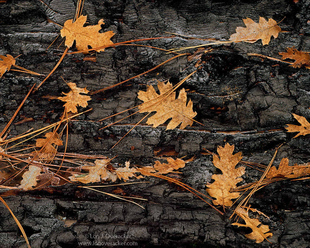
Another struggle for a title.  Was going to call it "Leaves, Needles, Char and Frost" but it was too long... ;-)

A leftover from my last outings with the 4x5, January of last year.  This is a found scene - at least I don't remember adding, removing any leaves, needles etc.  But then again, I have a poor memory. ;-)

Simple and straight forward.  I was attracted to and wanted to include the little bits of frost. It because just a matter of framing and choosing the best grouping of "things."

Would love the hear your thoughts, critiques and suggestions on this.

I gotta say, there are a whole bunch of outstanding images posted recently and I'm feeling a bit jealous.  Great work folks!

Lon

Comments

20 comments
Comment posted by Dave Dillemuth on May 3, 2016 at 8:27 PM
This is really outstanding, Lon. The details, right down to the frost tipped leaves in the large version are gorgeous. Processing looks spot-on and I like the warm rendering. Frankly, hard to come up with any suggestions. I'm sure this would make a lovely over-sized print. If you have amnesia and did place these elements - very nice job arranging sad
Registered on December 10, 2015, 104 Posts, 1112 Comments
Comment posted by Wayne Jones on May 3, 2016 at 9:22 PM
Oh Man, this is just the perfect way to frame it;  not too close, not too far, not too nothin'
It took some special seeing to know the frost would show up well
My only complaint is that the large version is not big enough, but neither is my monitor.
Registered on April 18, 2007, 953 Posts, 6435 Comments
Comment posted by Marylynne Diggs on May 3, 2016 at 11:12 PM
I love this, Lon.  It's a perfect little forest ecosystem...diverse trees, fire, seasons...it is almost abstract and yet a wide enough view to be emblematic. I can ger lost in the big version, following the leaves along the curves of the charred wood.  Nice work.

ML
Registered on December 14, 2010, 122 Posts, 1034 Comments
Comment posted by Sairam Sundaresan on May 4, 2016 at 4:05 AM
The large image is a visual treat, Lon. Lovely color contrasts. Pretty tough to come up with any improvements :)
Registered on March 14, 2013, 100 Posts, 643 Comments
Comment posted by Igor Doncov on May 4, 2016 at 9:40 AM
This is a very nice image, Lon. The warm leaves on a dark background around the frame provide a very pleasing sense to the viewer. I can't come up with any good suggestions. Would darkening the bark make the leaves 'pop' more? Probably, but you've undoubtedly tried that and decided that this is the amount of pop you wanted. Although it may make us aware of the frost more because it's not very prominent. I'm looking for a crop that could make the image stronger and can't find it. The upper right 2/3rds seem to be the most interesting aspect of the image but no crops work well with it. The texture of the burnt wood is really fascinating.
Registered on November 22, 2014, 189 Posts, 2733 Comments
Comment posted by Harley Goldman on May 4, 2016 at 9:56 AM
Real nice, Lon.  I might consider cloning the bit of red on the top, right and left sides and maybe even the needles leading out of the frame along the top? Ah, the old 4x5.
Registered on November 19, 2003, 586 Posts, 11271 Comments
Comment posted by Roel Wijtmans on May 4, 2016 at 10:13 AM
Nice choice including the frost. I really love frost on charred trees which often accentuates the shapes of the wood, so I'm with you on that choice! The brown and black looks great, and my only suggestion would be to crop out the two needles entering the frame in the ulc.
Registered on September 30, 2012, 116 Posts, 2257 Comments
Comment posted by Lon Overacker on May 4, 2016 at 12:47 PM
Thanks for the comments and feedback!  I didn't expect this to get as good a reception - or else I would have posted this months ago! ;-)

Great catch on the needles along the top guys!  Shame on me, Mr. Border Patrol!  I decided there was room to crop slightly rather than to clone.  I've also made some tweaks,  including reduced saturation and Darks color/hue and I've attempted to accentuate the frost and darken the char. Not very sophisticated adjustments, just painting with some luminosity layers.

I'm hoping this is an improvement.  Thanks!  Oh, also a slightly larger repost.
Registered on November 24, 2006, 521 Posts, 19147 Comments
Comment posted by Igor Doncov on May 4, 2016 at 1:31 PM
How about a crop like this? Better? Worse? or just different?
Registered on November 22, 2014, 189 Posts, 2733 Comments
Comment posted by Lon Overacker on May 4, 2016 at 1:42 PM
Thanks Igor.  I think a valid crop. Can't say better or worse. I often clarify my suggestions as "alternative."  Most of our images have many possibilities.  Your crop works for me. ;-)

Did you have an opinion on the repost?  Thanks!
Registered on November 24, 2006, 521 Posts, 19147 Comments
Comment posted by Igor Doncov on May 4, 2016 at 4:40 PM
Sure. I think it's an improvement because it's simpler (perhaps too simple) and because it lets the wood be part of the design rather than a background. By that I mean the horizontal line and the knothole. Besides, it appears to be the heart of the image. 

Having said aid that I often find the heart of the matter in all my subjects and zone in on it during a composition. As an afterthought I will take and image that includes more of the 'environment'. And at home I recognize that the wider in scope image is better. This has occurred so frequently now I make it a practice to take that second shot for later consideration. The above 2 images are like that. Does the additional matter improve the image? I'm not sure. I wouldn't have done it that way and that's why I posted how I would have handled it. It's just a different approach, is all.

BTW, if it's unethical to use images rather than words when making suggestions, please let me know and I will cease. People did it with my images and I didn't find it helpful. Primarily because they post what's already been considered. But you can be much more specific with a crop through an image than with words.  
Registered on November 22, 2014, 189 Posts, 2733 Comments
Comment posted by Marylynne Diggs on May 4, 2016 at 6:01 PM
The darker char and lighter frost on the repost work for me, Lon.  In the large version, that doesn't feel necessary.  I like Igor's crop too, although I would be inclined to either go further (almost square) or keep the original crop.  For me, the cut off leaves are a distraction (more so than cut off needles).
ML
Registered on December 14, 2010, 122 Posts, 1034 Comments
Comment posted by John Williams on May 4, 2016 at 11:03 PM
Of the different selections, I prefer your repost Lon. This is an eye-catching combination of elements. Busy, but in a good way.
Registered on September 6, 2007, 221 Posts, 5985 Comments
Comment posted by Reno DiTullio on May 5, 2016 at 1:13 AM
Frankly, Lon, I like the original post with Harley's suggestions.  The original colors of the leaves and needles is the draw for me, the rich "fall" colors against the stark burnt log, excellent work.
Registered on November 14, 2003, 130 Posts, 1644 Comments
Comment posted by Roel Wijtmans on May 5, 2016 at 3:15 AM
Haha, Border Patrol, I might just steal that term from you, Lon! The difference is small, but your processing in the repo is better with the slightly stronger contrast. Igor's crop is nice too, but feels a bit too tight for me.
Registered on September 30, 2012, 116 Posts, 2257 Comments
Comment posted by David Schoen on May 5, 2016 at 12:24 PM
I'm with Rene on this one, meaning the first repost seems to work best for me for the same reasons.  A lot to explore here.  Wonderful rich color and texture.  A winner.
Registered on November 6, 2006, 1213 Posts, 4587 Comments
Comment posted by Preston Birdwell on May 5, 2016 at 6:20 PM
While I like your repost, Lon. I prefer the original image's crop, color and tonality. The composition is really nice when coupled with Harley's suggestion for 'border patrol'.

One thing I want to mention for the benefit of everyone is that it is considered poor form to copy and repost an image without permission from the OP. Here's an excerpt from the NPN Posting Guidelines.

If you wish to rework a fellow member's photo, here is the procedure we suggest;

  1. Contact the member who posted the photo and ask them to email the photo to you. This will absolutely prove that the member voluntarily sent the photo to you, and that it was not copied without their permission.
  2. After you have reworked the photo, email it back to member who posted it with detailed notes on what you did to adjust the photo. They will then have the right to determine if they want the modified photo appearing as a repost.
 --P
Registered on November 1, 2003, 471 Posts, 5188 Comments
Comment posted by Dave Dillemuth on May 5, 2016 at 9:59 PM
Lon,
I prefer the original processing/crop with the border cloning.
Registered on December 10, 2015, 104 Posts, 1112 Comments
Comment posted by gary phillips on May 6, 2016 at 12:48 AM
I really like the repost, Lon.  Quite a collection of tones, textures, and color.  I don't think the crop works nearly as well for me.  The detail provided by the 4x5 is astounding.
Registered on October 24, 2013, 185 Posts, 4136 Comments
Comment posted by Ed Lowe on May 7, 2016 at 10:59 PM
This is another vote for the original post with Harley's clone suggestions, Lon. As you mentioned this is simple and straight forward, but there are so many wonderful details and textures to enjoy and savor in the large version. Outstanding image.

Ed
Registered on February 7, 2004, 414 Posts, 7115 Comments