Nature Photographers Network
This is the preserved archive of the original Nature Photographers Network. The community continues at naturephotographers.network.
Repost + Ice Torpedo
‹ PreviousLandscape GalleryNext ›

Repost + Ice Torpedo

by Sairam Sundaresan

Gallery: LandscapePosted April 28, 2016161 views14 comments
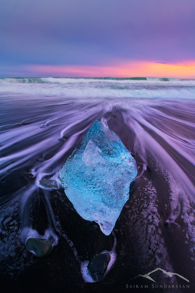
One of the craziest sites (although oft shot) locations I got the chance to visit was the famous beach at Jokulsarlon. On this evening, the clouds blocked out almost all of the light barring a small patch on the horizon. I was really attracted by this solitary Iceberg that seemed to lead the eye into the the distant light. 

This is a single shot, taken with the Sony a7r ii and the Canon 16-35 mm lens via the Metabones adapter. 

Appreciate any thoughts you have on this :)

Comments

14 comments
Comment posted by Dave Dillemuth on April 28, 2016 at 5:20 PM
Stunning image. The returning surf makes for some great leading lines. SS speed selection working well to create the surf lines but also to retain the wave action in the background. I'm not on a calibrated LT right now so difficult to judge but I might be tempted to back off a bit on the magenta cast in the foreground. Beautiful as presented but I think I would also play with cropping a bit off the top to place more emphasis on the strong foreground elements.
Registered on December 10, 2015, 104 Posts, 1112 Comments
Comment posted by Nick Bristol on April 28, 2016 at 6:59 PM
This is a very cool shot. Really an interesting composition that draws one right into the scene and towards the light. Great use of shutter speed creating such wonderful flowing lines from the receding surf. The magenta does look a little strong on my monitor but it sure is a wonderful image. I love the blue in the iceberg and how it contrast.

Nick Bristol
Lone Rock, WI
Registered on February 1, 2004, 752 Posts, 14140 Comments
Comment posted by Marylynne Diggs on April 28, 2016 at 7:10 PM
Very nicely seen and shot, Sairam. The large image is stunning...kind of  3-D.  I'm torn about the color treatment.  I like it, but it does  feel unrealistic.  The question is what you were going for with it.
ML
Registered on December 14, 2010, 122 Posts, 1034 Comments
Comment posted by Igor Doncov on April 28, 2016 at 8:43 PM
Interesting interpretation of the natural world. The ice looks like a gemstone. Very creative. If it were mine I would crop some of the purple sky off, even though it provides a very good balance with the purple sand. That crop should create a wider image which should accentuate the lines of perspective from the sides to the center. I don't know. Just try it and see if you like it.
Registered on November 22, 2014, 189 Posts, 2733 Comments
Comment posted by Kah Kit Yoong on April 28, 2016 at 9:08 PM
Beautiful composition and exposure. I like everything about this except for the colour treatment, in particular the magentas in the foreground seem very strong.
Registered on September 27, 2006, 636 Posts, 10682 Comments
Comment posted by Sairam Sundaresan on April 28, 2016 at 11:49 PM
Here's a repost with less Magenta on the foreground, and a slight crop on the top. Better ? :)
Registered on March 14, 2013, 100 Posts, 643 Comments
Comment posted by Vance Gese on April 29, 2016 at 12:05 AM
Like a blue diamond in a beautiful setting.  Your centered composition works very well.  The magentas and reds in the foreground surf seem a bit strong, better in th repost.  Your repost also has more impact with the crop placing more emphasize on the ice.  Really an outstanding image.
Registered on November 13, 2008, 298 Posts, 6629 Comments
Comment posted by gary phillips on April 29, 2016 at 1:05 AM
Outstanding, Sairam.  Love it.  The repost looks even better.  Igor it on head, Gemstone, set in and exquisite setting. The colors are crazy but I like them.  Really well done.
Registered on October 24, 2013, 185 Posts, 4136 Comments
Comment posted by Harry Lichtman on April 29, 2016 at 9:33 AM
Beautiful line in this -the magenta cast in the water is way too strong for me - might try to match it more closely with the surf.  I think the contrast with the dark beach would still make it pop, just in a more natural way.  This is one cool beach!
Registered on September 17, 2010, 304 Posts, 3507 Comments
Comment posted by Navin Sarma on April 29, 2016 at 10:58 AM
This is an awesome comp and shot Sairam! The foreground is unique and love the rushing water back to the sea. I would try a little selective color to turn the magentas warmer. I think that will give you better color congurency with the teals and oranges in the background. The magentas, even in the repost, seem a bit out of place to my eye. 
Registered on July 17, 2011, 233 Posts, 1373 Comments
Comment posted by Roel Wijtmans on April 29, 2016 at 11:22 AM
Comp is excellent (esp the repo), but the colors aren't working for me, even in the repo. The magentas in the sky and especially the foreground are too strong. They do not match with the blue of the ice. I think the fantastic blue of the ice should be the main point of attention, so I could see the satureation in both the water and the sky a lot less.
Registered on September 30, 2012, 116 Posts, 2257 Comments
Comment posted by Lon Overacker on April 29, 2016 at 5:32 PM
Sairam,

While most here have seen a lot of these ice images... it doesn't take away from the natural beauty of the phenomena, the setting AND getting to see different visions and interpretations from photographers.  This is an outstanding capture and composition especially with the receding waves and the timing of the sky.

I would agree though with the others about the purple/magenta.  It's a bit beyond reality for me. Bold and beautiful colors... but  The disconnect with that, for me anyway, is that the surf line is more nuetral/white with the blues/greens and so I don't see how the water rushing back down the sand would be purple?

The repost is an improvement (also the top crop) and now I can actually draw a relationship between the color in the sky to the color on the beach, so it's looking a little more believable.

Lon
Registered on November 24, 2006, 521 Posts, 19147 Comments
Comment posted by Marylynne Diggs on April 30, 2016 at 12:22 AM
Hi Sairam,
I like the repost a lot better, and I have fewer conflicts about the color processing.  I can imagine still more off the top, but that's just me.  The sky color and water color hold this together nicely, so I wouldn't remove too much more off the top.
ML
Registered on December 14, 2010, 122 Posts, 1034 Comments
Comment posted by Sairam Sundaresan on April 30, 2016 at 2:45 AM
I started a new thread here : http://www.naturephotographers.net/imagecritique/ic.cgi?a=vp&pr=235417&CGISESSID=1fc301dd761c65af16331b57030ba336&u=28662&title_action=

Thanks for the feedback folks 
Registered on March 14, 2013, 100 Posts, 643 Comments