Nature Photographers Network
This is the preserved archive of the original Nature Photographers Network. The community continues at naturephotographers.network.
More Josh Tree Rock + Repost
‹ PreviousLandscape GalleryNext ›

More Josh Tree Rock + Repost

by Marylynne Diggs

Gallery: LandscapePosted April 27, 20161,842 views8 comments
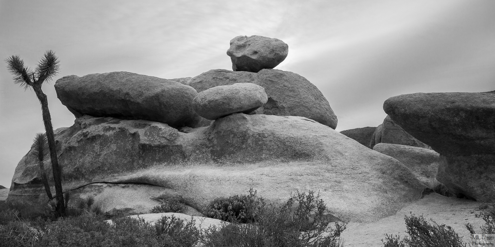
Here is another (the penultimate, I think) image of rocks from Joshua Tree National Park.  This one, like the two previous ones, was taken on a windy morning with weather changing quickly.  Skies were not so much dramatic as smeared with fast moving clouds.  I have a comp of this without the tree, but the rocks overlap more and are less distinct.  Nonetheless, if this one seems directionless, I'll share the other.

Canon 5d3 with 24-105mm at 24
ISO 160, f/16, 1/40s
BW conversion in LR

Comments

8 comments
Comment posted by Jim Hansen on April 28, 2016 at 12:02 AM
I suspect this is best in black and white as you have presented it, due mostly to the lack of interest in the sky.  I really like this composition and the processing looks really good.  I  can't help but feel it could use more on the bottom, but perhaps that area was not included for some good reasons.  I think it could use a little more brightness and contrast, as it seems a bit flat.  Overall, very nice image.
Registered on May 5, 2011, 161 Posts, 908 Comments
Comment posted by Igor Doncov on April 28, 2016 at 12:07 AM
Interesting composition. I like this one more than your other one. It's the shapes of those rocks. They look so alien somehow. Like something out of a Star Trek episode. The almost panoramic presentation seems to further elongate them and make them still stranger. And the small Joshua tree on the left really works well as a contrast to all that smoothness. I don't like that brush in the front but what can you do. The sky actually works well with your motif because it too has an other world glow to it. Nice job, Marilyn. Maybe a bit more sharpness to the rock surface could add some more texture.
Registered on November 22, 2014, 189 Posts, 2733 Comments
Comment posted by Nick Bristol on April 28, 2016 at 2:31 PM
Very nice b&w image, Marylynne. Quite interesting to look at and I like the comp you came up with here. I think your processing looks very good and could only suggest a bit more sharpness in the rocks as Igor mentioned. I also agree the sky works great with this image. Nice work on this!

Nick Bristol
Lone Rock, WI
Registered on February 1, 2004, 752 Posts, 14140 Comments
Comment posted by Vance Gese on April 28, 2016 at 9:50 PM
Really like this one, Marylynne, with the focus more on the rocks with fewer distracting bushes and such.  Lovely tones in the rock.  The semi-panoramic format works very well emphasizing the forms of this fascinating rock.
Registered on November 13, 2008, 298 Posts, 6629 Comments
Comment posted by gary phillips on April 29, 2016 at 1:19 AM
My first reaction was that the tree on the left needed a bit more breathing room, but there is some tension between it and the darker rock on the right.  It has grown on me and I like the lower contrast and apparent smoothness of the rock surfaces. I do like the glow in the sky.  Overall, a very nice image.
Registered on October 24, 2013, 185 Posts, 4136 Comments
Comment posted by Roel Wijtmans on April 29, 2016 at 11:12 AM
I like the balancing rocks and the overall comp a lot, but I feel there is a bit too much of the dark rock to the right. I think I would crop a bit from the right (but not completely remove that rock!). I feel that in some way that would make that rock look a bit more "abstract", which I feel would make it blend in better with the rest.
Registered on September 30, 2012, 116 Posts, 2257 Comments
Comment posted by Lon Overacker on April 29, 2016 at 3:22 PM
Marylynne,

I find this much more interesting and even compelling than the previous image.  The narrow format echoes many of the longer shapes in the rock.  And even though the tree on the left is a little tight, I really like the dynamics and tension that is created between all the elements.  And again, the b&w removes any issues with color.  There is enough interest and detail in the sky to be supportive, but with your comp/crop, the sky is the primary feature, so it works.

I like this a lot and can't think of much to suggest.  I think the only thing would be to play around with mid-tone contrast, or contrast in general.

Lon
 
Registered on November 24, 2006, 521 Posts, 19147 Comments
Comment posted by Marylynne Diggs on April 30, 2016 at 12:14 AM
Thanks for the feedback, everyone.  I really thrive on suggestions and depend on your second and third (and sixth) opinions.  Here is a version with a little more mid-tone contrast and a little less of the rock at right. The brush at the bottom is unavoidable now, I think. There is nothing that I'm hiding from below that brush (just more of it and patches of sand or rock), but I didn't think to move closer and change lenses, and cropping off the bottom cuts into the curve of the main, center rock. 

The tightness of the tree (close to the edge of frame) was something I tried to deal with in the field, but moving to the right made the two egg shaped rocks overlap and merge.  I have one without the tree at all, but it feels really static.

I have one more to come, and then I'll switch to some sand dunes from near the Salton Sea.

If cropping off some of the rock at right ruined something, let me know.  It gets rid of a lone branch of brush, which I think does reduce distraction on that side.
Registered on December 14, 2010, 122 Posts, 1034 Comments