Nature Photographers Network
This is the preserved archive of the original Nature Photographers Network. The community continues at naturephotographers.network.
Etched in Ice & BW Version
‹ PreviousLandscape GalleryNext ›

Etched in Ice & BW Version

by Harry Lichtman

Gallery: LandscapePosted April 1, 2016247 views15 comments
LARGER VERSION RECOMMENDED - I think even the Large suffers from reducing to under 500 kb with the fine detail

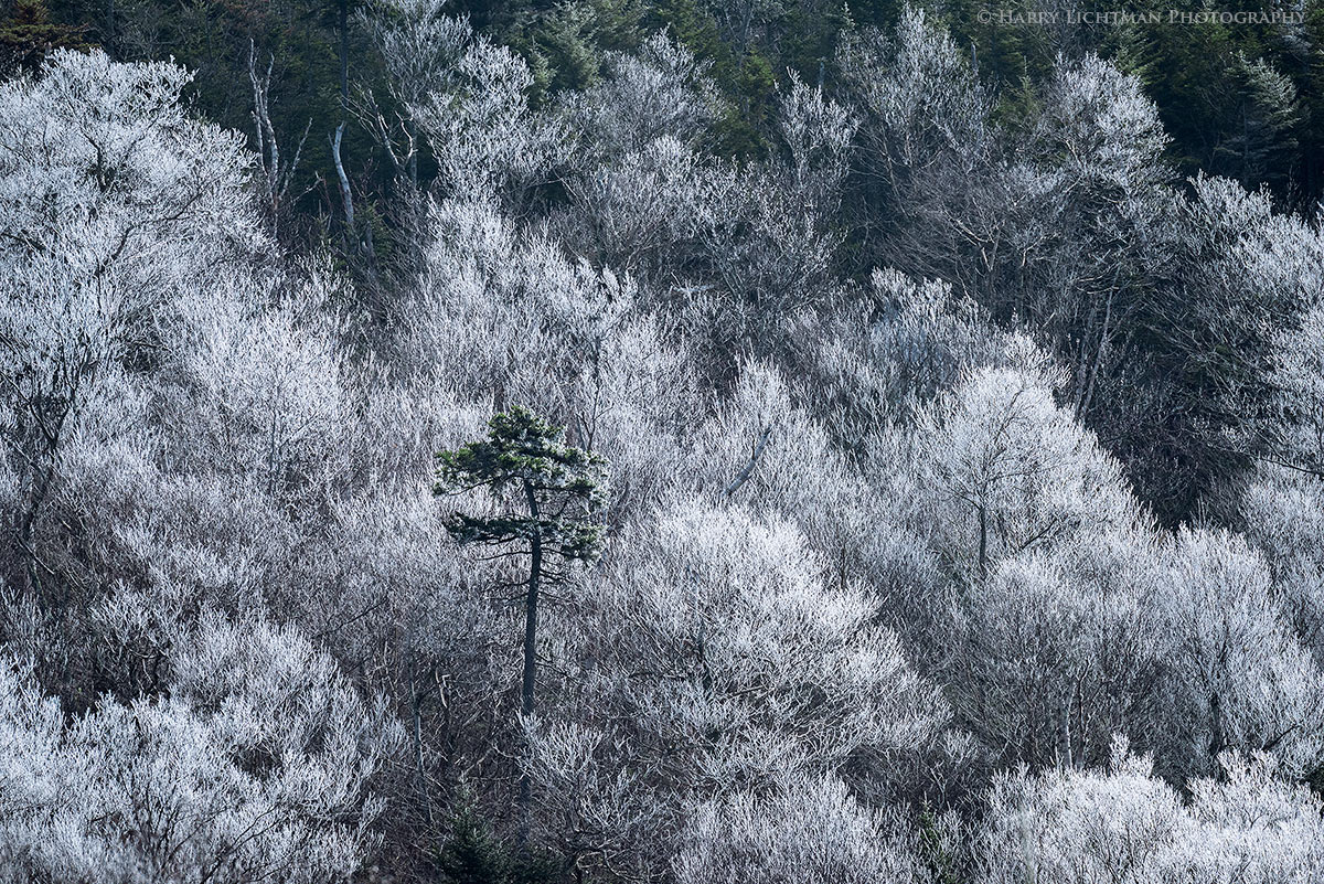
Another image from the same morning as my Previous Post. I currently prefer the color version vs the BW as it appears more surreal, as it did when I viewed the scene.  More like a color tinted photograph.  The hint of green in the single tree brings reality back into the view.  This was in Pinkham Notch, NH.  A thin band of freezing fog frosted the trees with rime in a relatively low band - you can see the upper edge near the top of the image where the frosting ends.  I was a bit constrained in my comps, even at 400 mm as nearby trees could easily obstruct this view.  I would have like to place the tree a little more off center, without the need to crop this down.  Also a slightly wider view would have allowed more of the frosted trees, but unfortunately nearer branches would start intruding into the frame.

D810, ISO 400,(windy conditions), 1/750 th sec., f8, Nikkor 80-400mm @ 400.

Comments

15 comments
Comment posted by Roel Wijtmans on April 1, 2016 at 10:37 AM
I can see your issues with the comp, but they do not bother me at all. I love this, with that lonely tree stciking out among the frosty ones. I agree with the green adding more to this photo, wouldn't go for B+W I think. Same goes for your previous post, where I prefer the color version.
Registered on September 30, 2012, 116 Posts, 2257 Comments
Comment posted by Harley Goldman on April 1, 2016 at 12:01 PM
I like this a lot. This one works real well in color. The green really looks good against the monochromatic trees. Real nice.
Registered on November 19, 2003, 586 Posts, 11271 Comments
Comment posted by gary phillips on April 1, 2016 at 1:14 PM
Pretty cool image, Harry.  I like the evergreen surrounded by the frosted trees.  I'm on an iPad and played a little with some crops.  I really liked this tightened up a bit more, eliminating the top dark green areas.  I think it further isolates the lone pine.  Nice work as always.
Registered on October 24, 2013, 185 Posts, 4136 Comments
Comment posted by Harry Lichtman on April 1, 2016 at 5:40 PM
I included a BW conversion that eliminates any distraction the green trees above the frost line might have created - and highlights in those areas actually appear as more rime ice possibly.  Anyway, just fun playing with the image.  Like everything, maybe this will appeal to some more than the original.

Right Clicking the image will make it much larger.
Registered on September 17, 2010, 304 Posts, 3507 Comments
Comment posted by Mark James Ford on April 2, 2016 at 12:51 AM
Hi Harry, great capture - well seen. I agree with Gary about tightening the crop to loose the green at the top - then I think the image will be very special.
Registered on January 16, 2015, 60 Posts, 430 Comments
Comment posted by Doug Koepsel on April 2, 2016 at 11:35 AM
Harry, I prefer the color version over the B&W as the green helps the pine stand out. I wonder if adding some more blue to the frost might be nice.
Edit to add that if the green along the top is a concern, maybe selectively decolor it rather than crop as i think those trees' darkness along the top of the image is a plus.
Registered on April 1, 2010, 196 Posts, 1592 Comments
Comment posted by Dave Dillemuth on April 2, 2016 at 9:14 PM
Harry,
This is very nice. The rime ice adds a wonderful graphic quality. I too prefer the color version which provides more separation for the evergreen. I also agree that cropping a slice off the top to minimize the dark trees improves the comp.
Registered on December 10, 2015, 104 Posts, 1112 Comments
Comment posted by Kah Kit Yoong on April 3, 2016 at 12:02 AM
The colour version for me. An amazingly effective landscape with terrific contrast and details.
Registered on September 27, 2006, 636 Posts, 10682 Comments
Comment posted by Basil Greber on April 3, 2016 at 11:31 AM
A nice view with the isolated green treetop among all the frosted ones. I personally prefer the color version due to the slight blue hue of the highlights, which conveys the frosty message even better.
Registered on November 8, 2005, 219 Posts, 1340 Comments
Comment posted by Aaron Feinberg on April 3, 2016 at 7:18 PM
Agree with your reason for the color over bw.  Color for sure here.  Very neat seen.  Good stuff!

aF
Registered on October 26, 2009, 399 Posts, 2789 Comments
Comment posted by Albert Darmo on April 4, 2016 at 10:23 AM
Hi  Harrycrying     Considering  the composition issues,  you did  very well.   and captured the   intricaterness  of  the  scene perfectly.  love  the color version  with it's  excellent  graphic detail 

Albert Darmo
Canada
Registered on November 25, 2008, 1386 Posts, 11978 Comments
Comment posted by Harry Lichtman on April 4, 2016 at 1:45 PM
Thanks for all of the feedback.
Doug - I do like your idea. It may be a way to keep the textures and boarder without the distracting color. Still mulling it over, still not sure what I will do with it.
Registered on September 17, 2010, 304 Posts, 3507 Comments
Comment posted by Jean C Cajolet on April 5, 2016 at 7:16 PM
Beautiful details, the composition is right on and the subtle green takes its place without disturbing the diamonds of the frosted trees. I saw that very often this winter with all the rain that we got and I never took the time to take out my camera, seeing that I regret it a lot. I love it. Bravo!
Registered on April 28, 2014, 53 Posts, 532 Comments
Comment posted by Nick Bristol on April 5, 2016 at 7:33 PM
Harry, I like this a lot. I think you did an excellent job capturing these conditions which I know is not easy to do. It also looks like you made the best possible comp with what you had and it works just fine. The b&w is quite nice but I do prefer the color.
Great shot!

Nick Bristol
Lone Rock, WI
Registered on February 1, 2004, 752 Posts, 14140 Comments
Comment posted by Peter Richter on April 13, 2016 at 2:45 PM
A wonderful composition, delicate textures for me, Harry. The subtle colors in your first version add a lot of interest to my eye.

Peter
Registered on November 10, 2010, 218 Posts, 2723 Comments