Nature Photographers Network
This is the preserved archive of the original Nature Photographers Network. The community continues at naturephotographers.network.
Shakin' it
‹ PreviousAvian GalleryNext ›

Shakin' it

by Jerry Marella

Gallery: AvianPosted March 4, 201665 views5 comments
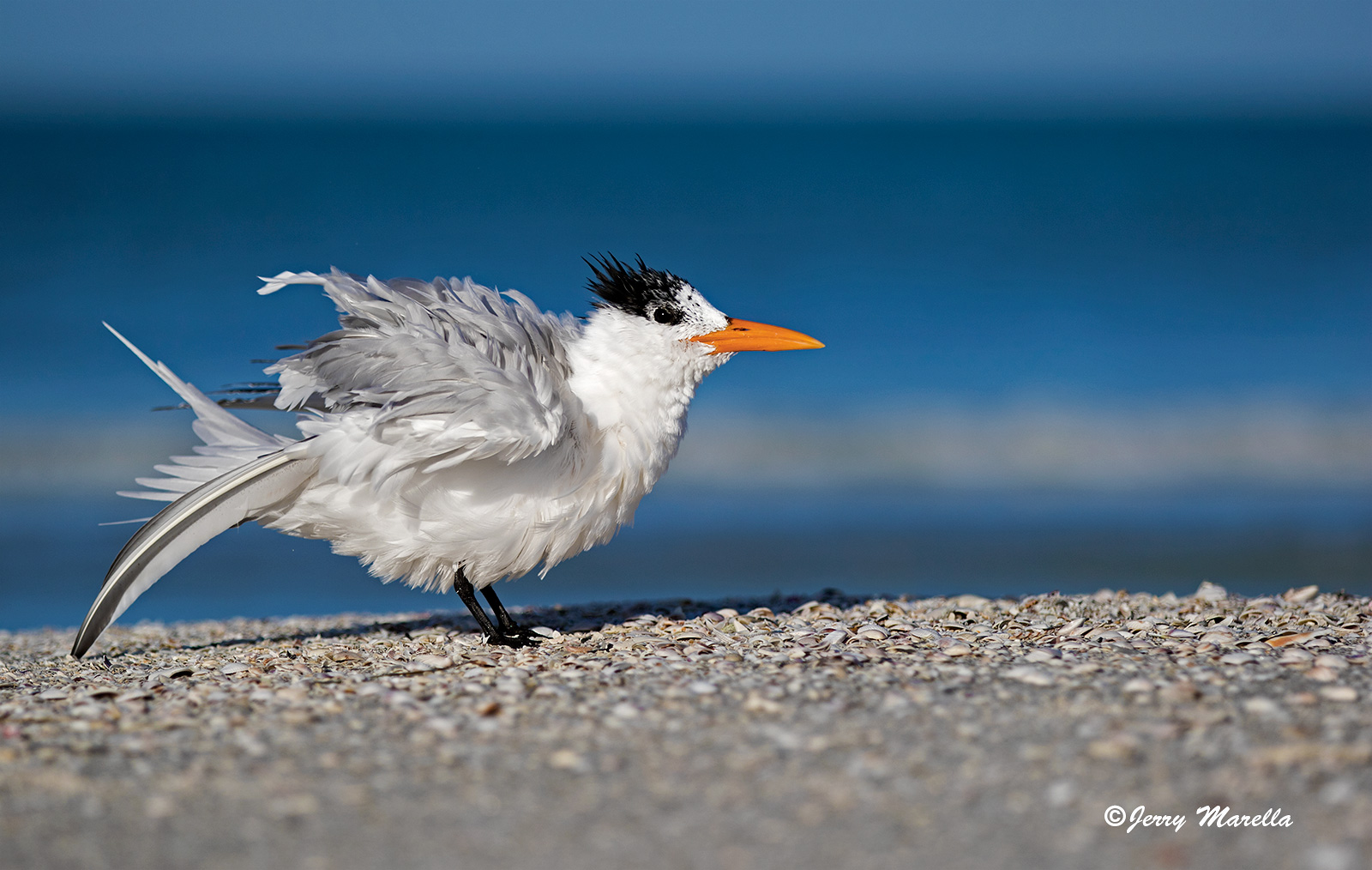
Morning photo of a Royal Tern shaking out whatever needed shaking.

I have several photos of the shaking action. I chose this one for the tail feather that looks like its about to pop out of the bird.  I would like to hear what you all think of the frame.  I cropped a little OOF sand off of the bottom and bit off of the back to give the photo a more proportional look.  Does it need more or less on the bottom?  There is a horizon line at the top.  Leave it in or take it out?  The frame is straight, but the slope of the sand isn't. I think that has to stay or things wouldn't look right. I pulled back the orange in the beak a little.  May need to pull that back a little more.

All comments and critiques are appreciated.  Thanks for all the constructive input on other images.

7D2, 70-200 @ 155, ISO 100, 1/6400 @ f2.8,

Comments

5 comments
Comment posted by Ed Williams on March 4, 2016 at 1:38 PM
Great action shot Jerry. Nice detail in the feathers especially considering the bright light on all of the bright whites. Well handled and nicely placed in the frame. I like.
Registered on December 28, 2010, 636 Posts, 3499 Comments
Comment posted by Steve Thompson on March 4, 2016 at 4:27 PM
Nice job on the whites Jerry. I like the low pov you captured and the Tern definitely looks a little roughed up. That lone tail feather really looks out of place, very cool. The orange beak looks fine on my monitor. Concerning the horizon line at the top; you could probably just darken it some so it matches darker tones better. It really doesn't bother me. I might lose some of the oof sand on the bottom and bring the right edge a little. Nice job!
Registered on August 7, 2014, 125 Posts, 2319 Comments
Comment posted by Dennis Plank on March 4, 2016 at 6:59 PM
Nice, Jerry.  If this were mine (and I wish it were), I'd probably crop a bit more from the bottom to deemphasize the oof gravel anb crop from the right proportionally.  The band at the top doesn't bother me.

devil
Registered on January 28, 2008, 1767 Posts, 23192 Comments
Comment posted by Alan Bryant on March 5, 2016 at 2:31 PM
Nice contrast colour and handling of the whites. A tad close to the left side of the frame IMO, but a crop on the bottom and the right would help that for comp. Nice angle and BG
Registered on March 31, 2006, 473 Posts, 1081 Comments
Comment posted by S Govindarajan on March 5, 2016 at 8:10 PM
Excellent colors and light, Jerry. I like the low angle and the tern is very sharp. I too feel taking a bit off the bottom will help this image become even better.
Registered on April 19, 2008, 115 Posts, 1921 Comments