Nature Photographers Network
This is the preserved archive of the original Nature Photographers Network. The community continues at naturephotographers.network.
Blue Oaks +alt version
‹ PreviousLandscape GalleryNext ›

Blue Oaks +alt version

by Lon Overacker

Gallery: LandscapePosted February 18, 2016199 views13 comments
Hey folks, thank you again for all your comments and suggestions on my previous image.

I'll never tire of Yosemite and have made three trips now since November.  Although I will say this. I will never visit the Valley again on New Year's weekend, after a snowfall! Families, kids, sleds, selfie sticks, Touron buses, double parking, lines, traffic... insanity.  Ahhhh, but get out in a meadow before sunrise..... peace.

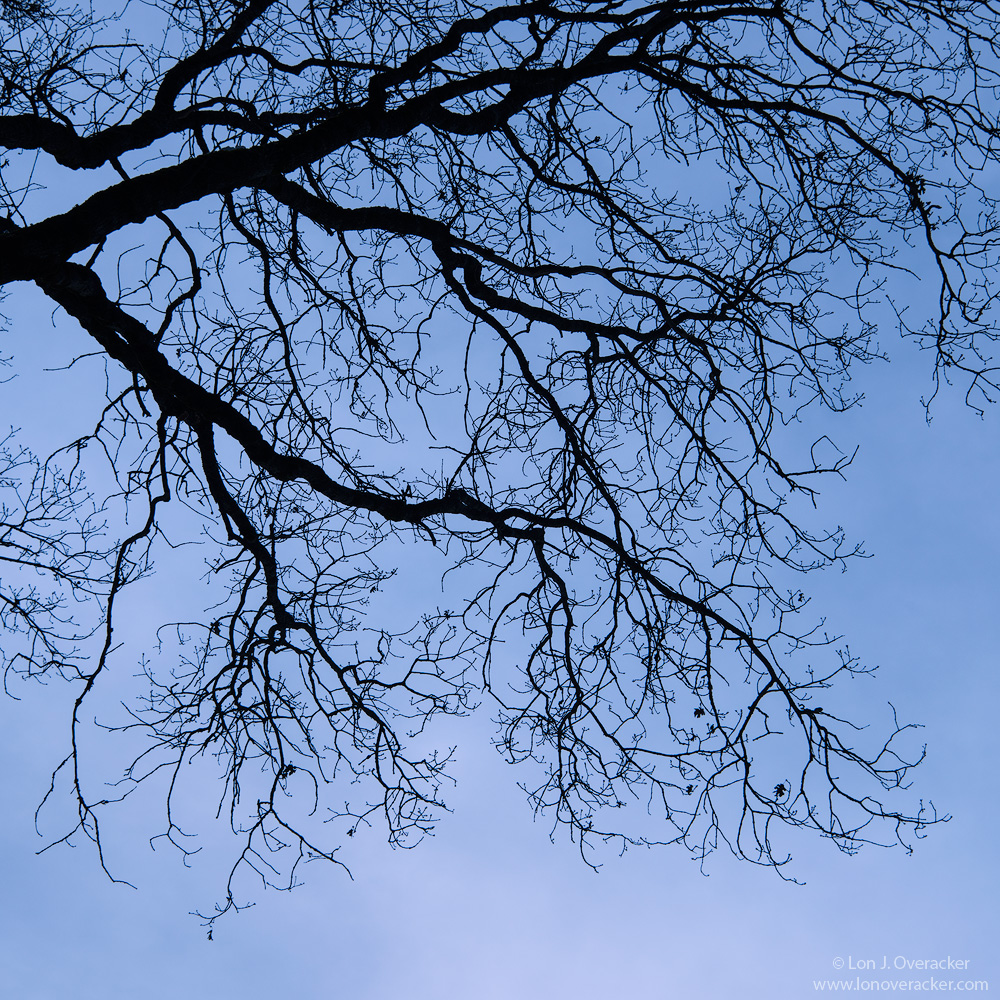
So I was, wandering around Leidig meadow, trudging through crusty snow. After an hour with not much luck I was making my way back to the car.  I had been hearing a helicopter earlier and now it was making it's return; an apparent rescue of an injured hiker, I believe.  I'd mentioned before how I rarely look up anymore and hardly ever include sky.  But at this time, I started looking up to watch the helicopter pass overhead.  And what did I find?  Black oak branches silhouetted against the sky.  Couldn't resist, so I fired off some frames.  Due to this being overhead, I shot this handheld. omg!

I was kinda tickled with the results here because the sky was actually a very thin veil of gray, with some vague notion of clouds.  So, as I'm bringing this up in ACR and cycling through the optional WB settings, all of a sudden this lovely blue pops up when I selected the fluorescent WB.  Go figure, works for me.  I still get a sense of not a clear sky, but I think the results look pretty natural.  Does this come across as natural, despite the mention of the WB setting?

Your thoughts, critiques and suggestions always welcome.  Oh, also which do you prefer square or vertical presentation?

Thanks!

Nikon D800E
Nikon 28-300 @145mm
f/10 @ 1/640 iso200 HH.
very little processing here

Comments

13 comments
Comment posted by Lon Overacker on February 18, 2016 at 1:09 AM
Here's the vertical format.  Do you have a preference?

slightly darker, a tad more saturation
Registered on November 24, 2006, 521 Posts, 19147 Comments
Comment posted by Dave Dillemuth on February 18, 2016 at 11:15 AM
Lon,
This works very well. Simple and elegant and very well composed. Both images are beautiful but I think I prefer the vertical. As far as the processing goes, again both look good, but my personal taste is something closer to the darker, more saturated rendering. I might end up with something in between the two but closer to the second.

...and on the returning to the same place over and over, your not alone. I'm headed on my 3rd trip to Bishop since Dec, tomorrow.
Registered on December 10, 2015, 104 Posts, 1112 Comments
Comment posted by Roel Wijtmans on February 18, 2016 at 12:15 PM
On all accounts the vertical version wins for me. There is some sorts of unbalance in the square crop, whereas the vertical crop looks spot on. Very nice! Also, it looks definitely natural to me, even after your mentioning the WB. It looks like a blue hour shot to me.

Oh, and make it a habit to look up! There are so many interesting things going on int the skies like clouds and optical phenomena! But I'm a sky nerd, I'll admit that. Obsessed with clouds, but even more with optical phenomena.....
Registered on September 30, 2012, 116 Posts, 2257 Comments
Comment posted by Reno DiTullio on February 18, 2016 at 12:20 PM
I like the square format of the first image, Lon, the oak seems to "fit" the format better for my eye.  I would not have known the difference in the sky color without your explanation, looks like a hazy blue sky.  Nicely done.
Registered on November 14, 2003, 130 Posts, 1644 Comments
Comment posted by Craig Moreau on February 18, 2016 at 12:52 PM
Lon, I prefer the square crop, which is unusual for me, as I usually prefer the original 2:3 or 4:5. In this case, something just works better for me in the square. And of course that's not to say I don't like the vertical.

As for the color, it looks perfectly natural to me.
Registered on April 21, 2015, 64 Posts, 584 Comments
Comment posted by Bill Chambers on February 18, 2016 at 1:08 PM
When I first saw it I was kind of thinking "blah", but when I saw the vertical image I started smiling again.  I like the composition better as well as the increased saturation in the vertical version.  Nicely done.
Registered on April 10, 2005, 753 Posts, 21216 Comments
Comment posted by Igor Doncov on February 18, 2016 at 10:42 PM
The 2nd is better because the rhythmic parallel branches give a sense of balance that the first one lacks. I almost always prefer a square to a narrow vertical but not in this case. 
Registered on November 22, 2014, 189 Posts, 2733 Comments
Comment posted by Mark Metternich on February 19, 2016 at 10:27 AM
I have always enjoyed simplicity.  This type of shot exemplifies it. Nice job Lon. 
Registered on June 19, 2009, 276 Posts, 6240 Comments
Comment posted by Dietrich Gloger on February 20, 2016 at 1:07 AM
This looks "natural" insofar as it shows the sky in a believable color. It certainly does not look deliberately toned into something "enhanced". Without your mention of the WB, I would not have assumed that the sky ever had a different color.
And I prefer the square, I find it much more elegant and composed, while the vertical format looks a bit standard and boring. It is a big difference for me, this time.
Registered on January 26, 2007, 360 Posts, 9876 Comments
Comment posted by Preston Birdwell on February 20, 2016 at 2:55 PM
Lon, I am in the square crop camp. I think the crop distils the elements down to their simplest and most elegant. The color in the sky against the dark branches works very well. I like this a lot.

--P
Registered on November 1, 2003, 471 Posts, 5188 Comments
Comment posted by Lon Overacker on February 21, 2016 at 3:22 AM
Thanks everyone for your comments.  I think I'm leaning towards square myself, but I think there are some nice compromises between the two. Decisions, decisions.
 
Registered on November 24, 2006, 521 Posts, 19147 Comments
Comment posted by Harley Goldman on February 21, 2016 at 9:03 AM
Definitely the square crop for me. The sky looks natural, too. Overall, the image ain't rockin' my world, but still enjoyable. 
Registered on November 19, 2003, 586 Posts, 11271 Comments
Comment posted by John Williams on February 21, 2016 at 12:34 PM
Another vote for square, although it's not a clear decision. I love the black on blue. 
Registered on September 6, 2007, 221 Posts, 5985 Comments