Nature Photographers Network
This is the preserved archive of the original Nature Photographers Network. The community continues at naturephotographers.network.
Mono Crater Sage +RP
‹ PreviousLandscape GalleryNext ›

Mono Crater Sage +RP

by Lon Overacker

Gallery: LandscapePosted January 22, 2016275 views23 comments
Thanks everyone for your comments on my last image.

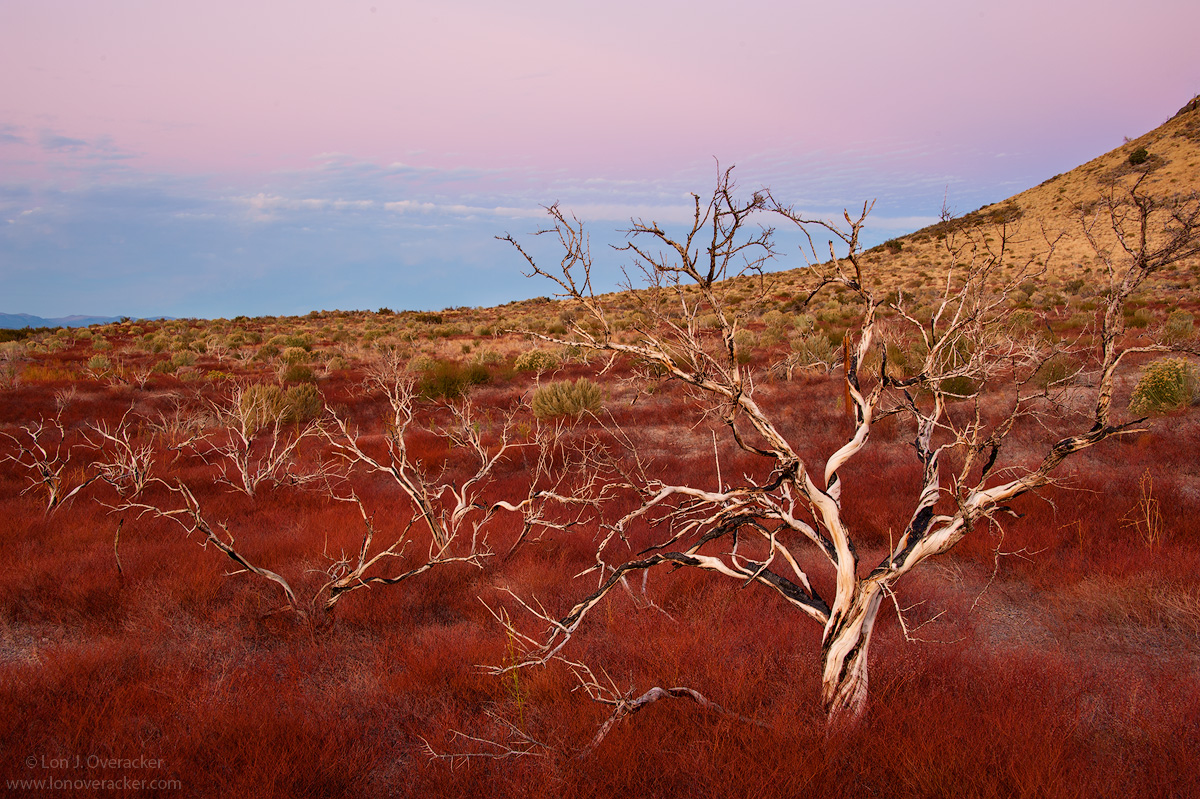
I didn't have plans on posting this image.  Kathy just mentioned in her post that she was purposefully trying to not include the horizon. And for me, I think it's been more than a couple  years since any of my images have included the sky or a horizon,  I'm also quickly learning that RAW images are not impressive by themselves and should not be judged as is whether or not they get trashed.  This is one of those image.

But I'm posting for a couple reasons.  One, it provides a little context to the "Red Sage" image I posted a while back.  The reds here, while still saturated a bit, are more realistically portrayed here. Secondly, I've been inspired by recent posts from Stephen, Dave E. and Dave D. of the Mono Lake basin and Eastern Sierra.  For someone who's been going there since the early 90's, it's just great to see refreshing imagery from places one is so familiar with.  Which, is why my buddy Kyle and I stopped here rather than go the extra couple miles to South Tufa - been there, done that.  (Having said that, if you've never been, and you only  have 1 or 2 days at Mono Lake, you need to visit the South Tufa. And I recommend walking to or from the Tufa - in the dark...) ;-)

So I'll put this one out there for your valued critique and suggestions.

Nikon D700
Nikon 28-300mm @40mm f/14

Thanks!

Comments

23 comments
Comment posted by Philip Hodgkins on January 22, 2016 at 10:48 PM
I love the red sage and the form of the hillside, the evening sky. I have no nits, but a couple of questions: what are the dead and burned snags; is the red sage the first to respond in a burned area; if not, why isn't it the area down range occupied with red sage?wink
Registered on July 24, 2006, 2741 Posts, 12349 Comments
Comment posted by Lon Overacker on January 23, 2016 at 1:26 AM
Phil,

Thanks very much for your comment - and question.  I think I've confused things by the titles of these images and thought I should clear it up.  The burnt, skeletal plants are the Sage brush.  I confused matters on my previous image titling it "Red Sage."  The red is actually the ground cover, not the bare, skeleton plants.  Some quick online search and I'm guessing the reddish ground cover is Mono Wild Buckwheat - in  it's autumn, going dormant form.  Ironically, I did a Google search on the term, "ground cover of mono craters" and my recently posted "Red Sage" image is on the front page already of the search.  go figure.

Anyway, sorry for the confusion.  But the bare plant structure is most certainly Sage Brush, some time after a fire.

Lon
Registered on November 24, 2006, 521 Posts, 19147 Comments
Comment posted by scott lanz on January 23, 2016 at 6:50 AM
Very nice, Lon. Well composed with beautiful color that look just right to me, including the pastel sky. Another fine image of the Mono basin not often photographed. 
Registered on November 14, 2003, 840 Posts, 12902 Comments
Comment posted by Roel Wijtmans on January 23, 2016 at 10:31 AM
Good choice including the sky, it is lovely! The trees stand out nicely against the red and yellow land, and I can't think of anything to improve. Your previous shot of this place was more like fantasy style (in a good way!), while this is more realistic. A really nice photo!
BTW, I think I just spotted one or two dust bunnies.
Registered on September 30, 2012, 116 Posts, 2257 Comments
Comment posted by Mark Seaver on January 23, 2016 at 10:59 AM
I like this one better than your red sage post, Lon.  There's a strong dynamic feeling with the big tree skeleton in front and the graceful curve of the hillside grabbing attention first, but then the lines and shapes lead back to that lovely pastel sky.
Registered on January 23, 2011, 1103 Posts, 17270 Comments
Comment posted by Lon Overacker on January 23, 2016 at 12:20 PM
Thanks for the comments!  Roel, OMG, I'm so busted. For me who is always nitpicking things like this.... Just goes to show how unaccustomed I am to working with skies.... I never worked on this file @ 100%...  cheeky  Thank you very much for pointing it out so I could clean them up in the master file!

Lon
Registered on November 24, 2006, 521 Posts, 19147 Comments
Comment posted by Chris Chamberlain on January 23, 2016 at 2:30 PM
More traditional, and I like that. Not that the other wasn't compelling as well. I love earth shadow, so for that alone I like this. This is an unusual landscape, and I must give it more consideration next time I'm in the area during fall. It's hard to say since the main "tree" seems pretty upright. But the distant clouds make me feel like it's tilted. Oh yeah, I vote for the return hike from the tufa to the parking area long after sunset. Nice pucker factor goes along with that walk!
Registered on March 13, 2007, 500 Posts, 8365 Comments
Comment posted by Dave Dillemuth on January 23, 2016 at 2:50 PM
Lon,
Outstanding image. Love the sweeping horizon and beautiful palette of colors you have captured. While I really enjoyed your prior image from this location the addition of the sky adds a lot of perspective and who can argue with that gorgeous pink glow.
Registered on December 10, 2015, 104 Posts, 1112 Comments
Comment posted by Reno DiTullio on January 23, 2016 at 2:54 PM
Lon, I like both of your "Red Sage" photos; the colors are representative of what I encountered last fall, spent about an hour in ths field of "Red Sage"devil
Registered on November 14, 2003, 130 Posts, 1644 Comments
Comment posted by Lon Overacker on January 23, 2016 at 3:52 PM
Thanks again for the comments and honest opinions.

Chris, I was wondering if anyone would point out the line of clouds.  I'm pretty sure my camera was level, but this bothered me from the beginning. I didn't say anything to see if it would get mentioned.  Thanks!  I've rotated a bit. And because I didn't want to crop with the edge space created during rotating, I went ahead and cloned in some around the edges so I could keep full frame.

I also tweak a tad bit more with saturation (more pink in sky) and a few other tweaks. 

It's great getting comments and kudos on our images, but at least for me, the best value is getting the comments and suggestions that help us improve our images.  Awesome!

Lon

ps. after posting, I'm thinking I went to far with the pink.  What do you think?
Registered on November 24, 2006, 521 Posts, 19147 Comments
Comment posted by Chris Chamberlain on January 23, 2016 at 4:05 PM
Yeah, that just looks right now, in regards to the horizon. I'm probably not the person to ask about the color. I think it's reasonable for my personal tastes. I know I have seen bands of pink that intense and more on occasion. I have been questioning if I should tone down the pink and blue in my Olympic Coast shot I posted a few weeks back. I know the color is a pushed a little, but I think that adds to the visual impact a print has vs. actually being there to witness the real thing. I think prints need that little extra pop to convey to the viewer the emotional response we as the photographers get to enjoy while witnessing the events.
Registered on March 13, 2007, 500 Posts, 8365 Comments
Comment posted by Nick Bristol on January 23, 2016 at 5:43 PM
Lon, I like this image very much. It's an interesting composition and fun to explore. For me the large version of the first one works best. I agree with Chris that if printed the second one might be the way to go for that extra pop. I like looking at this and it is so much different than things I'm used to seeing. Nice work Lon!
I forgot to add that I think the pink in the second one looks just fine so no problem there for me. Did you add more red in the foreground or is that just me thinking I see something? 

Nick Bristol
Lone Rock, WI
Registered on February 1, 2004, 752 Posts, 14140 Comments
Comment posted by Alberto Patiño on January 23, 2016 at 11:41 PM
I do find the colors in this one more satisfying than in the previous one, and the sky colors are indeed gorgeous! The composition is also easier to understand, at least to me (but I have never been there). And, it has also taken me a long time to realize that RAW images are, indeed, raw....
Registered on December 2, 2014, 278 Posts, 1736 Comments
Comment posted by Roel Wijtmans on January 24, 2016 at 3:37 AM
I actually prefer the non-rotated version. Yes, the clouds are a bit at an angle, but since the land is also at an angle I think these two cancel each other out. It might have been an issue if the horizon would have been flat, but in this case it looks good. And the pink looks good too.
Yes, dust bunnies are probably the biggest pain in the behind in digital photography.... I always crank up the black point and/or the contrast a lot (and I mean really a LOT), and then scan the sky (and things like water bodies) at 100 or 66 % for them. Makes most of them pretty obvious.
Registered on September 30, 2012, 116 Posts, 2257 Comments
Comment posted by Dietrich Gloger on January 24, 2016 at 11:52 AM
Very interesting to see this version. The inclusion of the sky gives a totally different feel. I like how the horizon seems to be the edge of the world and how this seems to be a view into outer space. The repost looks good, not too much pink imo.
Registered on January 26, 2007, 360 Posts, 9876 Comments
Comment posted by Igor Doncov on January 24, 2016 at 1:18 PM
For me there is too much sky in this image. The story here is these naked limbs rising out of the inferno. The sky has little to do with the story and dilutes the message. I would crop from the top and some from the left. That would still leave the sky but in a much more subordinate role. Just my opinion.
Registered on November 22, 2014, 189 Posts, 2733 Comments
Comment posted by Albert Darmo on January 24, 2016 at 3:05 PM
Hi   Loncrying   A very interesting perspective.frown  the sage brush  have  interesting form against  the curved hillsidecool.  the scene is  beautifully captured, but  even with the warm  colors   , the  burnt  skeletal plants   give the image tension.

Albert Darmo
Canada
Registered on November 25, 2008, 1386 Posts, 11978 Comments
Comment posted by Marylynne Diggs on January 24, 2016 at 4:59 PM
Thanks for sharing this other view, Lon.  I prefer the rotated version.  It just feels more right (regardless of whether it is!)

That said, I prefer the skyless version.  I might like this comp more if the sky were a different color (night sky, twilight, even blue), but my fashion sense keeps telling me not to wear pink with red.frown.  I know that sounds crazy, but there is something about the lack of complementarity that makes this feel a bit garish to me. Personally, I might try black and  white or even selective color if that's not an even more garish aesthetic for you.

ML
Registered on December 14, 2010, 122 Posts, 1034 Comments
Comment posted by Preston Birdwell on January 24, 2016 at 7:09 PM
I like the rotated version without the saturation increase. The composition works, and I have to say that having a sky in one of your images is a departure from your norm. The sage-buckwheat combination looks really nice.

--P
Registered on November 1, 2003, 471 Posts, 5188 Comments
Comment posted by Harley Goldman on January 25, 2016 at 5:47 PM
Very cool image, Lon. I am with PB, like the rotation but prefer the original saturation. Great trees and grasses!
Registered on November 19, 2003, 586 Posts, 11271 Comments
Comment posted by Lon Overacker on January 25, 2016 at 7:41 PM
Thank you all for your comments, observations and suggestions.  This is just such a great example of how we each all have different perspectives and reactions to an image.  Many different, diverse and almost opposing opinions.  But I can say for sure each one has helped. 

I hadn't even considered, but Igor's comment about too much sky makes sense too; no one had mentioned that.

I think I'll probably settle down with a rotated version with less saturation.  I don't think I mentioned, but one added difference with the repost was an Orton layer, at about 12% opacity. This has a similar effect with adjusting contrast and saturation.

Great comments!  this was a good exercise and learning process for me.
Registered on November 24, 2006, 521 Posts, 19147 Comments
Comment posted by Kah Kit Yoong on January 27, 2016 at 1:52 AM
Thought from the thumbnail that it might be an Australian outback landscape! The repost looks saturated but the result is more appealing than the original. I'm pretty happy with the proportions uncropped.
Registered on September 27, 2006, 636 Posts, 10682 Comments
Comment posted by Ryan Shain on January 28, 2016 at 6:30 PM
Hi Lon,

The repost with the rotation and maybe just a tad less saturation is the ticket for myself. the capture is rather wild with the dead sage brush providing a lot of structure. The red ground cover is so sweet, and makes this image special for me. Cropping the sky done further does place more emphasis on the sage brush and ground cover. It works, but I think it looks great as is with the current comp too.

Ver beautiful and unique work Lon
Registered on February 20, 2007, 226 Posts, 4571 Comments