Nature Photographers Network
This is the preserved archive of the original Nature Photographers Network. The community continues at naturephotographers.network.
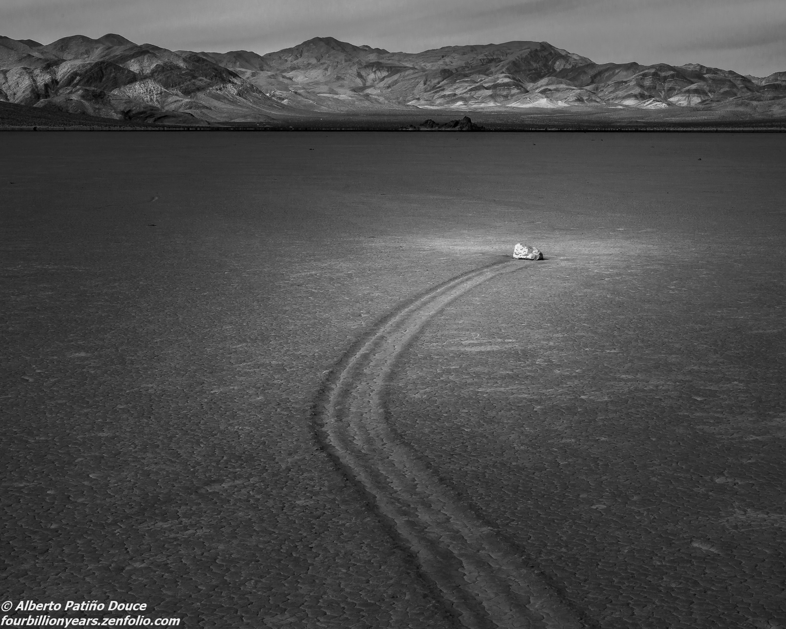
Racetrack B&W - repost
‹ PreviousLandscape GalleryNext ›

Racetrack B&W - repost

by Alberto Patiño

Gallery: LandscapePosted January 3, 2016102 views9 comments
Additional processing of my previous post, following Harley's and Lon's suggestions. Did I go to far? Not far enough? I can appreciate a good B&W image. Producing one is a different matter. Comments/suggestions welcome!

Comments

9 comments
Comment posted by Harley Goldman on January 3, 2016 at 6:05 PM
Big improvement on the presentation on this one! It is looking real good. My vote now goes for the B&W. sad
Registered on November 19, 2003, 586 Posts, 11271 Comments
Comment posted by David Schoen on January 3, 2016 at 6:53 PM
This has more emotion and otherworldliness to it which I thought was always the point for this phenomenon.  I like it and better.
Registered on November 6, 2006, 1213 Posts, 4587 Comments
Comment posted by Dave Dillemuth on January 3, 2016 at 8:31 PM
Alberto,
Very nice image. This version has stronger visual impact.
Registered on December 10, 2015, 104 Posts, 1112 Comments
Comment posted by Albert Darmo on January 3, 2016 at 9:57 PM
HI Alberto crying The  new B&W version  is better with the added contrast, but  the  beautiful colors in the  first  colored version  win the medal  for mecool


Albert Darmo
Canada
Registered on November 25, 2008, 1386 Posts, 11978 Comments
Comment posted by Sandro Bisotti on January 4, 2016 at 8:12 AM
I prefer the previous version. Here the "light on subject" is IMHO too much direct and strong.
All the best!
Sandro
 
Registered on February 8, 2015, 30 Posts, 265 Comments
Comment posted by Ed Lowe on January 4, 2016 at 11:11 AM
Overall this is my favorite so far, Alberto. This has so much more emotion and drama associted with it although
i could see the spot light on the rock dialed back just a touch.

Ed
Registered on February 7, 2004, 414 Posts, 7115 Comments
Comment posted by Roel Wijtmans on January 4, 2016 at 12:45 PM
Oh, now you're making me hesitate about preferring the color version! Where the previous B+W looked more like a desaturated version of the color version, this one looks like a genuine B+W!
Registered on September 30, 2012, 116 Posts, 2257 Comments
Comment posted by Mark Zelinka on January 4, 2016 at 1:50 PM
Cool shot, and otherworldly. Great artistic presentation too.
Registered on August 20, 2007, 206 Posts, 998 Comments
Comment posted by Lon Overacker on January 5, 2016 at 9:35 PM
Alberto,

I think this works wonderfully!  thanks for taking the time to rework and repost.  I like this rendition very much!

Lon
Registered on November 24, 2006, 521 Posts, 19147 Comments