Nature Photographers Network
This is the preserved archive of the original Nature Photographers Network. The community continues at naturephotographers.network.
The Entrance
‹ PreviousLandscape GalleryNext ›

The Entrance

by Lon Overacker

Gallery: LandscapePosted December 22, 2015214 views13 comments
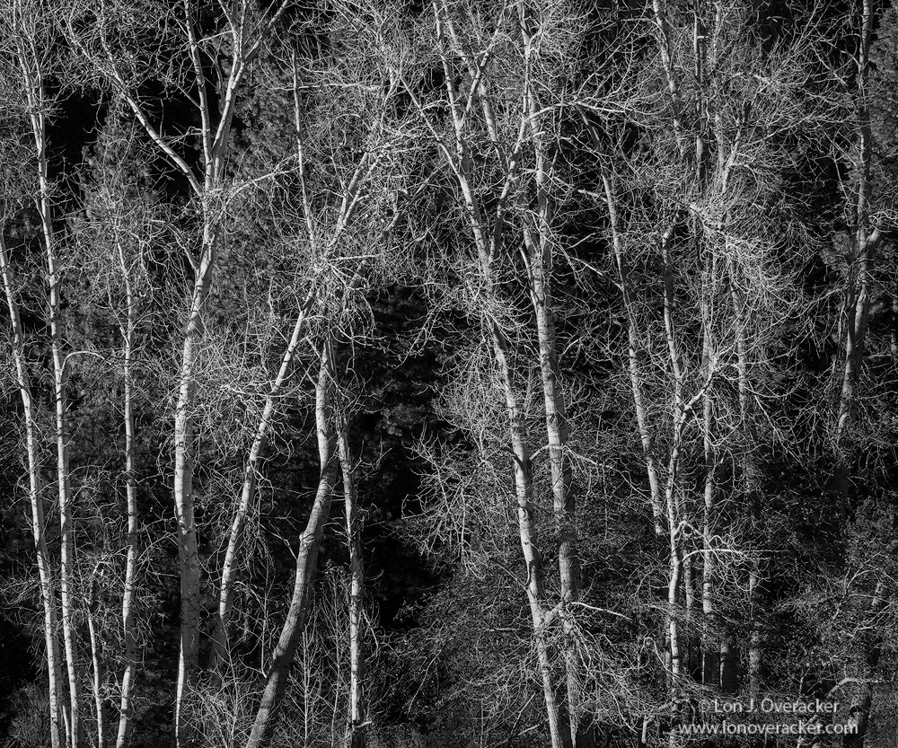
This is the only other b&w I'll be posting from our trip in November.  What a stark contrast from Yosemite posting this right next to Reno's, soft, warm colors and phenomenal view of Yosemite Valley; while this one here is almost polar opposite.

I'd photographed these trees right in Sentinel Meadow a few years ago with the 4x5 and have always been drawn to the center trees that kind of cross-over and the gap between just looks and feels like a doorway, a portal or something...  Guess one has to have an imagination. Do you see it?

Very curious your thoughts, especially the processing.

Nikon 800E
Nikon old 80-200mm 2.8 @ 95mm f/16

Thank you!

Comments

13 comments
Comment posted by D.A. Edwards on December 22, 2015 at 5:37 PM
I saw it before I even read your description so mission accomplished, Lon. Technically perfect as is virtually all of your work. This is one case however where a watermark really detracts from the experience. I know that there are many great reasons to have them but in this case, with the watermark's horizontality, not so good. cheeky
Registered on October 8, 2014, 226 Posts, 1187 Comments
Comment posted by Lon Overacker on December 22, 2015 at 5:42 PM
David,  you're absolutely right! My bad on this one.  I usually pay closer attention and the watermarks presence could have been much better! grrrrrr.  I processed this many weeks ago and should have taken a refreshed look at the presentation.  But heck, even with the distraction, you still "see" it.  Thanks for the honest feedback.  I'll be redoing the watermark.
Registered on November 24, 2006, 521 Posts, 19147 Comments
Comment posted by Bruce King on December 22, 2015 at 6:36 PM
Not a spectacular scene but a fine photograph. Busy scenes are normally not my preference but this still has a strong sense of form and is quite appealing.
Registered on January 14, 2010, 276 Posts, 2212 Comments
Comment posted by Ed Lowe on December 22, 2015 at 11:21 PM
I love the stark graphic quality of the lighter trees against the darker BG, Lon. I too see the door or portal you mentioned; looks like the sanctuary of the natural world that we need to preserve. The B&W processing looks excellent to me; I think it would make a lovely print.

Ed
Registered on February 7, 2004, 414 Posts, 7115 Comments
Comment posted by Dietrich Gloger on December 22, 2015 at 11:24 PM
Yes, Lon, this is very much to my liking! Very good light for this type of scene and suited for bw processing, which looks excellent.
I see the gate into an Ansel Adams Gallery here... enlightened
Registered on January 26, 2007, 360 Posts, 9876 Comments
Comment posted by Daniel Rappaport on December 22, 2015 at 11:46 PM
Really like this. The extreme contrast reminds me of an engraving.
Registered on September 9, 2009, 294 Posts, 2006 Comments
Comment posted by Dave Dillemuth on December 23, 2015 at 11:20 AM
Lon,
Fine image -  processing looks good to me.. Has a very graphic quality that lends itself well to B&W rendering.
Registered on December 10, 2015, 104 Posts, 1112 Comments
Comment posted by Roel Wijtmans on December 23, 2015 at 12:09 PM
I am really enjoying the almost abstract quality of those bright trees against the dark background. It's a busy comp, but that only adds to the abstract feeling for me, and works very well.
Registered on September 30, 2012, 116 Posts, 2257 Comments
Comment posted by Nick Bristol on December 23, 2015 at 5:38 PM
Lon, I like this image alot and clicking for the larger version really does the trick. The composition works great for me, and yes, I see the doorway. The b&w processing looks very good to me and I agree with Ed that this might make a very interesting print.
Happy Holidays! Nick
Registered on February 1, 2004, 752 Posts, 14140 Comments
Comment posted by David Schoen on December 23, 2015 at 7:16 PM
Very nice lighting on the trees with effective subtle shading creating a compelling abstract.
Registered on November 6, 2006, 1213 Posts, 4587 Comments
Comment posted by Igor Doncov on December 24, 2015 at 1:35 AM
From my point of view this is a well composed image. I don't find it busy. The small version looks better than the large due to the absence of a broad white frame in the larger version. That thin line of a frame in the larger version really hurts this image.
Registered on November 22, 2014, 189 Posts, 2733 Comments
Comment posted by Harley Goldman on December 24, 2015 at 10:06 AM
I like this one a lot. I find it is a nice combo of abstract and reality. And it has a Sexton look to it. Very well done. 
Registered on November 19, 2003, 586 Posts, 11271 Comments
Comment posted by Reno DiTullio on December 25, 2015 at 1:07 PM
Excellent, this is what BW is all about, also reminds me of a handcut block print.
Registered on November 14, 2003, 130 Posts, 1644 Comments