Nature Photographers Network
This is the preserved archive of the original Nature Photographers Network. The community continues at naturephotographers.network.
Monochromatic Dune + Repo
‹ PreviousLandscape GalleryNext ›

Monochromatic Dune + Repo

by Marylynne Diggs

Gallery: LandscapePosted December 12, 20152,039 views18 comments
Hi Everyone,
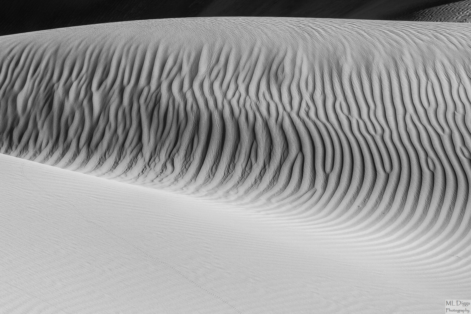
I hope I am not wearing out my welcome with all of these B/W conversions.  For those who don't know, I'm working my way through candidates for a portfolio, and I'm getting down to the final handful.  This is one of the Dunescapes from Death Valley I shared in color earlier this year.  It has a lovely buff color, but the textures also motivated me to go BW with it.  

Canon 7D with 24-105mm at 105
ISO 125, f/9, 1/200s
Conversion in Nik and LR

As always, let me know what you think, feel free to offer suggestions on composition and crop, contrast, processing in general.

Comments

18 comments
Comment posted by David Schoen on December 12, 2015 at 5:35 PM
My first thought on this is to increase the detail slightly in the bottom trianglular half.  There is a hint of detail but it might have more impact with a little more,  The curves and comp are just fine.  I could be off here but would like to see a version with a different balance.
Registered on November 6, 2006, 1213 Posts, 4587 Comments
Comment posted by Roel Wijtmans on December 13, 2015 at 8:31 AM
I agree with David about adding som contrast to the foreground. I really like the interaction between the low contrast in the fg and the high contrast in the bg, but I think it would still benefit from a bit more contrast in the fg. Otherwise this is excellent! Love those tiny animal tracks.
Registered on September 30, 2012, 116 Posts, 2257 Comments
Comment posted by Bill Leggett on December 13, 2015 at 9:29 AM
Very nice, Marylynne.  I like all the patterns in the sand.  For me an option to crop the top to eliminate the BG gives it a nice abstract feel.  The tracks in the FG are a nice touch.
Registered on July 21, 2004, 706 Posts, 3233 Comments
Comment posted by Igor Hoveijn on December 13, 2015 at 10:45 AM
I like this B+W rendition very much even without seeing the colour version. The patterns in the sand are quite complicated but the global composition is very simple. But for me the ratio's of the black, gray and white regions differ too much. So I would agree with the suggested crop. But then you loose the way the patterns in the sand curve along the sandhills. What about adding a black strip above, roughly the size of a fifth of the current height? Just a thought.
Registered on November 2, 2015, 18 Posts, 192 Comments
Comment posted by Nick Bristol on December 13, 2015 at 11:57 AM
Marylynne, I like this one a lot and the larger version is really cool to look at. Those tracks add such a wonderful touch to this and the lines and textures are very nice. I like it fine as is and it would probably work well with just a bit more contrast in the foreground too. Really nice work!

Nick Bristol
Lone Rock, WI
Registered on February 1, 2004, 752 Posts, 14140 Comments
Comment posted by Lon Overacker on December 13, 2015 at 2:10 PM
Marylynne,

A wonderful and graphic image.  I love the patterns and tiny details (which can only be explored viewing large - like the little tracks and tiny ripples in the sand..)

I agree with David about trying to extract some more detail out of the sand with some additional contrast - but not too much of course.  I would go so far as to say actually cropping some portion off the bottom to help create a closer balance or proportion with the other sections (dunes and top.)  As presented without more detail at the bottom, there isn't the competition visually with the central patterns, but any increase in detail/contrast at the bottom I think should be countered with a crop from the bottom.  But that's just me.

It will be a fine addition to your portfolio.

Lon
Registered on November 24, 2006, 521 Posts, 19147 Comments
Comment posted by Dietrich Gloger on December 13, 2015 at 2:23 PM
This is stunning. BW is the way to go here. The ripples are mesmerizing.
Registered on January 26, 2007, 360 Posts, 9876 Comments
Comment posted by Mark Metternich on December 13, 2015 at 2:39 PM
Now having spent time out there in DV I can see how one can get absolutely lost in dunescapes!  Very nice shot. 
Registered on June 19, 2009, 276 Posts, 6240 Comments
Comment posted by Jim Greenwood on December 13, 2015 at 5:12 PM
Very nice!  The animal tracks, more apparent in the larger version, add an element of interest to the image.  I agree with Bill that cropping the top to eliminate the background would result in a significantly more abstract composition ... not necessarily a better composition in my opinion, just different.  My suggestion, as an alternative, it to try to coax some more detail out of the shadows at the top, especially on the left where it is almost completely black.
Registered on November 9, 2003, 229 Posts, 1523 Comments
Comment posted by Mark Seaver on December 13, 2015 at 5:12 PM
The texture in the midground ridge is wonderful, Marylynne.  The gentler foreground and the touch of ridge along the top balance that heavy texture well.  The tracks scattered throughout add some fine extra interest.
Registered on January 23, 2011, 1103 Posts, 17270 Comments
Comment posted by Marylynne Diggs on December 13, 2015 at 9:13 PM
Thanks for the feedback everyone.  Here is another stab at that foreground area.  The bground (with some hints of dune) was a problem and debate in the color version also.  I could try to decapitate the entire dune and see what that does.  Might play with that later.  For now, I just narrowed that strip.  I think adding black to the bottom takes it too far out of the realm of the real for me.  I feel myself faaaaaallling just thinking about it.  Nonetheless, that's worth a try too if anyone thinks that's a better move than what I've done here.

Let me know if this version works better.  There is not a lot of texture in that foreground (and in the color version it is just buff). 
Registered on December 14, 2010, 122 Posts, 1034 Comments
Comment posted by Jim Greenwood on December 13, 2015 at 10:03 PM
Well ... In my opinion the repost is just too crowded and tight at the top  I'll stick with my earlier suggestion to try to coax more detail out of the shadows in the background at the top, especially on the left.
Registered on November 9, 2003, 229 Posts, 1523 Comments
Comment posted by Ed Lowe on December 14, 2015 at 3:16 PM
The large version is a visual treat, Marylynne. The textures and patterns in the sand is mezmerizing and I like the way the BG dune just fades away. This will work beautifully with your other B&W work.

Ed
Registered on February 7, 2004, 414 Posts, 7115 Comments
Comment posted by Lon Overacker on December 14, 2015 at 3:25 PM
Marylynne,

I much prefer the original crop.  If there is going to be space up top, there needs to be enough of it.  The original has just enough - and I like the hint of detail as well.  I'm also a little undecided about the bottom too.  It's like the higher key look of the original is better too... ;-)  just  one person's opinion though. Ultimately, you get to decide.
Registered on November 24, 2006, 521 Posts, 19147 Comments
Comment posted by Igor Doncov on December 14, 2015 at 7:12 PM
The original is considerably superior to the repost, both in the overall design and the handling of the tonality. The original jumps off the page - the repost is more pedestrian, sluggish. As I commented earlier, this is your best dune image of all we looked at. This is exquisite. The small wedge in the urc is just a great addition. Do not worry about the lack of detail in the dark section nor the white section. Look at it as a whole. Bravo.
Registered on November 22, 2014, 189 Posts, 2733 Comments
Comment posted by Preston Birdwell on December 15, 2015 at 1:02 AM
I loved the color version, but this takes the scene to the next level. I think the original posted image is exquisite! The tonal separation and thus, the overall contrast is quite beautiful. This will have to be printed very carefully, but it will be wonderful.

devil

--P
Registered on November 1, 2003, 471 Posts, 5188 Comments
Comment posted by Marylynne Diggs on December 15, 2015 at 11:26 AM
Thanks, everyone.  I really appreciate your willingness to suggest changes and to dial them back also.  I like the high key foreground too...it feels natural to me, given the way the light plays across the various dune surfaces. 
Registered on December 14, 2010, 122 Posts, 1034 Comments
Comment posted by Ryan Shain on December 16, 2015 at 10:04 PM
Hi Maylynne,

This image is a fine work of art in photography! The lines and tones in this image are wonderful to explore, and be very proud of this fine scene. devil
Registered on February 20, 2007, 226 Posts, 4571 Comments