Gallery: LandscapePosted November 30, 2015240 views22 comments
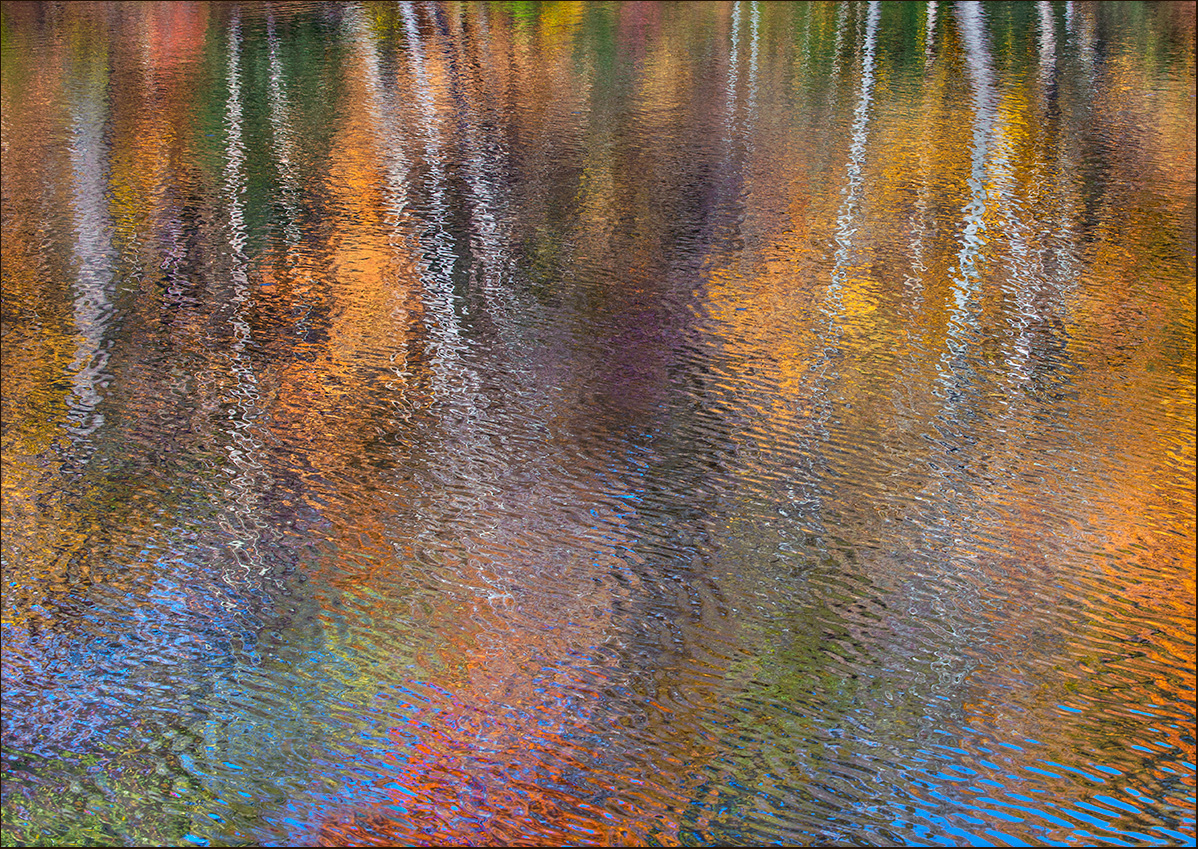
Getting a bit more abstract as the wind picked up. D600, 80-400 @ 80, 1/125, f16, iso 500. Suggestions, questions, critiques and other comments welcome.
Comments
22 comments
Comment posted by Eva McDermott on November 30, 2015 at 7:33 PM
Wonderful abstract Scott. Very impressionistic and colorful. It works well as is but I might be tempted to invert the image.
Registered on January 4, 2009, 1015 Posts, 13229 Comments
Comment posted by scott lanz on November 30, 2015 at 7:35 PM
Thanks for the suggestion, Eva. I inverted the first two of the series, and went back and forth on this one.
Registered on November 14, 2003, 840 Posts, 12902 Comments
Comment posted by Lon Overacker on November 30, 2015 at 8:28 PM
Scott,
Wow, what a kaleidoscope of color! This is a wonderful abstract and a fine compliment to your earlier images. I loved how you inverted the other two, but honestly, I love this one being presented as seen. It's certainly abstract and has that impressionistic style, yet it's still grounded a little in reality. I love the whiteness of the trunks with the golden hues of the reflected leaves. Love this one.
The only suggestion I have, as in your previous image, is back to the blue. The blue in the LRC is a little strong. Not sure if it's a hue or a saturation thing. But in general the saturation is high, but not overly so - after all is all about the great variety of colors right?
Registered on November 24, 2006, 521 Posts, 19147 Comments
Comment posted by Tony Kuyper on November 30, 2015 at 9:25 PM
Very beautiful. Hard to suggest much, but a vignette at the edges might be something to try.
Registered on November 1, 2003, 364 Posts, 22328 Comments
Comment posted by Harley Goldman on November 30, 2015 at 9:31 PM
Another excellent abstract! I am finding it much too saturated for my tastes, but my tastes tend to run to the more understated. You are killing it with your abstracts.
Registered on November 19, 2003, 586 Posts, 11271 Comments
Comment posted by Alberto Patiño on November 30, 2015 at 11:02 PM
I love the interplay of colors and ripples, with the suggestion of trees to give some sense of reality. I think I like it this way, rather than upside down.
Registered on December 2, 2014, 278 Posts, 1736 Comments
Comment posted by Ian Cameron on December 1, 2015 at 5:32 AM
That's a glorious shot a real pot pourri of exotic hues (I don't mind the enhanced saturation at all), beautifully diffused and abstracted by your choice of shutter speed. The rippled colour is fantastic, love it, love it, love it!! I might even skim the first 1cm off the top of the image to maintain its abstract colour pattern more completely.
Registered on August 6, 2004, 1125 Posts, 3318 Comments
Comment posted by Albert Darmo on December 1, 2015 at 10:23 AM
Hi Scott I love this wonderful palette of color. the textures and shapes of color in this fine abstract are eye candy.
Albert Darmo
Canada
Registered on November 25, 2008, 1386 Posts, 11978 Comments
Comment posted by Barb Pflaum on December 1, 2015 at 10:36 AM
This is really beautiful, Scott! It's my favorite of your autumn impressions series. I love the colors and ripples. I prefer it this way rather than inverted.
Registered on January 14, 2009, 316 Posts, 2724 Comments
Comment posted by Jim Jirka on December 1, 2015 at 10:37 AM
This is just masterfully done. I am not usually drawn to the this style of image, but I must say you have been converting me. This is my favorite thus far. well done.
Jim
Registered on November 1, 2003, 254 Posts, 1620 Comments
Comment posted by David Schoen on December 1, 2015 at 11:51 AM
All three of your impressionistic images exhibit originality. Despite being saturated, I think this works for me.
Registered on November 6, 2006, 1213 Posts, 4587 Comments
Comment posted by Roel Wijtmans on December 1, 2015 at 11:56 AM
Ok, the other ones were really nice, but this one is simply amazing! I don't mind the saturation, because the colors are the stars of this image. I wouldn't change a single thing....
Registered on September 30, 2012, 116 Posts, 2257 Comments
Comment posted by Mark James Ford on December 1, 2015 at 1:34 PM
Hi Scott, a wonderful 'impression' with a great mix of colours and structure. I wouldn't change anything as such but a 'panorama' crop with the bottom 2/3 of the image, would, I suspect, also make for a very powerful 'abstract' since the tree trunks would be even less recognizable.
Cheers, Mark
Registered on January 16, 2015, 60 Posts, 430 Comments
Comment posted by Daniel & Loana on December 1, 2015 at 3:08 PM
Great colours for this abstract, Scott.
D&L
Registered on October 7, 2008, 166 Posts, 3044 Comments
Comment posted by Igor Hoveijn on December 1, 2015 at 3:46 PM
Sometimes the wind destoys the reflection, but here it acts as a colour mixer with a beautiful result. Very painterly, almost pointilistic at some parts. For me, a little bit of oversaturation works quite well here.
Registered on November 2, 2015, 18 Posts, 192 Comments
Comment posted by Nick Bristol on December 1, 2015 at 4:54 PM
Scott, My favorite of these so far! I love this one. Nick
Registered on February 1, 2004, 752 Posts, 14140 Comments
Comment posted by Igor Doncov on December 1, 2015 at 10:51 PM
Interesting. This doesn't look like a photograph at all, but a Monet. It might belong in the art gallery more than here. IMO the bright colors at the bottom are fine. I would add more luminosity to the green trees at the very top of the image. That cyan green doesn't fit well with this color palette.
Registered on November 22, 2014, 189 Posts, 2733 Comments
Comment posted by Dietrich Gloger on December 2, 2015 at 2:33 PM
Great version of the "Monet" type of image. Although the subject is blurred, the contrasty ripples add a lot of structure and eetail to explore. Very cool effect!
Registered on January 26, 2007, 360 Posts, 9876 Comments
Comment posted by Mark Seaver on December 3, 2015 at 7:21 PM
Another beauty, Scott. More abstract that your most recent post, but more colorful as well. I think they're both great. I could see inverting this or even cropping just a bit off the top where the water much smoother.
Registered on January 23, 2011, 1103 Posts, 17270 Comments
Comment posted by Chris Chamberlain on December 4, 2015 at 12:14 AM
Amazing colors! I like the effect of the wind here. The ripples work well with the intensity of the color.
Chris
Registered on March 13, 2007, 500 Posts, 8365 Comments
Comment posted by Kory Lidstrom on December 4, 2015 at 1:20 PM
You got every color in the rainbow here and that's what makes it work.
Registered on November 19, 2008, 49 Posts, 1035 Comments
Comment posted by Bill Fach on December 6, 2015 at 5:04 PM
Scott: Viewing these in reverse order but I believe this may be my favorite simply for the color. I like this uninverted view. Makes one think a little and that is a good thing. 2 thumbs up! >=))>
Registered on November 1, 2003, 1805 Posts, 26981 Comments

Comments
22 commentsWow, what a kaleidoscope of color! This is a wonderful abstract and a fine compliment to your earlier images. I loved how you inverted the other two, but honestly, I love this one being presented as seen. It's certainly abstract and has that impressionistic style, yet it's still grounded a little in reality. I love the whiteness of the trunks with the golden hues of the reflected leaves. Love this one.
The only suggestion I have, as in your previous image, is back to the blue. The blue in the LRC is a little strong. Not sure if it's a hue or a saturation thing. But in general the saturation is high, but not overly so - after all is all about the great variety of colors right?
Albert Darmo
Canada
Jim
Cheers, Mark
D&L
Chris