Nature Photographers Network
This is the preserved archive of the original Nature Photographers Network. The community continues at naturephotographers.network.
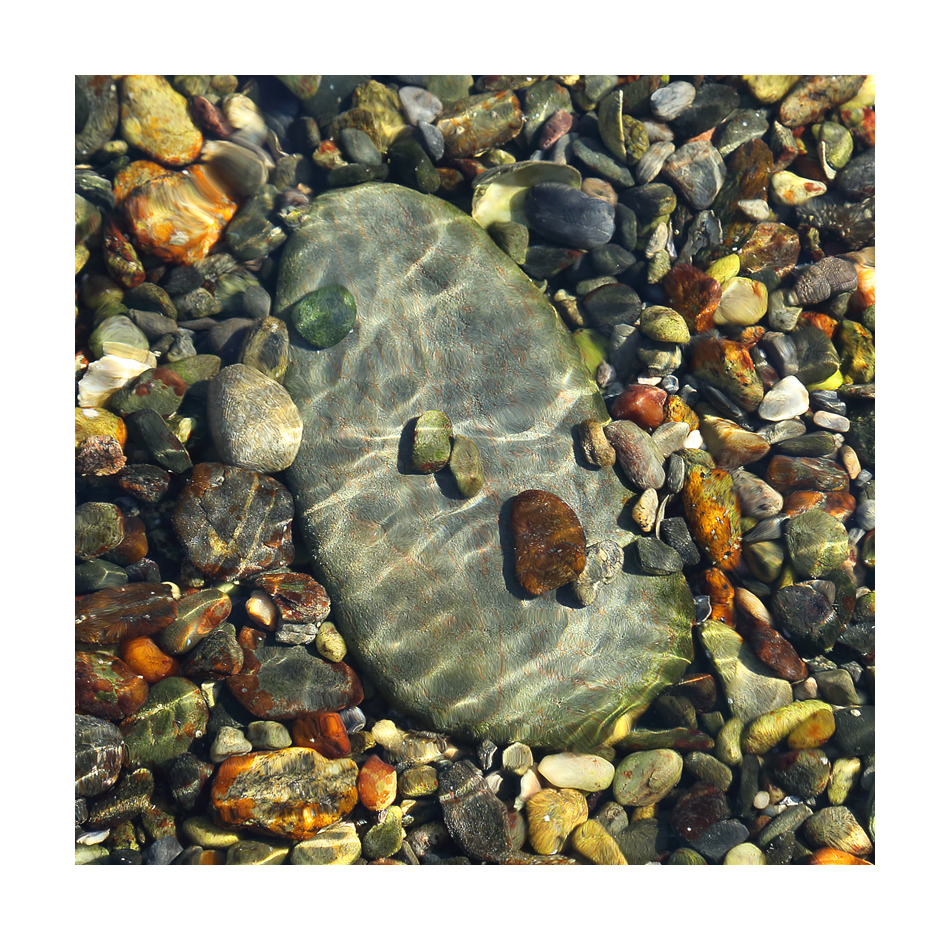
Tidepool Jewels #2
‹ PreviousLandscape GalleryNext ›

Tidepool Jewels #2

by Igor Doncov

Gallery: LandscapePosted November 20, 2015224 views18 comments
As promised this is a composition where water motion played a smaller role and there are no visual distortions. Which composition do you prefer? I typically have an easier time with this sort of composition and feel more comfortable with it.

BTW I used Harry Lichtman's method of sharpening here. Thank you.

Canon 6D, 24-105mm@82mm, F8.0, ISO 800, 1/100 sec, CPL, tripod, cable release

Comments

18 comments
Comment posted by Eva McDermott on November 20, 2015 at 2:59 AM
This works better for me but your last post was also very good.  I like the square corp and positioning of the large center rock.  The ligh streaks are mesmerizing.
Registered on January 4, 2009, 1015 Posts, 13229 Comments
Comment posted by Jim Greenwood on November 20, 2015 at 7:53 AM
I think I prefer this composition over the previous one.  The previous image, due to the extra distortions, is more pure abstract impressionism to me.  As opposed to #2, in which the subject matter is clearly identifiable and recognizable.  I like the added interest of the few pebbles resting on top of the large stone.  I think that the centered placement of the large stone works nicely for this square crop.  But I would be interested in seeing a 4:5 crop in which the large stone is not centered and follows the rule of thirds.  Nice effort!
Registered on November 9, 2003, 229 Posts, 1523 Comments
Comment posted by Harley Goldman on November 20, 2015 at 9:31 AM
Ditto of the above, this one works a little better for me than the last (which I liked a lot).  The big rock is a solid image anchor and lots of nice shapes and color.
Registered on November 19, 2003, 586 Posts, 11271 Comments
Comment posted by Louis Pattis on November 20, 2015 at 9:38 AM
First one for me. I love the achieved plastic wrap filter effect one the first image which makes it so special and refreshing. Composition aside, because we are not comparing apples to apples.
Registered on March 30, 2012, 0 Posts, 164 Comments
Comment posted by Jim Jirka on November 20, 2015 at 9:57 AM
Igor,
While this image and description sounds like it captured what you wanted it to, I find the abstract qualities of previous post more to my liking. The movement in the first provides me with a chance to look at the image for more than a few seconds. Very well done in both, though.
Jim
Registered on November 1, 2003, 254 Posts, 1620 Comments
Comment posted by Mark Seaver on November 20, 2015 at 10:55 AM
You've got a fine collection of colors here, Igor.  The large stone surrounded and topped by the smaller stones anchors the view very well.  The light streaks add extra interest.
Registered on January 23, 2011, 1103 Posts, 17270 Comments
Comment posted by Kathy Barnhart on November 20, 2015 at 11:46 AM
I didn't see the prior post but this is just beautiful. The colors are lovely, as are the reflections and wavy lines of light that lets the viewer know the rocks are submerged. Love the square crop too.
Registered on November 11, 2011, 404 Posts, 1639 Comments
Comment posted by Roel Wijtmans on November 20, 2015 at 12:23 PM
For me it is the previous, more abstract version, no doubt about it. This one is nice too, but is too much in your face, while the other one leaves a lot more to the imagination which I really like. The details in this one are very nice though, as said, this is a nice one too!
Registered on September 30, 2012, 116 Posts, 2257 Comments
Comment posted by Dietrich Gloger on November 20, 2015 at 12:25 PM
 I prefer this one over the other - the sharpnes and clarity of the rocks gives my eye more to explore and "understand". Although that big rock is centered in the composition, it works very well there.
Registered on January 26, 2007, 360 Posts, 9876 Comments
Comment posted by Albert Darmo on November 20, 2015 at 12:28 PM
 Hi    Igor crying   You  captured the light   and  color  here  beautifully.  but  the   light streaks  do  not make an  inpression like  the water movement in  the first abstract.  both  excellent  images.  , but i always  tend to  favor an  abstract form


Albert Darmo
Canada
 
Registered on November 25, 2008, 1386 Posts, 11978 Comments
Comment posted by David Schoen on November 20, 2015 at 1:22 PM
Igor, I think both images are nice.  When I saw the thumbnail of this image, I thought I preferred the first image because of its simplicity but now that I have looked at both of them in large format, I like the clarity of this one.
Registered on November 6, 2006, 1213 Posts, 4587 Comments
Comment posted by Nick Bristol on November 20, 2015 at 4:06 PM
Igor, I prefer this one! I like this comp very much and the extra sharpness really works for me. Harry's sharpening method worked very well for you. Nice work.

Nick Bristol
Lone Rock, WI
Registered on February 1, 2004, 752 Posts, 14140 Comments
Comment posted by Preston Birdwell on November 20, 2015 at 5:54 PM
I like them both, Igor, because each has a different story to tell. I love the color, here, and the bits of sunlight. The large stone makes a nice contrast with the smaller ones. Very nice, solid image!

--P
Registered on November 1, 2003, 471 Posts, 5188 Comments
Comment posted by scott lanz on November 20, 2015 at 9:44 PM
A vote for this version, Igor. It's abstract enough to be quite artistic, and more like "jewels."
Registered on November 14, 2003, 840 Posts, 12902 Comments
Comment posted by gary phillips on November 21, 2015 at 12:12 AM
This one for me.  Somehow having a bit less water motion makes the image work great for me. Love the clarity of the image and the gems really shine.
Registered on October 24, 2013, 185 Posts, 4136 Comments
Comment posted by Lon Overacker on November 21, 2015 at 12:57 PM
Igor,

This is excellent!  Despite the centered position and the dominant size of the big stone, this just works.  Processing, color, all the technicals look great.  No nits here.
Registered on November 24, 2006, 521 Posts, 19147 Comments
Comment posted by Marylynne Diggs on November 22, 2015 at 7:12 PM
I love this.  There is no reflection, just the play of light.  It looks like there is no water at all, except that's the only explanation for the waves of light.  Very nice.
Registered on December 14, 2010, 122 Posts, 1034 Comments
Comment posted by Mark Metternich on November 23, 2015 at 8:47 PM
Love it!
Registered on June 19, 2009, 276 Posts, 6240 Comments