Nature Photographers Network
This is the preserved archive of the original Nature Photographers Network. The community continues at naturephotographers.network.
...Forest for the Trees
‹ PreviousLandscape GalleryNext ›

...Forest for the Trees

by D.A. Edwards

Gallery: LandscapePosted November 11, 2015146 views14 comments
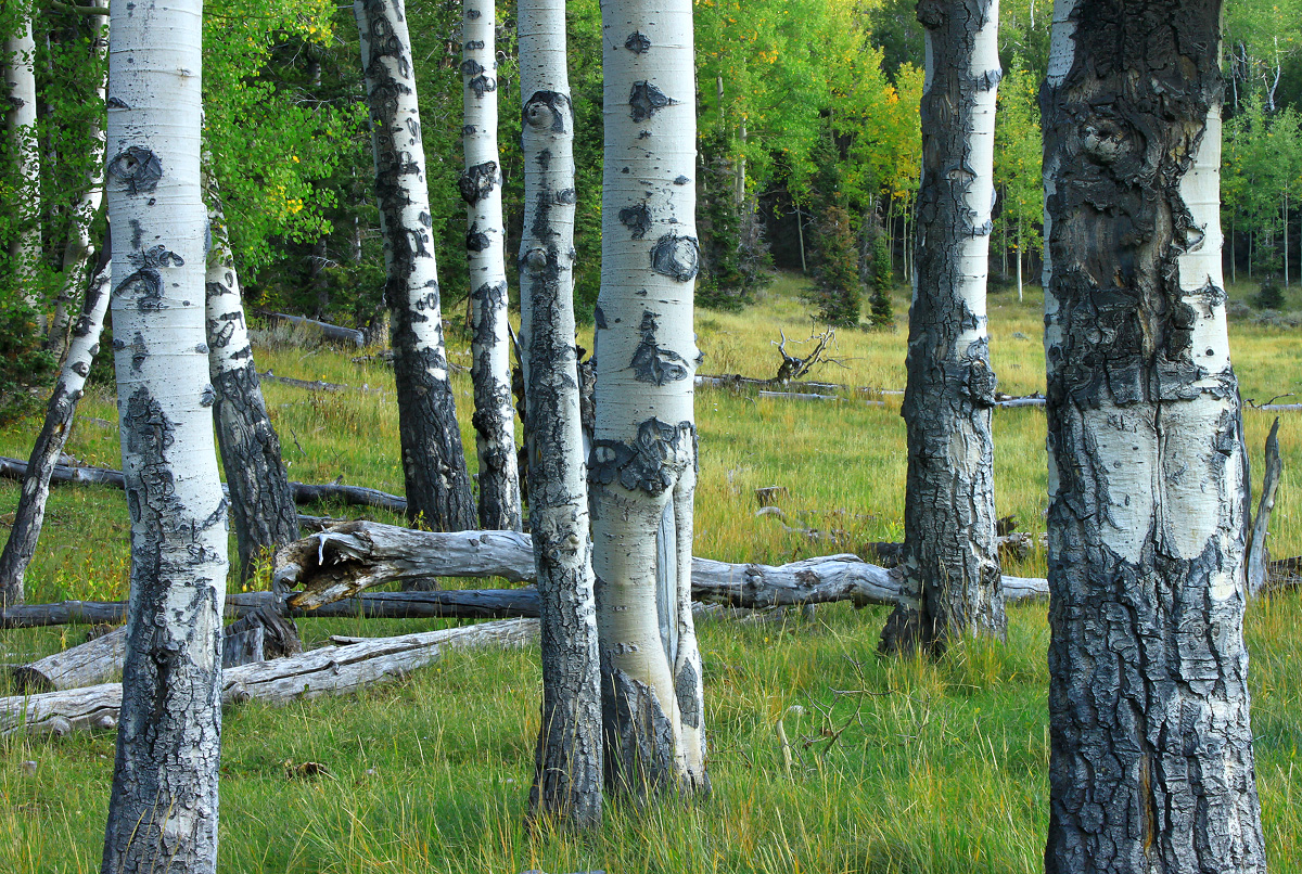
A last shot from the same meadow in Great Basin NP as my last Landscape posting. These aspens just laid out perfectly for my eye across the meadow's edge with their colorful cousins in the BG.  No eyes though! ;-)

It makes a pretty nice B+W, too.

Comments

14 comments
Comment posted by Basil Greber on November 11, 2015 at 6:51 PM
It's funny that you make about B&W - because this was one of the first things I thought about when I viewed this image. I'm sure that works pretty well. With the color version, I wonder what adding a bit of yellow to the highlights to remove the blue cast would do to it?
Registered on November 8, 2005, 219 Posts, 1340 Comments
Comment posted by D.A. Edwards on November 11, 2015 at 7:05 PM
I like to have a bit of blue on white objects in shadow (and who doesn't like blue with yellow) Basil, but that's obviously a personal thing. I see people on NPN all over the board on that particular topic and some really take it beyond what I may think is reasonable but it's all in the interpretation. It is my understanding that the camera is recording the blue reality while our eyes make adjustments "in brain" so to speak ;-) I've seen Ian Plant, for example, expound on this fact in his blog.

Here's a B+W, too....
Registered on October 8, 2014, 226 Posts, 1187 Comments
Comment posted by Alberto Patiño on November 12, 2015 at 12:30 AM
Gorgeous in both versions, although I think I prefer B&W by a very small margin. I believe this is very close to one of my favorite campsites cool - nicely done!
Registered on December 2, 2014, 278 Posts, 1736 Comments
Comment posted by gary phillips on November 12, 2015 at 12:46 AM
<div>I like both images Dave.  The thing that really makes this work for me is the superior depth of field.  Very nice,  I always lean toward the b/w sad.</div>
Registered on October 24, 2013, 185 Posts, 4136 Comments
Comment posted by Harley Goldman on November 12, 2015 at 9:41 AM
Real nice, and I prefer the B&W.  It makes it more about the geometry to my eye. Nicely done.
Registered on November 19, 2003, 586 Posts, 11271 Comments
Comment posted by Nick Bristol on November 12, 2015 at 2:20 PM
Dave, This is a great shot!! I love the depth you have here and just totally enjoy the scene. The composition works so well and it feels like I'm standing right there. Really nice work on this! 
I like both versions very much and it would be hard to pick one over the other. Great job on the b&w processing.

Nick Bristol
Lone Rock, WI
Registered on February 1, 2004, 752 Posts, 14140 Comments
Comment posted by Ryan Shain on November 12, 2015 at 6:35 PM
Hi Dave,

First of all, this image is very nice.The placement of the trees in the frame is well planned out and executed. I think the colors in the original are fine, but I think my brain processing sees blues in everything. I sometimes wonder how I am wired with this blue/cyan thing. I have to mentally ask myself if there is too much blue in this image or not, lol.

The black and white works great for me to. This image does a beautiful job of bringing me to the scene with you DAVE.
Registered on February 20, 2007, 226 Posts, 4571 Comments
Comment posted by Stephen Stanton on November 12, 2015 at 9:54 PM
I like the image and shoot similar ones when th eopportunity presents. The color shot and slightly blue white balance work best for me. My critique comment would be the two  central trees might be enhanced if they had a bit more foreground to firmly plant them in the meadow and the frame. The single dark one to the right of them seems...just about right to my eye. I enjoy the scattered deadfall too.
Registered on March 1, 2015, 54 Posts, 453 Comments
Comment posted by Albert Darmo on November 13, 2015 at 12:12 PM
Hi  Dave    As the others mentioned.. excellent  DOF,  giving  a  3D effect..      looking through the trees.i agree with  Nick.  feel's like  were standing there...  love both  versions.  but prefer the color.

Albert Darmo
Canada
Registered on November 25, 2008, 1386 Posts, 11978 Comments
Comment posted by Roel Wijtmans on November 13, 2015 at 12:28 PM
Nice juxtaposition of the white trees on the green grasses/trees, and therefore I prefer the color version. I always struggle with that blue shadow problem as well. They are blue(ish) in reality, but as you say, our brains process them differently than the sunlit parts and makes us experience them less blue. But how far we go with removing the blue is indeed a matter of taste, or maybe more a matter of displaying reality vs experience.
Registered on September 30, 2012, 116 Posts, 2257 Comments
Comment posted by Jim Greenwood on November 13, 2015 at 1:46 PM
Yes, the amount of blue cast is a matter of personal preference, and of course different people have different preferences.  And of course different people see colors differently also.  My personal preference with respect to this issue leans towards less of a blue cast than in your composition.  But as I said, that is just my preference.  That said, I don't think that the blue cast of the tree trunks detracts from your superb composition at all.  The only minor distraction for me is the trunk leaning into the image from the left border.
Registered on November 9, 2003, 229 Posts, 1523 Comments
Comment posted by Peter Richter on November 14, 2015 at 4:17 PM
Dave, I appreciate the b&w version a lot, as it conveys the subtlety of the complex composition in a most appealing way to me.

In the color version, the lush greens of the background distract my attention too much from the delicate details of the barks in the foreground.

Thanks for the possibility to compare the two versions!

Peter
Registered on November 10, 2010, 218 Posts, 2723 Comments
Comment posted by Lucy Aron on November 15, 2015 at 6:24 PM
   The composition is esp strong, esp with the contrasting lines between the uprights andthe fallens.  The trees evoke a confab of people.
Registered on February 25, 2011, 189 Posts, 1160 Comments
Comment posted by Igor Doncov on November 15, 2015 at 10:04 PM
This is one of your best images, Dave. There's a wonderful sense of space here. I personally like the bluish tinge to the trees and wouldn't change that at all. I do agree that the strong colors of the background trees are slightly overwhelming the remainder of the image. I would back off on the greens in that part of the image. Since the background is subordinate it's intensity should be subordinate as well. The sharpness of the detail throughout is a pleasure to see. It would be nice if you would provide the camera settings and anything else that was used.
Registered on November 22, 2014, 189 Posts, 2733 Comments