Gallery: FloraPosted October 26, 2015138 views9 comments
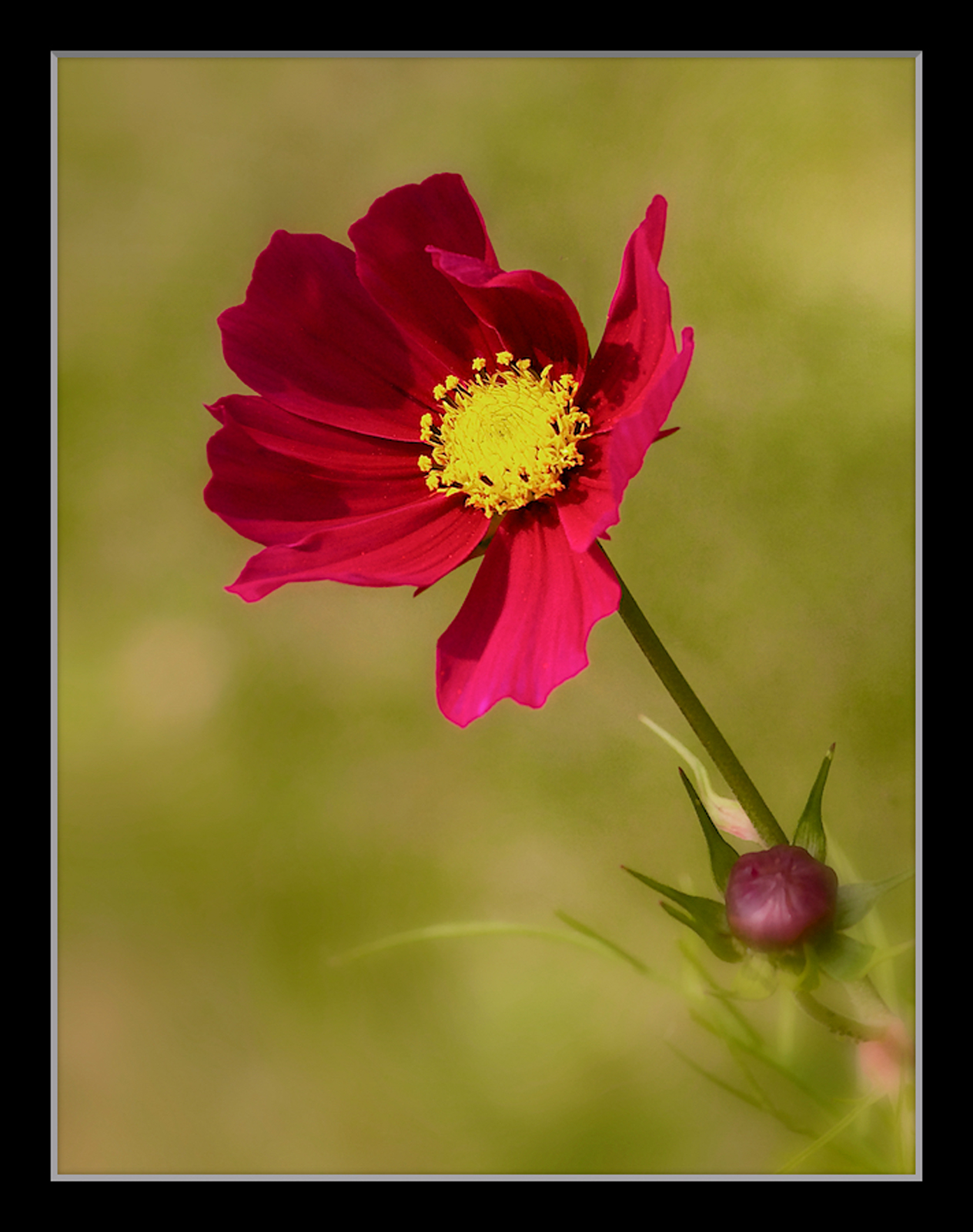
This is a reworkof an image I posted a year or two back. Canon 7D, Tamron 55-200 @ 108, 1/640 @ f 7.1, - 1ev, ISO 400
Comments
9 comments
Comment posted by Giuseppe Guadagno on October 27, 2015 at 4:43 AM
The colors of the image are beautiful as always. I love also the composition with the emerging bud in a hurry for blooming.
Ian, I am considering the effect of lowering the light and saturation of the yellow in the center; what do you think about it?
Excellent image anyway.
Registered on February 3, 2007, 827 Posts, 5052 Comments
Comment posted by Nathan Buck on October 27, 2015 at 4:12 PM
I love the color of the bloom against the BG. The bud is nice, as is the softness toward the bottom of the image. For me, I really would like more detail out of the center of the main bloom - but that could be an issue just on my monitor.
Nathan
Registered on November 1, 2003, 1101 Posts, 13589 Comments
Comment posted by Graham Brown on October 27, 2015 at 4:19 PM
I really like that background and emerging bud set on a diagonal compositio Ian. Perfect dof, vibrant colours but I'm thinking I might like to see a more uniform flower image. I guess you have done this deliberately so others will prefer the irregular petals as yourself. Graham
Registered on November 20, 2007, 275 Posts, 1365 Comments
Comment posted by Ian Wolfenden on October 27, 2015 at 4:32 PM
Thanks, Gigi and Nathan, for the comments. I think I have maybe oversaturated the centre in compensating for the web - a desat. version is attached to see what people think.
Registered on May 18, 2007, 1108 Posts, 7647 Comments
Comment posted by Philip Hodgkins on October 27, 2015 at 9:21 PM
I was going to add my two cent's worth along the same line, but the repost came with the appropriate correction for the center. I think you took a little zip out of the background as well though. One more fix to fix the fix. Personally, I think before you do anything I would look at a side by side and choose which BG, flower petals and center you like best, then make it happen.
Registered on July 24, 2006, 2741 Posts, 12349 Comments
Comment posted by Wayne Jones on October 27, 2015 at 11:43 PM
Verey effective composition, Ian, especially with the way the focus fades into the corner.
I agree with Phil's comment about limitiing changes to the center of the flower. Everything else is beautiful.
Registered on April 18, 2007, 953 Posts, 6435 Comments
Comment posted by Dennis Plank on October 29, 2015 at 10:02 PM
Nice Ian. I think you want to be somewhere about halfway between the two versions you posted. The second one has a rather dull look. I think if you just desaturated the center enough to get the detail back, you'd be about right.
Registered on January 28, 2008, 1767 Posts, 23192 Comments
Comment posted by Yun Gao on October 29, 2015 at 11:08 PM
Ian, I agree with Dennis’ comment. I like your composition and processing. It is a delightful image.
Registered on September 11, 2012, 267 Posts, 1621 Comments
Comment posted by scott lanz on October 30, 2015 at 8:13 AM
Very nice, Ian. I agree with others that, as between the two versions, the first is better except for the blown center. I would work on the center while trying to maintain everything else as is.
Registered on November 14, 2003, 840 Posts, 12902 Comments

Comments
9 commentsIan, I am considering the effect of lowering the light and saturation of the yellow in the center; what do you think about it?
Excellent image anyway.
Nathan
I agree with Phil's comment about limitiing changes to the center of the flower. Everything else is beautiful.