
by Igor Doncov
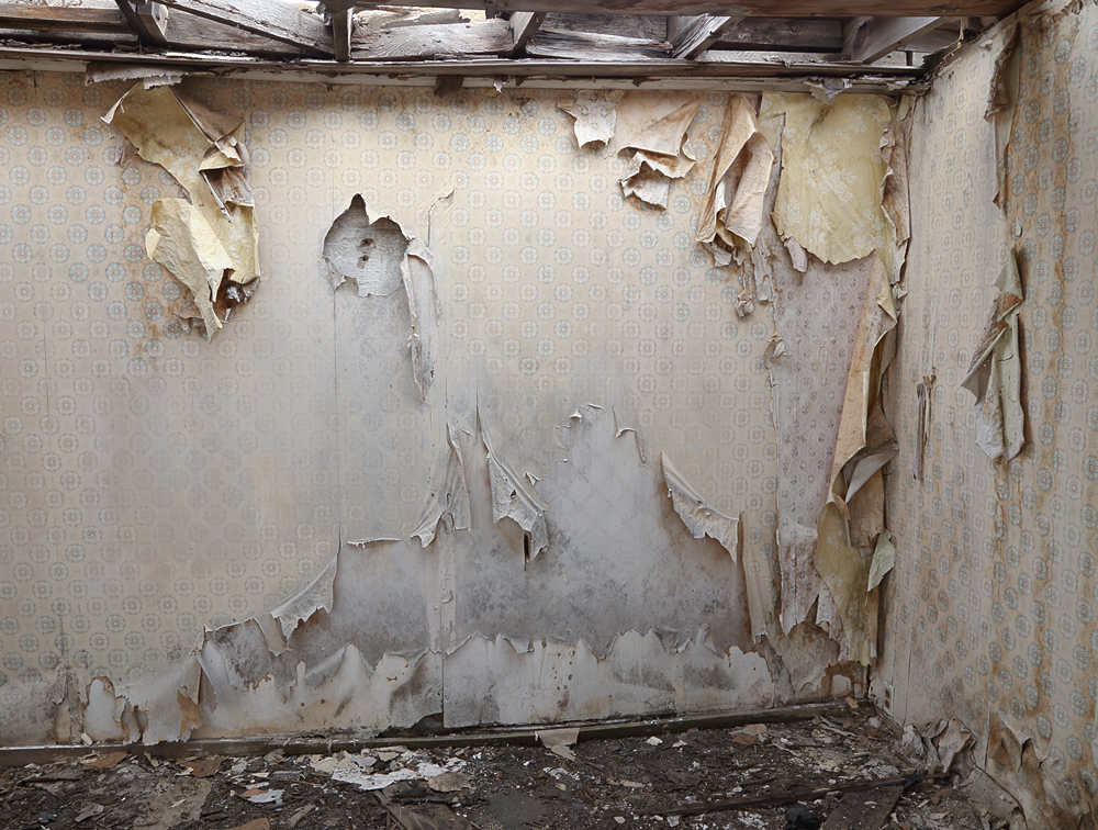
There is a gas station on Hwy 20 at Brothers that has 'No Trespassing' signs all over it. I found it irressitable. After poking around for a bit and scaring the resident cottontails this is the best I could come up with. I tried it in B&W but the color version is more appealing to me personally. What do you think?
Canon 6D, 24-105mm @24mm, 1/200 sec, F8.0, iso 800
Comments
7 commentsI think this would have worked quite well in B/W. I hope you don't mind, but I ran this through SilverEfex Pro and added a light sepia. I like the way it turned out.
I like this one, Igor. It has a lot of decrepit character. Very well done. It works well in B&W as shown by Phil, but I prefer the color version. It seems to show more ruin. And yep, getting old is a bitch.
The faded colors – lost in the B & W – add a lot to the message of the photo. I agree with your choice.
I like this. I think the color version looks very nice--the slight variations in color come across much better than the B&W. You might consider burning down the high values at the top. I hope you got some detail shots of some of the peeling wallpaper.
--P
Preston
If you are still reading this. I did take some close ups of parts of this scene. I thought that the bottom center had some great graphic potential. But when I came home it was neither particularly beautiful nor did it say anything to me. So I stayed with the large overall composition and decided to include both the upper rafters and the scattered debris on the floor. I felt they framed the wall well because it was a bit busy by itself.
Love the decaying beauty of the layers of paper on the walls, beautiful storytelling of walls that have things to say !
This is quite a scene, Igor. You got some good light in there (courtesy of the open roof?) which really shows off the current state of this old room. The subtle color is important to this scene, so I can understand why you prefer this over a monochrome version. Speaking of the composition, I like how you have managed to show both the roof and the floor, which really helps place the viewer inside the environment.