
by Wayne Jones
Please click on the image above to see a larger version.
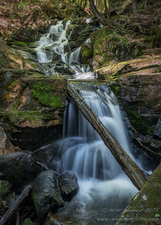
I don't think this little waterfall has a name. It's in a steep gorge that has violent floods every spring, and there are no hiking trails nearby. I have never seen a name for it on any map, so I call it Deep Shadow Falls. I was a little disappointed (but not at all surprised) to find an old pine trunk wedged right in front of the biggest drop. I could not find a camera angle to shoot around it or minimize it, so I just put the log front and center. I spent most of an afternoon climbing around the area, trying lots of angles and exposures. I like this one because of the dappled light hitting the top of the falls.
Canon 5D3; Canon 24-105 mm.
1.3 sec. @ f/16; ISO 320
P.S. Feels good to be posting again. I took a month off because I had all four grandkids at the house, and two of them came from Texas, where they moved last year. We were VERY busy; had some great times, but didn't do much nature photography.
Comments
13 commentsGreat shot, well composed. I'm good with the tree, but I might warm up the color balance a bit.
Wayne, nice to see your recent post here after being sequestered with the visiting family duties.
This small cascade area looks very inviting, especially for all us water starved CA. types. For me the steep staircase view seems to add to the vertical perspective very nicely. I'm glad you could provide the small amount of top area and allow us the view of seeing where the water cycle in the scene begins. I DO NOT find the large log at the bottom an issue at all, in fact, I really think it is a big part of adding some additional viewing interest overall.
Anyway, a wonderful image here, and as always I'm jealous of the greenery and the amount of water you all enjoy in your neck of the woods.......but not those darn mosquitos & ticks.....
btw: spoke to John B. awhile back and he is doing very well and honing his very talented skills in macro / closeup work a lot these days.
Beautiful falls. The log in front is working nicely for me. I agree with Ron about warming it up a bit, but that is a personal preference. I tend to like warmer images.
Real pretty scene Wayne. Your scouting many different angles paid off nicely. The comp looks great- just a couple of suggestions. I tend to like clean borders- the pale rock on the left could probably be darkened as not to attract the eye out of your scenes flow. I would also probably clone out the leaf near your watermark- it not being much of an element you want to bring attention towards. Lastly the image feels a bit flat saturation wise. I would selectively use a saturation brush in areas similarly to dodging and burning- rather than an overall saturation. I would bring the gold and orange color in the leaves up in the top of the image especially.
Because of the dominance of the log the image has 2 parts - above the log and below the top of the log. The composition to seems stronger if you crop just at the top of the log. The new design includes the diagonal log, the wedge on the bottom right, and the round glistening rocks on center left. With the water peering through. A marvelous image. Keep it blue to preserve the hues of light in shadow. Just my 2 cents from seeing this through an iPhone.
Very nice scene, Wayne. The log doesn't bother me. I might be tempted to cut back on the blue/cyan in the main fall and the adjacent rocks just a bit. I think that would add to the warmth. I like the perspective and the bit of forest at the top which gives the image a nice sense of depth.
--P
Wayne, nice composition, saturation of the colors and shutter speed.
The comp excels! The step-ladder cascade fills the frame and has a strong sense of movement. I like some of the prior ideas to add oranges to the leave...a little movement away from the flesh-skin tones on the top half. I do notice that the water in the lower half has a nice blue tint...but above it, greenish tint is more dominant. I might try to shift that top portion aligned to the blue below. This is a real winner...
Pretty scene, the log doesn't bother me at all. The contast seems flat, so a bump in that might help. The brightest parts of the falls could go almost white - things look a little grey. Just name the falls after yourself
I too like the log a lot for providing some dramatic depth in front of the water and leading the eye to the upper cascades. On my monitor the color looks quite natural for a scene such as this although the upper left corner color looks a bit muddied. Were there some bright spots in the sun there that got burned down a bunch? Very minor nit on an evocative image of an upstate forest.
I'll echo the sentiments about the tree....it makes the scene very natural and adds a sense of the extreme terrain. The details at the top are amazing...the light, the trees, the bend in the creek. The water looks a tad bluish, but the rest feels like a very natural color temp for this kind of woods. Very nice work!
Wayne, this is very nice and I'm glad to see you back posting. I love everthing about this image, log and all. Like Paul, I'm envious of the cool feel of the falls and the surrounding forest. Pretty dang hot out in this part of the country. I'm on a haitus from posting due to a computer meltdown. I should be back on line soon.......thank god.
Very nicely developed and presented, Wayne. It gives the place a wonderful character.