
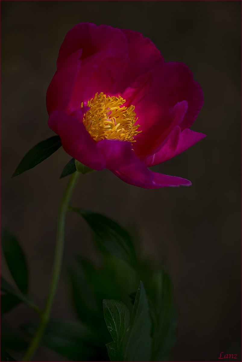
by scott lanz
I am looking for comments/suggestions on the background and overall light/contrast, bg color, and overall image. Should bg be darker, lighter, or is it OK? Should the bg be warmer, cooler (more neutral), or is it OK?
Peony, Fellows Riverside Gardens, Youngstown. D600, Sigma 150, hh, 1/800, f4, iso 200, cpl. Natural filtered morning light. 5/30/15. Comments, suggestions, and questions welcome. 
Edit: I should have also noted that the bg is natural (shaded mulch/dirt).
Comments
15 commentsScott: Really like the light on the center and the overall dark color palette. I pretty much like the BG as is. Perhaps a tiny bit lighter for a bit more separation of the flower but I agree with your choices. Well done.>=))>
An air of mystery & sophistication, the pervasive darkness forces one to look deep inside towards the light..
And that's the truth
I would not change a thing Scott, a work of art as it stands.. Very nice
I am mostly happy with this as is, but I would like to see a bit more brightness in the rest of the plant. The BG is fine, as is the color temp. I realize that art leaves a wide and subjective basis in the matter of lights, darks, contrast, etc., and that this is certainly within those bounds. It still needs to be able to allow suspension of belief by the viewer. For my part, a little brighter is more believable. But I am also sure others might disagree. That's art!
Thanks Bill, Howard, and Phil. Here's a version with a bit more exposure for the flower. Preference?
Scott: I'll give a 51-49 preference for the original. Just like the darker palette after seeing the repost. >=))>
And I'll go the other way!
Scott, just MHO, I like the first one best. I agree with Howard that is presents a feeling of haunting beauty. Well done.
Hi Scott I guess i'm influenced by the old masters , and their use of soft natural light to create beauty. so i vote 100% for the first version.. Scott.... you have created a work of art

Albert Darmo
Canada
Scott, I like the lighter BG in the second one, but wish to reduce a bit the light in the flower center. The BG has a painterly look. Very nice!
Scott, Put me down for favoring the second version. The flower's center is very nice.......................................Jim
Scott - For me this is somewhat of a hybrid between painting and photograph (in a good way). I cannot imagine you were blessed with this crazy good light (filtered and falling on the center). And full marks to you for making excellent use of it.
Depending on the mood that is intended to be conveyed, background can be darker or lighter. This one reminds me of sun has just risen. Time to wake up. My immediate reaction would be to lighten the background but the more I see it (your version) I am beginning to back off from lightening it.
Just saw the lightened version --> I much like the original.
A masterly presentation, Scott ! The repost is fine, but I do prefer the original for its darker mood with the light wholly on the flower centre. The leaves and bg textures add so much to the drama and are definitely not too dark for me - excellent flora photography
The 'redux' is unnaturally bright for my taste.. Or did someone turn on the spotlight?
In that case, please disregard

I really like how you've worked the lighting here for a different and original presentation - the comp is also spot on. Well done.
OK.... I am another one in the hybrid camp: Overall I prefer the second version for viewing on the web....but, I would tone down the brightness of the yellow center to somewhere between the two.