
by Ryan Shain
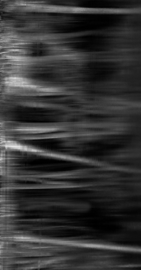
This image was captured at the Morton Arboretum. The same week I captured my spring images already posted on here. I was out basically 7 days in a row with some sweet weather. This image was captured at the very end of the day with light fading and darkness entering. I was fascinated by the reflections of the night in the water. This image is rotated from the original, so I am not sure if it should be in photo art. The image was blurred form the start because of a long shutter, but I just saw the possibility of a black and white conversion, and I really like how it layers in the vertical format.
What do y'all think? The larger version shows better 
This image is definitely not for everyone, but I love to experiment and see what works for people.
Thanks for making some time to have a look, and leave a comment if you fancy it
Canon 70d, iso 400, 6 seconds, f/11, 70-300 IS, cable release, tripod, Conversion with Lightroom and Photoshop CC
Comments
12 commentsThis is very different, Ryan. I really like it as art - I wonder what it would look like in the original orientation? And have you considered a colored version with very gentle saturation? Just some ideas- that would probably result in an image that transmits a very different message from this one. I can see this version as a beautiful large abstract print, though.
Well I love abstracts Ryan so this works for me. I do wish that there were a few more whiter tones on the right but that is a personal preferece.
Very creative, Ryan, but the vertical comp is not really working for me. However, if I rotate it 90 degrees CW, I think it becomes a really great abstract in my eyes. Looks almost like some sort of scan you might get from a hospital, hehe.
Interesting. Actually like it vertical, I think it may lose impact otherwise
I like this a lot. I did take a look at it rotated in various ways and I think I like it best horizontal with the whiter part at the bottom. But it works well as presented. Nice abstract take! Good creativity.
rotated with white at bottom
thanks for the input on this one
I will probably post the original color version later this week
Hi Ryan, This is different from you and I was having a hard time deciding what I really thought of it. I have looked at it a few times and now actually quite enjoy the abstract quality of it. I was thinking like Harley and Roel about rotating it and now I see your repost which I think works great! I think having the white on the bottoms works very nice and it would probably make for a pretty interesting print. Cheers, Nick
The repost works great for me!! I like this one a lot.
Yep, the repost for me. Love the abstact with the white on the bottom. Very cool experiment.
Now that you've reposted your image I feel much better about commenting. It is so much better than the original. Now I know what I'm seeing. The lesson, I guess, is that an abstract should have some suggestion of reality. It's an abstraction of reality.
I really like the repost Ryan.
Interesting experiment, Ryan, the vertical post is much more abstract because it's source is not recognizable. When you rotate, I recognize this as a tree trunk reflection. I think that bit of recognition helps a lot in making it interesting, but that could be familiarity. I do wonder how increasing the brightness in the right half of the original post would work. The vertical version, because it's not recognizable, has quite a ghostly feeling.