
by D.A. Edwards
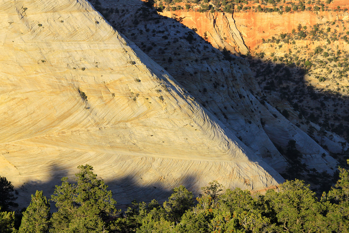
A couple of miles into the Zion backcountry, on the south end of Checkerboard Mesa, from the campsite where I took the tent/Orion shot in the recent WC. The cross-bedding on that massive rock is truly amazing. Not sure about the comp and the light is quite strong coming right over my shoulder but it is a different look from Zion than the usual locations.
Comments
10 commentsBeautiful colors and details. The composition, for me, is good with this diagonal line from corner to corner that brings a big contrast with the fine lines found on the rock. I like it.
I like the composition just fine, Dave. I can understand why you were attracted to this. The texture on the side of that cliff is really remarkable. The large version helps you appreciate that. I don't think the light is that harsh but having it being frontal makes it more challenging. There are some cool streaks of orange on that yellow that could be teased out in photoshop. It's really nice the way it is, however. The trees on the bottom provide a nice foundation for the composition.
I think the comp is fine but the hard bright area of rock face tend to keep me from entering and exploring the entirety of the image. The suggestion of bringing out more detail in that area may help to resolve this.
Large photo is a must, it really shows the patterns on the rock, which is very nice. Looks like a great opportunity for some intimate abstracts of the rock!
The strong light works very well for me, Dave - it is a very realistic depiction of a Colorado Plateau light. And the detail on the cross bedding in the large image is off-scale
The larger image really shows the wonderful detail and patterns in the stone. I think I understand your concern for the composition The foreground trees get in the way, don't they? If the shadow area was actually darkened it might provide a better depth and make the sunlit redrock in the background more prominent. A vertical format or crop might work. I like the image, Dave. There is a lot to work with from this particular location.
I like the mix of the warm and cool but overall, I am a bit on the fence over the composition. The wall and the trees work for me or the wall with the shadow and the warm tones, but all together I am not quite sure.
Appreciate everyone's comments on this which echoed my trepidation with the comp. I have to agree that something doesn't feel right. I did see the trees at the bottom as a foundation for the rest of the image. Per the above, I did consider a square-ish crop from the left which would make the main diagonal work better for me but then I'd be losing so much of that fascinating cross-bedding. The crop might however make it more noticeable. Thanks again.
Hi Dave,
This image makes me want to go explore Zion again, and I think the image works okay, but I have seen more compelling images from you. What I really appreciate about this image, is the cross-bedding in the rock. That area is fascinating, and could make for some compelling intimates. The cropped image does works better for me, and I do enjoy that presentation much more. I still think that cross bedding has a load of possibilities in it.
Your repost is a significant improvement. You were well advised with that suggestion. Not only is the layout superior but the texture of the face is more evident due to it's prominence and better lighting in that part of the image. That ridge line is the heart of the image IMO.