Nature Photographers Network
This is the preserved archive of the original Nature Photographers Network. The community continues at naturephotographers.network.
The first light
‹ PreviousLandscape GalleryNext ›

The first light

by Roel Wijtmans

Gallery: LandscapePosted March 31, 20151,324 views10 comments
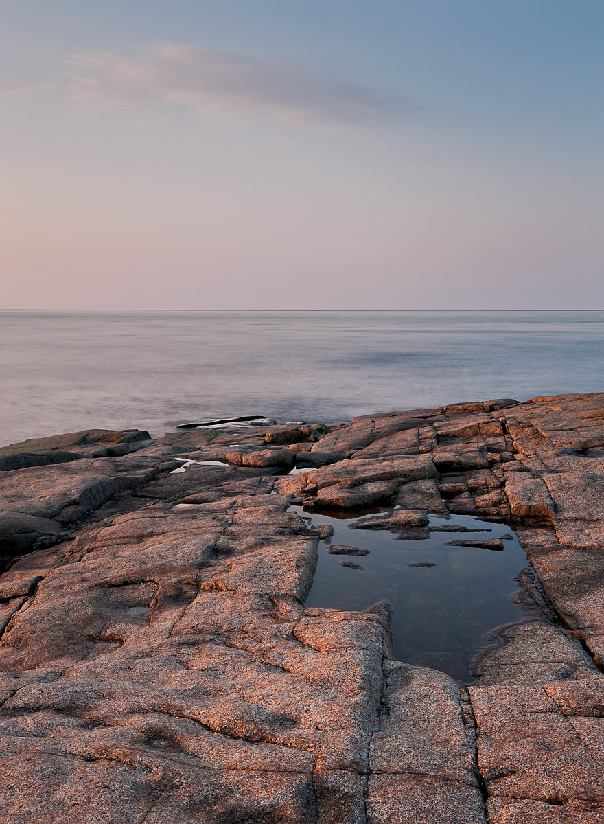
I am curious for your thoughts about this one. I have my thoughts of course, but I want to know what others think. One early morning at another great campsite at the sea!

35 mm, f/18, ISO 200, 5 sec, ND6.

C&C welcome, large version is included!

Roel

Comments

10 comments
Comment posted by Ronald Murphy on March 31, 2015 at 1:18 PM
The sky, of course, could be a bit more fun, but the calm sea and warm morning light work nicely for me. There is great texture in the rocks too.
Registered on March 13, 2012, 279 Posts, 975 Comments
Comment posted by Philip Hodgkins on March 31, 2015 at 4:14 PM
I believe if you cropped about 25% from the top and applied a digital ND grad of a further -1.5 to the remainder of the sky, you might further remove some of the bland from this otherwise fine morning shot. :smile:
Registered on July 24, 2006, 2741 Posts, 12349 Comments
Comment posted by Kah Kit Yoong on March 31, 2015 at 9:43 PM
I agree that the brightness of the sky makes it somewhat bland. The warm light on the foreground is really nice.
Registered on September 27, 2006, 636 Posts, 10682 Comments
Comment posted by Alberto Patiño on March 31, 2015 at 10:57 PM
Roel,

I don't object to the sky tones, as I believe that they fit the mood very well - more contrast would ruin the peaceful feeling, I think. I do have two "nits": the sea looks a bit too bright, and the dark line on the horizon look unnatural (but I'm not sure what you can do about this). I'd love to have been camping there, though!
Registered on December 2, 2014, 278 Posts, 1736 Comments
Comment posted by gary phillips on April 1, 2015 at 1:36 AM
An interesting and stark image. I guess we all view these types of photographs differently, which is a very good thing. This is one of those, "if this were mine", sort of exercises. If this were mine, I would try to draw just a little more attention to the sky and to the cloud in particular. As is, for me, at this point in time, I think the foreground is overwhelming the rest of the image. I do like the subtle colors and the overall mood. It has an appeal that is hard to put my finger on. :confused:
Registered on October 24, 2013, 185 Posts, 4136 Comments
Comment posted by Jim Hansen on April 1, 2015 at 3:37 PM
Love the foreground rocks Roel. I also like the texture created in the sea by the long shutter speed. The sky is a bit too empty for me, though it does have some nice color. I wonder if it would help if that cloud was a little bolder. On the other hand, the more I look at it the more I appreciate the subtlety and simplicity of this image.
Registered on May 5, 2011, 161 Posts, 908 Comments
Comment posted by Dietrich Gloger on April 2, 2015 at 1:53 AM
Works for me! "Stark" as Gary commented fits well as description. I like it and I think you did well using very basic ingredients to make an image that conveys "something".
Registered on January 26, 2007, 360 Posts, 9876 Comments
Comment posted by Igor Doncov on April 2, 2015 at 2:20 PM
I usually avoid vertical images where the horizon bisects it in half. It's a problem with horizontal images but more so with vertical. With this image I would make a commitment either to the sky and make it about the sky or about the rocks and crop much of the sky out. For my taste I would crop from bottom creating a three layer image - rock, sea, and sky with the sky dominating as the largest layer but the rocks providing a strong counterpoint because of their richer tones and texture.
Registered on November 22, 2014, 189 Posts, 2733 Comments
Comment posted by Tony Kuyper on April 2, 2015 at 10:43 PM
I like the comp with the focal points of the pool and the cloud. The dark line on the horizon seems a bit strong.
Registered on November 1, 2003, 364 Posts, 22328 Comments
Comment posted by Ken Henke on April 10, 2015 at 7:12 PM

The foreground is just great with nice light and texture. But for me, the sky and water as just a bit flat. Maybe some significant levels/curves work just on the sky and water to bring out some richness? Cropping out some sky could also benefit this image and put the focus on the gorgeous foreground. 

Registered on February 20, 2012, 117 Posts, 285 Comments