Nature Photographers Network
This is the preserved archive of the original Nature Photographers Network. The community continues at naturephotographers.network.
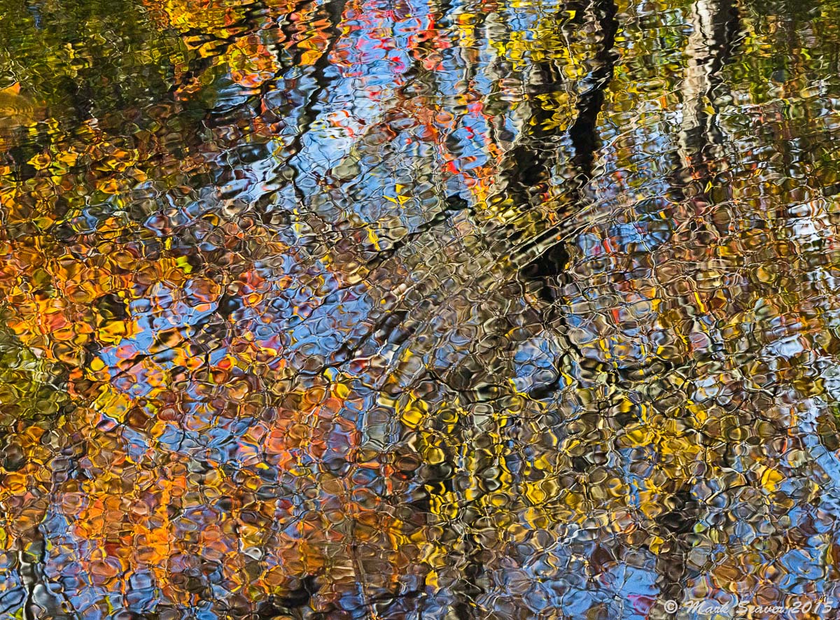
Rippled Fall Canal
‹ PreviousWeekly Challenge GalleryNext ›

Rippled Fall Canal

by Mark Seaver

Gallery: Weekly ChallengePosted March 1, 2015240 views6 comments
Here's a look at fall colors reflected in the C&O canal and distorted by a modest breeze. This week's challenge has me channeling Donovan's song "...may as well try and catch the wind." (5D3, 70-200 f2.8 @ 140mm, 1/160, f/20, iso 6400, tripod & polarizer) Needed big dof and high shutter speed to get the ripples sharp from edge to edge.

P.S. I met Eric Stensland and his young son, last spring catching a RMNP sunset from Trail Ridge Road and as is often true for RMNP there was a steady wind that blew clouds in and hid most of the sunset. It was clearly a special time for Eric and his son acting as dad's helper.

Comments

6 comments
Comment posted by Alberto Patiño on March 1, 2015 at 1:05 PM
Beautiful complex patter given by crisscrossing ripples!
Registered on December 2, 2014, 278 Posts, 1736 Comments
Comment posted by Patricia Brundage on March 1, 2015 at 1:29 PM
Always love the variety and design of the reflections. The moving water has made a Monet style design. Wonderful!!
Registered on March 23, 2006, 1111 Posts, 6531 Comments
Comment posted by Mark Seaver on March 1, 2015 at 2:32 PM
Here's a rotated version. Does the orientation matter?
Registered on January 23, 2011, 1103 Posts, 17270 Comments
Comment posted by Gary Minish on March 1, 2015 at 7:14 PM
Another great colorful abstract, Mark! It's interesting how the rotated version is immediately recognizable as trees whereas the posted version is more abstract and I tend to focus more on the shapes, colors and textures. Nicely seen and shot! :toast:
Registered on February 4, 2006, 625 Posts, 3583 Comments
Comment posted by Allen Brooks on March 3, 2015 at 12:37 AM
Great colors and patterns. Love it. I think the first one works better as an abstract. Also, the brighter leaves in the first photo capture my eye and then lead me into the rest of the photo. Whereas in the second photo my eye is drawn to the brighter leaves and tends to stay there.
Registered on July 27, 2011, 262 Posts, 2597 Comments
Comment posted by Albert Darmo on March 3, 2015 at 10:11 PM
Hi Mark :wavey: I agree with garys comment :eek: :jump: :eek: Both versions have stunning color and detail. love them both :toast:


Albert Darmo
Canada
Registered on November 25, 2008, 1386 Posts, 11978 Comments