Nature Photographers Network
This is the preserved archive of the original Nature Photographers Network. The community continues at naturephotographers.network.
Glacier Lake (III) (+repost)
‹ PreviousLandscape GalleryNext ›

Glacier Lake (III) (+repost)

by Basil Greber

Gallery: LandscapePosted February 10, 2015599 views7 comments
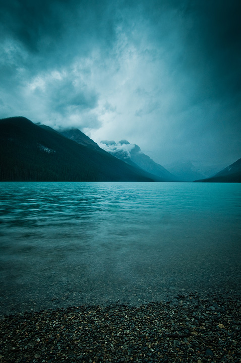
This has been setting on my hard drive for more than two years, and I've apparently never looked at it. So, I've recently "re-discovered" and processed it, and I quite like the result. I think it captures the feeling of being there quite well - it was dark, cold, and windy, and the only thing that kept my mood in a reasonable shape was the pot of hot pasta I had gobbled up before taking this shot. :smile:

Nikon D90, 12-24/4 DX, tripod (it was pretty dark already).

Comments

7 comments
Comment posted by Roel Wijtmans on February 10, 2015 at 3:09 PM
I like the mood that is present in this image a lot, really dark and almost foreboding. It's a bit too green for my taste though, I think a more blueish image would work even better in expressing the mood. Other than that, I would definitely not change anything!
Registered on September 30, 2012, 116 Posts, 2257 Comments
Comment posted by Alberto Patiño on February 10, 2015 at 6:00 PM
It is very moody, Basil, and I like the illumination quite a bit. I too find the white balance a bit disconcerting, though. I would try either a less greenish cast, as Roel suggests, or go a different way altogether and make it warmer, perhaps by cancelling the color of the low clouds around the peak in the center. I hope this helps! :wavey:
Registered on December 2, 2014, 278 Posts, 1736 Comments
Comment posted by D.A. Edwards on February 11, 2015 at 5:23 PM
I see the green also that others have mentioned although I have no problem with it particularly if the lake was that color in real life. Sweet comp with some effective vignetting. :toast:
Registered on October 8, 2014, 226 Posts, 1187 Comments
Comment posted by Harry Lichtman on February 12, 2015 at 4:48 PM
I would agree with the other posts that a little less cyan and more blue would create a more realistic feel yet contain the mood that you felt. Now Pasta sounds like a good combo!
Registered on September 17, 2010, 304 Posts, 3507 Comments
Comment posted by Basil Greber on February 12, 2015 at 6:33 PM
Thanks for all your comments! For some reason, I am somewhat fond of the "electric" color cast, but maybe a more natural blue version is worth thinking about. Please have a look...
Registered on November 8, 2005, 219 Posts, 1340 Comments
Comment posted by Ryan Shain on February 12, 2015 at 9:53 PM
Hi Basil,

The re-post sings bright and loud, and the blue tones go so well with the mood the scene conveys. I really enjoy the transition of layers in this image. The layers transition with texture, color and light, and they all work wonderfully together.

Sweeeeeeeeeeeeeeeeet image :toast:
Registered on February 20, 2007, 226 Posts, 4571 Comments
Comment posted by Mark Metternich on February 17, 2015 at 1:41 AM
Nice shot! Love the revision. :toast:
Registered on June 19, 2009, 276 Posts, 6240 Comments