Nature Photographers Network
This is the preserved archive of the original Nature Photographers Network. The community continues at naturephotographers.network.
Endless Motion+
‹ PreviousLandscape GalleryNext ›

Endless Motion+

by Navin Sarma

Gallery: LandscapePosted January 15, 2015352 views21 comments
I've used this title many times but... ya know.

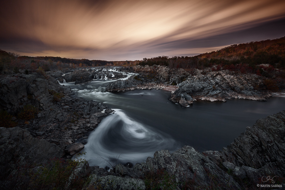
I shot this in late 2010, when my photography training wheels were just coming off. It was this particular night where I felt inspiration like none I had ever felt before, as I saw the massive eddy take shape after experimenting with long exposures. More on the blog on all that.

This image is a two exposure high dynamic range (HDR) shot; one image for the landscape at f/11, 2 min and one for the sky at f/4 and 4 min 20 sec. This allowed me to capture quality light in both the landscape and sky with optimal depth. While I didn’t plan for this final image to be the result of these two exposures, I am glad that I was able to make it work!

Still not sure if I love the balance of colors in this image. While the fall foliage on the right is compelling, I am not sure that the reds/oranges work well with the more yellowish sky and the teal water. I may try a B&W rendition to see how that works. In the meantime, your thoughts are certainly appreciated!


Comments

21 comments
Comment posted by Keith Bauer on January 15, 2015 at 11:01 AM
I think this is very interesting. The two long exposures certainly add to the mood for me. It feels like a B&W merged with a color image. The land part of the image is almost all monochromatic while the sky is color. I think your thought of a complete B&W is worth the effort. My guess is that is will be stronger. The fall foliage on the right that you mention is sufficiently dark that I didn't even notice until I read your description.
Registered on November 20, 2003, 458 Posts, 4836 Comments
Comment posted by Roel Wijtmans on January 15, 2015 at 11:40 AM
Very nice! It's an uncommon color combination, but it works for me. Although warming the land a bit would maybe look a bit more natural? I would however like to see more detail in the land, it feels too dark compared with the brightness in the sky. Would be interesting to see a B+W version!
Registered on September 30, 2012, 116 Posts, 2257 Comments
Comment posted by Aaron Feinberg on January 15, 2015 at 2:56 PM
Very cool. Love the lines and textures going on here. Nice work.

aF
Registered on October 26, 2009, 399 Posts, 2789 Comments
Comment posted by Mark Metternich on January 15, 2015 at 4:56 PM
See larger image!!! So cool man!! So surreal. :toast:

My only suggestion is the slight halo looking horizon line. Looks a little desaturated and haloish. I'd consider trying to do some advanced subtle color and tone work there to make that stand out less.
Registered on June 19, 2009, 276 Posts, 6240 Comments
Comment posted by Lucy VanSwearingen on January 15, 2015 at 5:05 PM
Very interesting sky. But, the land and water have beautiful tones of gray and the same red found in the sky. I would bring those colors out...otherwise, IMO, you have a very interesting sky above a dark space. What goes on in that dark space looks, absolutely, fascinating. Unlock that potential, and you will have an outstanding work of art!
Registered on May 23, 2009, 800 Posts, 2042 Comments
Comment posted by Aaron Feinberg on January 15, 2015 at 5:07 PM
ps. im seeing a tilt to the ccw...might be just the landscape but check to see how it looks with a degree back cw
Registered on October 26, 2009, 399 Posts, 2789 Comments
Comment posted by Richard Teller on January 15, 2015 at 6:20 PM
I like the very interesting lines, the depth and the way the water takes the eye into the image. It does have a surreal feeling. I like the different colors. I also like the composition. The one thing that I think would strengthen it even more would be to have more detail in the darker parts of the image.
Registered on August 23, 2010, 1162 Posts, 6692 Comments
Comment posted by Dan Kearl on January 15, 2015 at 8:17 PM
Other worldly Navin, maybe my favorite of all the work I have seen from you.
Unusual terrific sky color and the dark and foreboding land.
Very nice work.....
Registered on September 2, 2013, 209 Posts, 1514 Comments
Comment posted by Gary Gosewisch on January 15, 2015 at 9:01 PM
I think this is a bit dark. There are some very interesting textures here. It would be nice to see what it would look like if you pushed the exposure a bit.
Registered on June 3, 2012, 17 Posts, 59 Comments
Comment posted by Navin Sarma on January 16, 2015 at 12:29 AM
Thanks, all, for your thoughts so far.

To achieve a bit more color cohesion I warmed up the foreground per Lucy's comment. Also applied a very slight amount of burning and fixed the tilt. I did try to reattack the seeming halo on the right ridges, may try a little more later... but in general, the light pollution was coming in from near the horizon which makes this difficult. Before I proceed to a B&W version, may I ask which of these two you prefer?

REPOST

Registered on July 17, 2011, 233 Posts, 1373 Comments
Comment posted by Alberto Patiño on January 16, 2015 at 12:23 PM
I think that the exposure and color balance between sky and water works very well!
Registered on December 2, 2014, 278 Posts, 1736 Comments
Comment posted by R.Bill Moser on January 16, 2015 at 3:53 PM
Cool image and well executed.
Registered on January 29, 2010, 285 Posts, 4281 Comments
Comment posted by Lucy VanSwearingen on January 16, 2015 at 9:44 PM
My suggestion was to open up the shadows on the rocks and the pretty foliage. You seemed to have just increased the red and decreased the blue in the shot. The original colors were perfect. The blue of the water is much more elegant in the first photo. Go back to the first photo and just, selectively, lighten the landscape without touching the color palette. the blues and grays in the rocks of the first photo were perfect, too.
So, if you only give me the choice of the two, I'd have to say the first one. But, they seem only different in hue, not in contrast or highlighting. :confused:
Registered on May 23, 2009, 800 Posts, 2042 Comments
Comment posted by Albert Darmo on January 16, 2015 at 11:03 PM
Hi Narvin Even the title works for me. Your interpretation of the light and color here, adds a wonderfull mood to the scene .


Albert Darmo
Canada
Registered on November 25, 2008, 1386 Posts, 11978 Comments
Comment posted by Roel Wijtmans on January 17, 2015 at 2:21 AM
The repost is a big improvement for me! Makes the whole image more coherent. Really cool shot!
Registered on September 30, 2012, 116 Posts, 2257 Comments
Comment posted by Navin Sarma on January 17, 2015 at 9:55 AM
Hi Lucy, thanks for your thoughts. I think it was actually Roel's comment that I was addressing so I understand why he might like the result :) Since these shots were about 30 min apart, the light temperature did change a bit from cool to warm, and I think that I was already struggling with how the teals and blues mixed in with the oranges yellows, so I think I'm a bit more comfortable with the repost version... but I do appreciate your honest opinion an your critique
Registered on July 17, 2011, 233 Posts, 1373 Comments
Comment posted by Nick Bristol on January 17, 2015 at 11:42 AM
Navin, This is really a wonderful image. I looked at the repost and absolutely loved it. I'm for that one! This has such great drama and mood and I would love seeing a much larger version. I also think this is looking like it would make an awesome print! :toast:

Nick Bristol
Lone Rock, WI
Registered on February 1, 2004, 752 Posts, 14140 Comments
Comment posted by Jared Warren on January 17, 2015 at 3:33 PM
Wonderful, Navin! Good feedback already provided, but overall I really like the energy. No complaints from me on color. :toast:
Registered on May 11, 2012, 84 Posts, 931 Comments
Comment posted by Mark Seaver on January 18, 2015 at 10:54 AM
Navin, I sure like the sky and the sense of motion in the river that your long exposure has created. I like the colors in the sky and in the fall trees on both sides of the river. I find my interest mostly in the right 80 - 85% and think that cropping the darkest area on the left improves the balance. I like the repost significantly better, but some of that may be that the larger viewing size means more shadow detail, which is really important here.
Registered on January 23, 2011, 1103 Posts, 17270 Comments
Comment posted by Daniel Rappaport on January 18, 2015 at 11:27 PM
Beautiful image, well done. Love that sky.
Registered on September 9, 2009, 294 Posts, 2006 Comments
Comment posted by Kah Kit Yoong on January 27, 2015 at 9:05 AM
Surreal and moody. What's not to like!
Registered on September 27, 2006, 636 Posts, 10682 Comments