Nature Photographers Network
This is the preserved archive of the original Nature Photographers Network. The community continues at naturephotographers.network.
Silver and Blue + rp
‹ PreviousLandscape GalleryNext ›

Silver and Blue + rp

by Preston Birdwell

Gallery: LandscapePosted January 2, 2015243 views19 comments
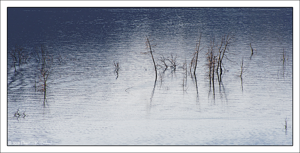
This is my first image of this new year, taken on New Year's Day. This is New Melones Lake in Tuolumne County, CA.. The ongoing drought in CA has greatly reduced the water level, allowing old trees to be visible.

I liked the reflected blue and the silver sheen on the sunlit water. This image was a total experiment, so I am interested in how it works for you from a composition, tonal, and color standpoint.

Nikon D-7100
Nikkor FX 70-300 @ 300mm
TK's Luminosity Masks and Cloud Sharpening actions.
Cropped to pano.

Please see the large version. Thanks!

Your thoughts are always appreciated. :smile:

Happy New Year, everyone!

--P

Comments

19 comments
Comment posted by Ian Cameron on January 2, 2015 at 7:21 PM
I like this one. My sort of gentle pastel colours and simplicity and a contrast level that is kind to the eyes. If anything I would shave just the narrowest sliver off the top edge of the picture as that lined pattern on the water is just starting to break up at the edge. Everything else just fine though I must admit it would have been lovely if your pool of light had extended a fraction further to the left and up so that the left side edge twiggery would separate just a tad more from the dark shaded water.
Registered on August 6, 2004, 1125 Posts, 3318 Comments
Comment posted by Igor Doncov on January 2, 2015 at 8:59 PM
I would say your experiment was a success. This creative, simple composition has a delicate feeling. The limited color pallete supports this simplicity. The browns and blues work well together. And the vertical twigs nicely offset and balance the horizontal bands of water.

I actually like the twigs close to the borders, bottom right and left side. I think they make the composition richer.

Don't know what to suggest. A B&W interpretation would probably be inferior.
Registered on November 22, 2014, 189 Posts, 2733 Comments
Comment posted by Alberto Patiño on January 2, 2015 at 11:16 PM
Preston, I find the tonal and color aspects beautiful, From a composition point of view, I wonder if the image could be made stronger by having larger trees, even if that means having less trees. For example, cropping the trees on the left all the way to the middle of the patch of water with no trees, and perhaps the small tree close to the right edge. That way you could make the main group of trees more prominent. Of course, it would no longer be a panoramic crop, and that may not be what you intended in the first place..... :smile:
Registered on December 2, 2014, 278 Posts, 1736 Comments
Comment posted by gary phillips on January 3, 2015 at 12:40 AM
i like the experiment, Preston. i think if it were mine, i would crop out everything outside of the main group of trees. I like a tighter shot that takes into account the linear ripples and the light around that set of trees and their reflection. I t really feels too stetched out to me but I can see what you were thinking.
Registered on October 24, 2013, 185 Posts, 4136 Comments
Comment posted by Catherine Reilly on January 3, 2015 at 4:47 AM
Hi, Preston,
I like the tonal range, except that the tree tops get lost in the dark blue on the left. For a drastic suggestion, how about cropping about 1/4 of the image off the left… :eek: Then, to me, it looks a little over-sharpened, which is good if abstractness is what your trying for. Otherwise, might ease off the sharpening a tad for a more peaceful look. Depends on what you're after. Has the makings of an Asian influenced painting mood/look.
Registered on August 16, 2006, 603 Posts, 9192 Comments
Comment posted by Bill Dark on January 3, 2015 at 9:30 AM
The soft shimmer is very relaxing to me, but I think cropping the group of tops on the left might focus more attention on the larger ones. I also feel that the wave interference coming in from the left distracts to some degree. Overall, this is beautiful to look at. I think your experiment was a success!
Registered on May 27, 2005, 148 Posts, 1121 Comments
Comment posted by R.Bill Moser on January 3, 2015 at 12:17 PM
I love your experiment. I turned out really nice. Love the simplicity and the soft pastel colors. Beautiful work
Registered on January 29, 2010, 285 Posts, 4281 Comments
Comment posted by Ed Lowe on January 3, 2015 at 12:17 PM
Works for me, Preston. I like the color combination along with the lack of scale in the scene. I could also see this working with a crop of the trees on the left side as they get lost a little in the darker blue. Just a thought. I really like the mood here; very relaxing.

Ed
Registered on February 7, 2004, 414 Posts, 7115 Comments
Comment posted by Nick Bristol on January 3, 2015 at 2:30 PM
Preston, This image really works nice for me. I like this comp and the cool blue and silver tones work wonderfully creating the quiet mood. The rippled water adds some nice texture and highlights as well. Only thing I could wish for as Ian mentioned would be for the light to reach a bit more to the left, but I do like it very much as it is here too. This is one of those images that would be interesting to see in a print. Very successful experiment I would say!

Nick Bristol
Lone Rock, WI
Registered on February 1, 2004, 752 Posts, 14140 Comments
Comment posted by Preston Birdwell on January 3, 2015 at 2:58 PM
Thanks for all your great suggestions!

I cropped this and reduced the sharpening.

The large version is on my website. Please take a look.

What do you think of this version?

Many thanks,

--P
Registered on November 1, 2003, 471 Posts, 5188 Comments
Comment posted by Igor Doncov on January 3, 2015 at 3:25 PM
The original one was more .... original.
Registered on November 22, 2014, 189 Posts, 2733 Comments
Comment posted by Jared Warren on January 3, 2015 at 6:32 PM
I concur with others' thoughts about continuing to experiment with different crops. For me, at first glance there wasn't much interest in the lower 1/4th of the image, but to me the repost is an improvement over the original.
Registered on May 11, 2012, 84 Posts, 931 Comments
Comment posted by Nancy Lea Sandy on January 3, 2015 at 10:23 PM
The rhythm of the ripples gives the water a wonderful texture that contrasts great with the vertical element of the trees. The overall silvery sheen is a big plus. Beautiful and elegant
Registered on January 24, 2011, 576 Posts, 6942 Comments
Comment posted by Kah Kit Yoong on January 3, 2015 at 11:02 PM
I personally prefer the original version. The silvery and cool tones are very nice.
Registered on September 27, 2006, 636 Posts, 10682 Comments
Comment posted by Mark Seaver on January 4, 2015 at 1:01 PM
Preston, I really like the blue/silver tonality and especially all the ripples in the water. You've got just enough trees scattered around to keep it interesting. Because of the ripples, I was thinking of a crop from the bottom, but now I see the repost and it works very well.
Registered on January 23, 2011, 1103 Posts, 17270 Comments
Comment posted by Bill Chambers on January 4, 2015 at 5:20 PM
Beautiful Preston - the repost is much nicer.
Registered on April 10, 2005, 753 Posts, 21216 Comments
Comment posted by Harley Goldman on January 4, 2015 at 8:08 PM
I really like both versions (sharpening aside). I can't decide, so they both work for me. Win/win. Nicely done, PB.
Registered on November 19, 2003, 586 Posts, 11271 Comments
Comment posted by Ryan Shain on January 4, 2015 at 8:10 PM
Hi Preston,

The silver and blue tones work really well for me, and the placement of the trees in the repost is very nicely done. In the repost, my eye is not dancing as much from left to right. Instead, my eye is exploring the repost more calmly, and it feels like a better fit for this kind of image. Thanks for the link on the larger version in the repost as well. It much easier to appreciate this image with the larger size.

I am really enjoying this experiment, well done
Registered on February 20, 2007, 226 Posts, 4571 Comments
Comment posted by Stuart Williams on January 7, 2015 at 9:36 AM
Simple and elegant, preston. to my eye, in your presentation, this is over sharpened but that matters little. overall, i like the composition as it is - i find the darker tones of the top a little oppressive and would consider bringing them up a little.
Registered on December 7, 2007, 247 Posts, 4792 Comments