Gallery: LandscapePosted December 23, 2014354 views13 comments
....Ode to Lawren Harris
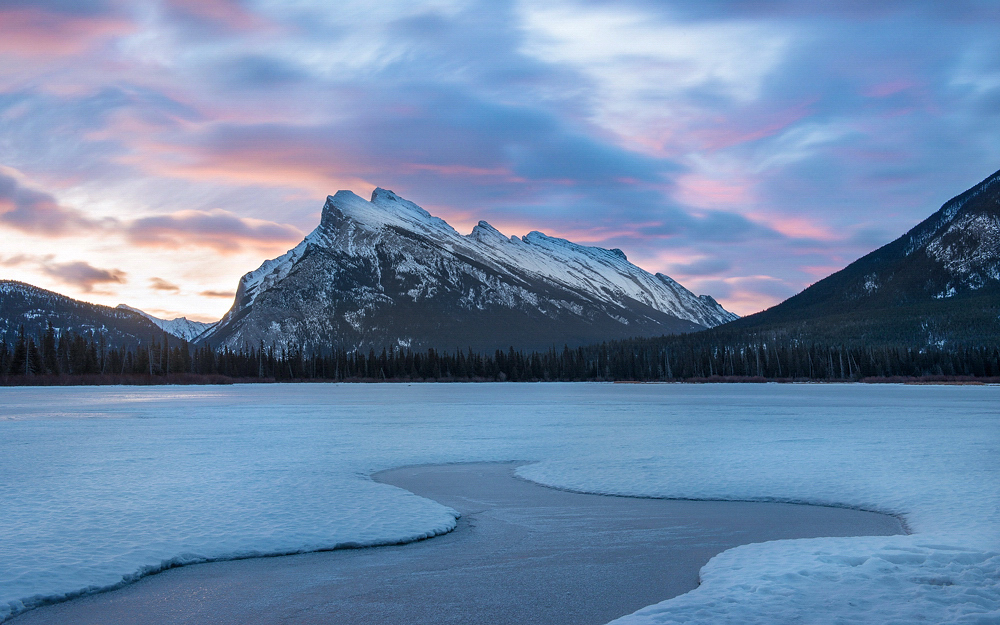
Taken a couple of days ago about half an hour or so before sunrise. Even though the sunrise was one of the nicer more colorful ones I seen at this locale I preferred this shot over the later ones.
Comment posted by scott lanz on December 23, 2014 at 7:26 AM
Well timed image for the the pre-sunrise colors, Carey. Beautiful sky and I like the leading foreground. My only suggestion is to consider reducing the cyan in the snow but this is subjective and I see you like the cool tones.
Registered on November 14, 2003, 840 Posts, 12902 Comments
Comment posted by Roel Wijtmans on December 23, 2014 at 11:26 AM
Nice! I like the leading line in the foreground and especially the color and texture in the sky is great. If it would be my picture I would warm it a wee bit though. And I second the cyan reduction that Scott mentioned. But very nice as it is!
Registered on September 30, 2012, 116 Posts, 2257 Comments
Comment posted by Rick Turner on December 23, 2014 at 11:47 AM
Light on left mf is sweet. Nice work Carey.
Registered on February 18, 2012, 534 Posts, 2755 Comments
Comment posted by Kah Kit Yoong on December 23, 2014 at 2:54 PM
A very neat composition from this popular location. Rundle itself looks a bit washed out, I would try to increase the contrast there as well as bring out some of those patterns in the foreground ice.
Registered on September 27, 2006, 636 Posts, 10682 Comments
Comment posted by Alberto Patiño on December 23, 2014 at 3:41 PM
I like the subtle colors and light, and that one pool of light hitting the snow on the left is beautiful. I would perhaps crop it so as to make it more panorama-like and less symmetric, but I'm hard pressed to suggest whether to take from the top or from the bottom - it would have to be the top, I think
Registered on December 2, 2014, 278 Posts, 1736 Comments
Comment posted by Harley Goldman on December 23, 2014 at 4:19 PM
Real nice composition and scene. I think I would like it warmed up (warming filter 85 at 20%?), but that is a personal preference. I definitely like the image.
Registered on November 19, 2003, 586 Posts, 11271 Comments
Comment posted by Richard Teller on December 23, 2014 at 6:08 PM
I like the colors and feeling of this image. I also agree with the other comments.
Registered on August 23, 2010, 1162 Posts, 6692 Comments
Comment posted by Nancy Lea Sandy on December 24, 2014 at 1:52 PM
There's a lot of blue in this image but you did mention you found inspiration in them Still, I think reducing the cyan on the peaks would be nice, snow capped white peaks would really stand out against that sky. Love the composition and the leading line of the open water
Registered on January 24, 2011, 576 Posts, 6942 Comments
Comment posted by Ryan Shain on December 24, 2014 at 2:54 PM
Good day Carey,
You have framed this image up beautifully, and capture a sweet sunrise with a beautiful mountain for the background. I really enjoy the texture, color, and formations in the clouds. I like the idea of trying to bring out the patterns of the foreground ice a bit more, but this is such a nice image as is Carey.
Registered on February 20, 2007, 226 Posts, 4571 Comments
Comment posted by Ed Lowe on December 24, 2014 at 7:58 PM
I really like the combination of warm and cool colors along with that wonderful shape of clear ice in the FG, Carey. My only suggestion would be to tone down the bright sky on the left a bit. Still very nice as is.
Ed
Registered on February 7, 2004, 414 Posts, 7115 Comments
Comment posted by Mark Seaver on December 25, 2014 at 11:07 AM
Beautiful scene, Carey. The open water makes a fine lead into the distance and the soft pinks in the clouds add a fine touch of warmth. I do think the cyan/blues are too strong, both in the ice and in the shades clouds.
Registered on January 23, 2011, 1103 Posts, 17270 Comments
Comment posted by Preston Birdwell on December 25, 2014 at 12:46 PM
This one of the nicer images I've seen of Mt. Rundle. Just a thought, but you might drop the level of cyan in the ice just a wee bit. I love the sky and the detail in the textures throughout. Nicely done.
--P
Registered on November 1, 2003, 471 Posts, 5188 Comments
Comment posted by Carey Closs on December 25, 2014 at 2:36 PM
Thanks for all the feedback everyone. In regards to the Cyan, I did anticipate some comments on that and my preference is usually for less as well. I actually toned it down considerably from early versions of this image and made one with even less but I felt this one looked more natural, especially given that this was taken 40 minutes before sunrise and it was still a bit dark out. It could be just a matter of taste but maybe it's we are seeing different things because of monitor calibration and brightness because to my eye, the saturation on the ice isn't that strong. I'm upgrading my computer in the new year and plan on getting some calibration tools and will be reviewing all my images for color accuracy because it is a common complaint.
Regarding adding warmth, again my preference is usually for warmer images as well but felt the cool tones reflected more how the dawn's light looked to my eye when there, also it just seems more wintery. Warmer images of this scene to come though. There's been some great warm color explosion sunrises so far on this trip, that I can't wait to process :)
Kah and Scot, good suggestion. I did bring out some details there before posting but will try to get some more.
Alberto, as to the crop suggestion, this is 16:10. Tried a variety of others but settled on this one. Can have another look though.
Thanks again for all other suggestions, as mentioned I will be reviewing this image when I upgrade.
Registered on April 15, 2012, 107 Posts, 326 Comments

Comments
13 commentsYou have framed this image up beautifully, and capture a sweet sunrise with a beautiful mountain for the background. I really enjoy the texture, color, and formations in the clouds. I like the idea of trying to bring out the patterns of the foreground ice a bit more, but this is such a nice image as is Carey.
Ed
--P
Regarding adding warmth, again my preference is usually for warmer images as well but felt the cool tones reflected more how the dawn's light looked to my eye when there, also it just seems more wintery. Warmer images of this scene to come though. There's been some great warm color explosion sunrises so far on this trip, that I can't wait to process :)
Kah and Scot, good suggestion. I did bring out some details there before posting but will try to get some more.
Alberto, as to the crop suggestion, this is 16:10. Tried a variety of others but settled on this one. Can have another look though.
Thanks again for all other suggestions, as mentioned I will be reviewing this image when I upgrade.