Nature Photographers Network
This is the preserved archive of the original Nature Photographers Network. The community continues at naturephotographers.network.
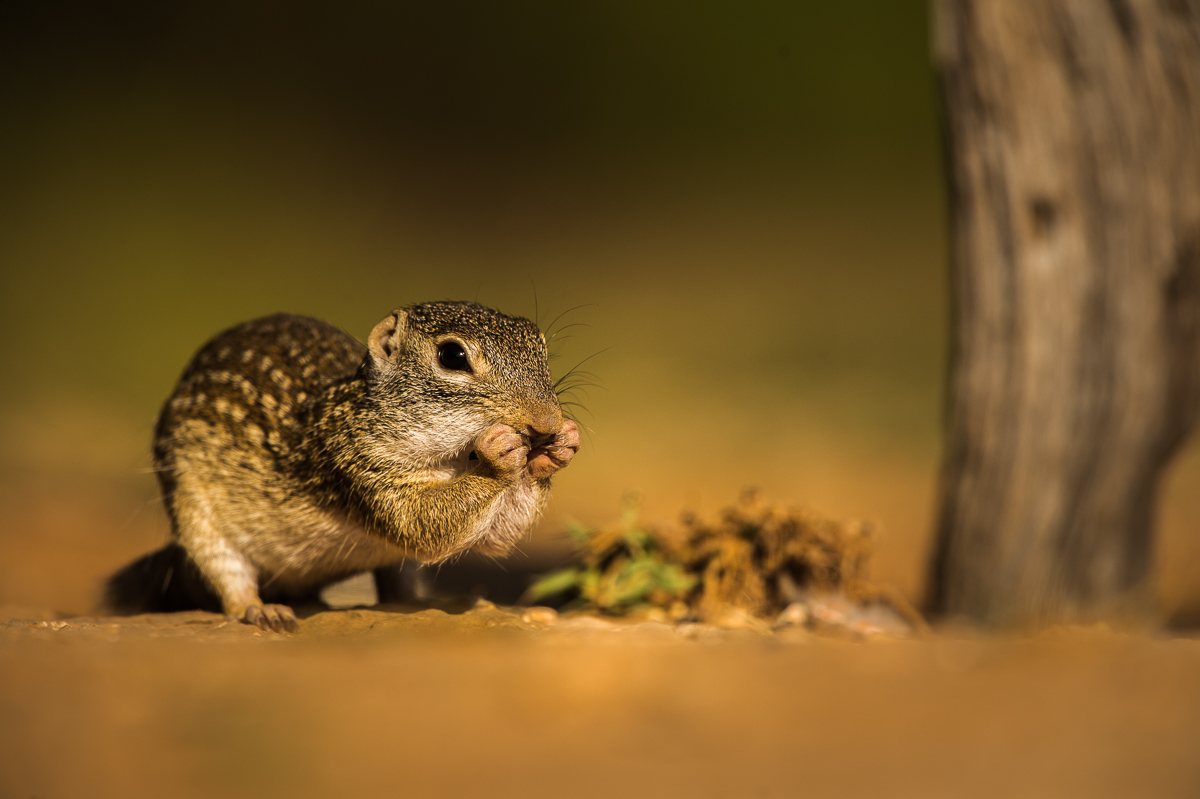
Mexican Ground Squirrel-Repost
‹ PreviousWildlife GalleryNext ›

Mexican Ground Squirrel-Repost

by Richard Sandor

Gallery: WildlifePosted December 4, 2014217 views18 comments
I put this squirrel on an "island" as the immediate surroundings weren't the most pleasant. What do you think of this approach? Richard
D4, 500 mm + TC 1.4, 1/2000, f/6.3, Auto ISO at 400 and -1EC. Richard

Comments

18 comments
Comment posted by Alberto Patiño on December 4, 2014 at 1:23 PM
The focus on its face and front paws is excellent (and very cute !!) and in my view this "makes" the picture. Since you apparently modified the surroundings I would go a bit further and crop the image a bit, so as to remove the pole(?) on the right, i.e., show only the squirrel on the "island".
Registered on December 2, 2014, 278 Posts, 1736 Comments
Comment posted by Richard Sandor on December 4, 2014 at 2:38 PM
Alberto: thanks for the comments. I looked at cropping what is actually a tree trunk out of the frame. That left the photo in an unusual looking (near) square frame. In looking again at the trunk, I decided to darken it to make it less prominent. Here's the result. Richard
Registered on January 12, 2014, 453 Posts, 1625 Comments
Comment posted by Philip Hodgkins on December 4, 2014 at 3:51 PM
I like either one, Richard. I do like the ground level angle, the detail and the cute pose. :smile:
Registered on July 24, 2006, 2741 Posts, 12349 Comments
Comment posted by Stephen Kaluski on December 4, 2014 at 3:52 PM
Hi Richard, I quite like the subject being offset and the 3/4 angle/posture of the body, likewise the position of the front paws. Might look to coming in on the RHS to give a hard edge to the framing. Overall it looks a bit too saturated and perhaps going more cooler may help, but you were there so have a better indication of colour. Backing off on the Shadows, Blacks and even some Contrast I feel may open up the detail a fraction more, but just my take. Watch the Dust Bunny about 3 inches in from the right, 1/4 inch down from the top.

TFS
Steve
Registered on March 25, 2007, 189 Posts, 1064 Comments
Comment posted by John Tobias on December 4, 2014 at 5:20 PM
I like the pose and sharpness of the squirrel, but to me the "island look" makes it appear to have been photographed in an exhibit. I am not saying it is, just that it looks that way. The OOF foreground looks like it is dirt up against glass. Would like to see it without the "island" look. Thanks for sharing.
Registered on September 12, 2009, 2120 Posts, 6455 Comments
Comment posted by Alberto Patiño on December 4, 2014 at 6:35 PM
Hi Richard,

I see what you mean. I do prefer the second version, as it (subtly) makes the cute squirrel more prominent. As to your original question I have no problem with the "island" approach, I think it looks quite natural and keeps the attention on the subject - again, those little paws are too cute.....

Best
Alberto
Registered on December 2, 2014, 278 Posts, 1736 Comments
Comment posted by Max Waugh on December 4, 2014 at 7:08 PM
Richard, ignoring the processing work (which is a matter of taste, IMO), I must say I like the low angle and the lighting here.

Max
Registered on September 26, 2008, 428 Posts, 2329 Comments
Comment posted by Lon Sharp on December 5, 2014 at 12:40 PM
The low perspective makes the shot, IMO. If anything, I would look at reducing the amount of oof foreground.
Registered on December 9, 2007, 258 Posts, 9892 Comments
Comment posted by Richard Sandor on December 5, 2014 at 12:54 PM
Thanks again to all for commenting. Here's another re-do with some of the oof foreground cropped out as per Lon's suggestion. I also tried taking some from the top, but that led to too much of a panorama type look. Richard
Registered on January 12, 2014, 453 Posts, 1625 Comments
Comment posted by keith mitchell on December 5, 2014 at 1:53 PM
Richard torn between the OP and the RP but must say I would be more than happy with either .

Keith.
Registered on July 12, 2008, 127 Posts, 1735 Comments
Comment posted by Brad Hill on December 5, 2014 at 1:54 PM
Hi Richard,

I intentionally held off commenting on this until others had a go at it. So far no one has touched on the exact thoughts I have, so will get into them now...

To begin with, in looking both at the image and your comment about putting the squirrel on an "island" I'm assuming you're referring to the fact that you've got a thin DoF AND that you've selectively blurred parts of the image in post-processing (correct if I'm wrong about the blurring in post-processing, but I see no other way the vegetation (immediately to the right of the squirrel) or the tree could be so OOF when they appear to be almost parallel to the plane of focus and about the same distance to the camera).

So...assuming that I'm right...

1. As a photographer with a technical bent, the minute I look at a photo like this I think "heavily post-processed" (simply because no other explanation - other than possibly using a LensBaby - could explain the DoF). For ME (this is personal preference), a wildlife image with this much obvious manipulation doesn't work too well. I acknowledge fully that this is something a non-photographer may miss and then the manipulation issue is therefore irrelevant and we move to completely to aesthetics...

2. Differences in sharpness in an image have a major impact on eye flow (just behind luminosity differences and, on average, just ahead of colour differences). My eye definitely went to the squirrel first, and possibly faster than if the other parts of the image (vegetation and wood) were in focus. So in that regard the blur may work.

3. Overall Aesthetics: Personally (again personal preference) I very commonly find that objects in near proximity of a subject are MORE distracting if they're OOF than if they're in focus (or close to in focus). When in focus additional elements can add a sense of place and/or habitat and become integral elements in making the shot work. But distinct objects close to the subject (and I want to be clear that I'm referring to the vegetation and the wood/tree and NOT the smooth foreground or background) - and that are OOF - add virtually nothing to most images. What I can NOT judge is how distracting these objects would be if they weren't intentionally blurred - and I think that would be dependent on just how sharply rendered they were in the original shot (so seeing the original might help in deciding this).

Oh...and to me darkening the tree/wood made no difference to me in terms of how much it is of a distraction (either way - for me - it's still a major distraction).

I hope I explained my rationale clearly enough - as per our previous discussions I know you want completely honest feedback and not just simple "looks great" comments that may be sugar coated!

Just my 2 cents worth...

Brad
Registered on May 29, 2007, 431 Posts, 6061 Comments
Comment posted by Richard Sandor on December 5, 2014 at 8:18 PM
Thanks to all for the comments and in particular to Brad for a vey detailed reply. Brad, a Lens Baby was not used, nor was there any manipulation done to the Dof. I think the shallow Dof was due to the proximity of the squirrel (2-3 meters at most from the lens hood) and the employment of a 500 mm lens with TC. If memory serves, there was also a raised lip of dirt between me and the squirrel which accentuated the shallowness of the Dof. Also, if memory serves, the vegetation and tree trunk were not parallel to the squirrel.
Here's a post of the untouched original. Richard
Registered on January 12, 2014, 453 Posts, 1625 Comments
Comment posted by Stephen Kaluski on December 6, 2014 at 4:26 AM
Richard the last posting looks pretty spot on and also illustrated my thoughts on the OP/RP being too saturated and backing off on the Blacks/shadows. The last image seems to require the absolute minimal PP IMHO and I like this far more. :toast:
Registered on March 25, 2007, 189 Posts, 1064 Comments
Comment posted by Brad Hill on December 6, 2014 at 11:00 AM
Hey Richard,

Thanks for correcting me on the blurring (or lack thereof) in post-processing - have to say I was quite convinced that both the vegetation and tree trunk looked to be on virtually the same plane as the squirrel.

So...I'll shorten my previous response to simply point #3 above - for me the OOF objects do distract and I personally would have preferred more DoF to bring those objects more into focus. With that much focal length you could have stopped WAY down and still had a DoF thin enough to have both background and foreground pleasantly out of focus (assuming of course you didn't end up with shutter speeds too slow to get a sharp shot).

I'm with Stephen in liking the 3rd repost the best for the reasons he outlined (I think...I have no clue what he means by OP/RP being too saturated!).

Cheers...

Brad
Registered on May 29, 2007, 431 Posts, 6061 Comments
Comment posted by Stephen Kaluski on December 6, 2014 at 12:27 PM
Brad - OP - Original Post, RP, Repost. :smile:
Registered on March 25, 2007, 189 Posts, 1064 Comments
Comment posted by Richard Sandor on December 6, 2014 at 2:49 PM
Thanks again to all for the comments. In comparing the latest re-post which is in Nikon Neutral Picture Control and SOOC, I think I should consider entering a 12 step program for serial over-saturaters. Richard
Registered on January 12, 2014, 453 Posts, 1625 Comments
Comment posted by Mario Moreno on December 11, 2014 at 2:40 PM
Splendid frame Richard ! Really like the DOF and warm tones :toast:
Registered on January 24, 2012, 163 Posts, 369 Comments
Comment posted by Jenaya Launstein on January 20, 2015 at 3:03 AM
The DOF on this one is really impressive. I'm not sure which one I like better between the original and your repost. Sweet image!
Registered on February 8, 2011, 254 Posts, 1302 Comments