Nature Photographers Network
This is the preserved archive of the original Nature Photographers Network. The community continues at naturephotographers.network.
Above the Clouds
‹ PreviousLandscape GalleryNext ›

Above the Clouds

by Alberto Patiño

Gallery: LandscapePosted December 3, 2014414 views18 comments
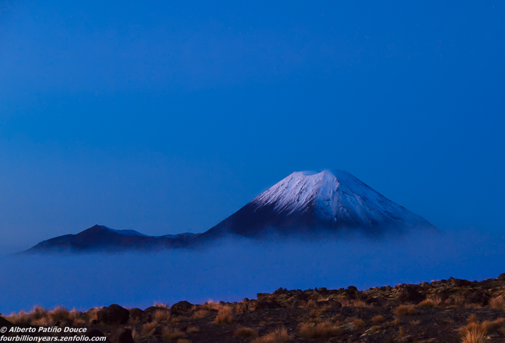
Mount Ngauruhoe, Tongariro National Park, New Zealand North Island. It had been a miserable foggy and drizzly day in the lowlands, but it was a different story above the clouds at sunset.

Zuiko Digital 12-60mm, Olympus E-620, ISO 800, 1/40 sec handheld.

Comments

18 comments
Comment posted by Floyd Hopper on December 3, 2014 at 7:31 PM
Gorgeous: :jump:
Registered on May 1, 2009, 652 Posts, 762 Comments
Comment posted by Pat Sampson on December 3, 2014 at 7:40 PM
I like this as posted Alberto but would also consider a version that completely removed the trees. Love the clouds and the blue in this.

pat
Registered on May 19, 2007, 953 Posts, 15989 Comments
Comment posted by Mark Metternich on December 3, 2014 at 7:59 PM
Nice. I think it works well with the empty negative space.
Registered on June 19, 2009, 276 Posts, 6240 Comments
Comment posted by Preston Birdwell on December 3, 2014 at 8:03 PM
Very dramatic, Alberto. I am not usually a fan of lots of blue, but here the blues work quite well. A version without the foreground would also work, as Pat suggested.

--P
Registered on November 1, 2003, 471 Posts, 5188 Comments
Comment posted by Ryan Shain on December 3, 2014 at 8:41 PM
I would say it was sweet story Alberto. The blues work so well in conveying the mood of this place at the time of capture. The image is so relaxing and peaceful, and I like the inclusion of fg, but agree that a version with out would work great too.

It would provide different kind of feel that could be very nice. :smile:

Sweet image
Registered on February 20, 2007, 226 Posts, 4571 Comments
Comment posted by Alberto Patiño on December 3, 2014 at 10:13 PM
Thanks you all for the very kind comments and the useful suggestions! Here goes a version without the bottom foreground - preferences? I can talk myself into choosing either the original (horizon adds depth) or the cropped version (more "mystical). Thanks for any suggestions!
Registered on December 2, 2014, 278 Posts, 1736 Comments
Comment posted by Pat Sampson on December 3, 2014 at 10:43 PM
I still like both Alberto but I prefer the cropped version. For me it has more impact.

pat
Registered on May 19, 2007, 953 Posts, 15989 Comments
Comment posted by gary phillips on December 4, 2014 at 12:25 AM
Cropped version for me, Alberto. The foreground in the original doesn't work for me. Great image.
Registered on October 24, 2013, 185 Posts, 4136 Comments
Comment posted by Gary Minish on December 4, 2014 at 12:34 AM
My vote is for the cropped version, Alberto. It results in much more focus on the snow capped mountain which is obviously the primary subject.
Registered on February 4, 2006, 625 Posts, 3583 Comments
Comment posted by Holger Streu on December 4, 2014 at 7:44 AM
My vote also goes to the floating mountain. Nice image.
Registered on September 19, 2011, 50 Posts, 113 Comments
Comment posted by Nick Bristol on December 4, 2014 at 9:31 AM
Alberto, This is really cool looking. I love all the blue surrounding the mountain and as mentioned it looks like it is floating. The original one works great but I might lean towards the crop version as my favorite. You have both so that's cool. :smile:

Nick Bristol
Lone Rock, WI
Registered on February 1, 2004, 752 Posts, 14140 Comments
Comment posted by Harry Lichtman on December 4, 2014 at 10:04 AM
Viewing the thumbnail, the image looked tilted CCW, less so with the cropped version. My brain wants the cloud base to be near level, so it looked off even though the clouds may have indeed been angling up or down slope. Maybe play with it and see if it works any better for you. Glad the weather worked out for you.
Registered on September 17, 2010, 304 Posts, 3507 Comments
Comment posted by Ed Lowe on December 4, 2014 at 7:49 PM
Definitely the cropped version for me, Alberto. It simplifies the scene and adds an element of mystery to the image. Great image.

Ed
Registered on February 7, 2004, 414 Posts, 7115 Comments
Comment posted by Nancy de Flon on December 5, 2014 at 8:46 AM
I could go for either version, Alberto, but think I prefer the cropped one. In any case, the negative space works very well. This is one of those rather rare times when the plain blue without any clouds works. Someone might want to buy this and add text at the top, for a greeting card.
Registered on June 28, 2010, 61 Posts, 284 Comments
Comment posted by Mark Seaver on December 5, 2014 at 9:10 AM
This is a very interesting, minimalist view, Alberto. I like the "connection to reality" that the foreground adds but could see a comp. without any foreground...a floating mountain! I do think that you could brighten the mountain a bit in this version (although that could be a compression problem). For me, the mountain feels too close to the bottom of the frame in the cropped version.
Registered on January 23, 2011, 1103 Posts, 17270 Comments
Comment posted by Albert Darmo on December 6, 2014 at 6:23 PM
Hi Alberto :wavey: I love both versions, but if i had to choose, i would take the croped version... beautiful work


Albert Darmo

Canada
Registered on November 25, 2008, 1386 Posts, 11978 Comments
Comment posted by Kah Kit Yoong on December 6, 2014 at 9:45 PM
This is awesome. I second the crop but suggest adding some addition space to the bottom which shouldn't be too hard since it's all uniform blue at the base.
Registered on September 27, 2006, 636 Posts, 10682 Comments
Comment posted by gary phillips on December 10, 2014 at 9:16 PM
Congratulations on the WP, Alberto. Beautiful. :toast: :toast:
Registered on October 24, 2013, 185 Posts, 4136 Comments