Nature Photographers Network
This is the preserved archive of the original Nature Photographers Network. The community continues at naturephotographers.network.
Hidden Gems
‹ PreviousLandscape GalleryNext ›

Hidden Gems

by Tony Kuyper

Gallery: LandscapePosted November 28, 20143,216 views24 comments
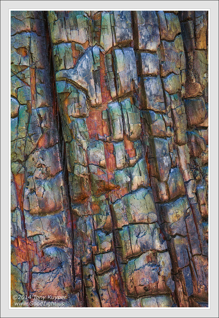
After photographing burnt trees a few times this particular morning, I could see that the camera was picking up colors reflecting from the surrounding forest and clear sky that I really wasn't seeing when I looked at the charred wood. It reminded me a bit of sandstone in this regard, so I figured it might develop out similarly.

This was the only comp that displayed this mosaic of colors when I upped the saturation. It sort of reminded me of the the polished inlay jewelry fashioned by the Hopis and other pueblo tribes in the Southwest.

Large and selective saturation increases were used to produce this effect. The straight RAW conversion is below. The RAW image does show inklings of these colors, but there's little question this has been pushed a bit beyond "real" . . . but hopefully not beyond believable.

Your thoughts and suggests are always appreciated.

Canon 5D2, 28-300@92mm, f/16, 1/4 sec, ISO 400

Comments

24 comments
Comment posted by Tony Kuyper on November 28, 2014 at 10:18 PM
Registered on November 1, 2003, 364 Posts, 22328 Comments
Comment posted by Kathy Barnhart on November 28, 2014 at 10:47 PM
This is so beautiful, and quite amazing that you recovered all that color from the original. Just love it. Quite a reminder to keep looking since it was the only one that came out this way.
Registered on November 11, 2011, 404 Posts, 1639 Comments
Comment posted by Eva McDermott on November 29, 2014 at 12:39 AM
Reminds me of stained glass Tony. Beautiful. Love the kaleidoscope of color. BTW - first post for me.
Registered on January 4, 2009, 1015 Posts, 13229 Comments
Comment posted by Dan Kearl on November 29, 2014 at 1:28 AM
While I like what you did with this (It does look like Hopi or Navaho Jewelry), I like the RAW image better.
I like the subtle silver and muted color a lot.
Nice eye for this....
Registered on September 2, 2013, 209 Posts, 1514 Comments
Comment posted by Prashant Khapane on November 29, 2014 at 3:56 AM
yes, reminds me of the stained glass.
Registered on November 1, 2003, 492 Posts, 4580 Comments
Comment posted by Kah Kit Yoong on November 29, 2014 at 5:57 AM
Great job bring out those colours in such a beautiful manner.
Registered on September 27, 2006, 636 Posts, 10682 Comments
Comment posted by Daniel & Loana on November 29, 2014 at 10:05 AM
I really like your version of this tree. Wonderful colours.

D&L
Registered on October 7, 2008, 166 Posts, 3044 Comments
Comment posted by Harley Goldman on November 29, 2014 at 10:15 AM
Nice capture, Tony. It will be no surprise to you that I find the saturation a bit too heavy for my tastes. :biggrin: Beyond believable? Well, yeah. :biggrin:

I think the raw file with a nice S curve would yield some stunning results, too.
Registered on November 19, 2003, 586 Posts, 11271 Comments
Comment posted by Tony Kuyper on November 29, 2014 at 10:56 AM
Just want to be clear that the colors here are not highly saturated. Saturation adjustments were used to bring out the colors, but the overall color saturation is still quite low. The saturation map (above) of the final image (where a fully saturated color would be white) shows only dark grays and almost black.

And maybe I should clarify "believable." It doesn't mean that you believe you could actually see this were you standing there. I already said this is not what I saw, but what the camera saw. "Believable" is used in the sense that these colors are natural in this setting. The greens are reflected from the surrounding forest, the blues are reflected from the open sky, and the reds and yellows are inherent in the deeper, unburned wood. By bringing out natural colors I feel there is a believability in the results that would be missing were the colors transformed into something like purple and pink . . . or over-saturated.
Registered on November 1, 2003, 364 Posts, 22328 Comments
Comment posted by Pat Sampson on November 29, 2014 at 12:20 PM
I prefer the first image Tony but also like the second. The colors and patterns of colors and shapes in the first remind me of Georges Braque's Cubist paintings.

I don't know what "believable" means in this context. How believable is any two dimensional electronic representation of a four dimensional human experience? (smile) When I saw the image, I immediately recognized it as an image of a charred tree trunk. It's certainly believable in that sense. It's also believable to me in the same sense that my favorite black and white images are believable.

I like the first image a lot and I also like the second because of the comp and textures. If I had a choice as to which one to frame and hang on my wall for daily viewing, it would certainly be the first though.

pat


Registered on May 19, 2007, 953 Posts, 15989 Comments
Comment posted by Bill Fach on November 29, 2014 at 12:41 PM
Tony: As an admitted and unrepentant color junkie I really like what you did with the posted version. I also like the RAW capture. Good vision to see this in the first place and great work on the processing. >=))>
Registered on November 1, 2003, 1805 Posts, 26981 Comments
Comment posted by Harley Goldman on November 29, 2014 at 3:10 PM
Tony, be assured that I very much respect your work and your techniques. Our differences lie merely in our personal tastes and what works for us individually, in this case our very personal tastes on saturation.

I also have a difference in the way I define believable. To me, believable means that I stand a reasonable chance of seeing those colors when I am out in the field. It does not mean to ME that traces of those colors are picked up by film or a sensor and then saturated to make them very visible. To me, your image is not believable by my definition, but that has no bearing on its artistic merits.

I don't always go with believable in my own work. As Pat points out, B&W is not a representation of reality (or therefore believable), but I still shoot B&W film and convert color files to B&W.

I consider our differences in opinions to be healthy. It means we present very different artistic interpretations in the presentation of our work. Neither of us are interested in literal views of scenes we photograph. We just take our images in different directions.

So hopefully I have not offended you, but if I did, my apologies.

Cheers,

Harley
Registered on November 19, 2003, 586 Posts, 11271 Comments
Comment posted by gary phillips on November 29, 2014 at 4:23 PM
I think this is really cool as originally posted, Tony. I have zero interest in the debate concerning the amount of latitude an artist decides in the presentation of an image. What is the most important thing in my mind is how good is it and this is very good. Kudos' on your interpretation, Love it.
Registered on October 24, 2013, 185 Posts, 4136 Comments
Comment posted by Nick Bristol on November 29, 2014 at 6:15 PM
Tony, I really like the way this looks. I think the larger this one is the better and better it would get. The colors are wonderful and the shapes and textures look great to me. Very cool image.

Nick Bristol
Lone Rock, WI
Registered on February 1, 2004, 752 Posts, 14140 Comments
Comment posted by Tony Kuyper on November 29, 2014 at 6:21 PM
Most certainly not offended, Harley. Your comments made it possible for me to add some additional information, and I appreciate that opportunity. Also forces me to think about what I say and how I say it, which is always a good exercise.
Registered on November 1, 2003, 364 Posts, 22328 Comments
Comment posted by Nancy Lea Sandy on November 29, 2014 at 9:17 PM
Beautiful job bringing out all that wonderful color. The original is an interesting image but your processing really makes it sing.
Registered on January 24, 2011, 576 Posts, 6942 Comments
Comment posted by R.Bill Moser on November 30, 2014 at 1:38 PM
Grat textures and detail and I also love the colors. This is simply gorgeous
Registered on January 29, 2010, 285 Posts, 4281 Comments
Comment posted by Preston Birdwell on November 30, 2014 at 2:03 PM
I realize the color in the OP is an artistic choice, Tony, but for myself, I think something between the OP and the RAW file would work well, too.

I have photographed a lot of char, and like you I can see the color of the surrounding environment reflected in the sheen when I'm in the field. However, I prefer a more understated look. I do like the composition of your image.

--P
Registered on November 1, 2003, 471 Posts, 5188 Comments
Comment posted by Paul Breitkreuz on November 30, 2014 at 3:27 PM
A very graphic look at an ordinary piece of charcoal wood or log here, Tony. I like the outcome overall....... :cool:
Registered on February 25, 2006, 525 Posts, 8448 Comments
Comment posted by David Chauvin on December 1, 2014 at 8:11 AM
This is simply beautiful, Tony. Color saturation is so often used for wow factor to get an image noticed but in this instance I think you have drawn the line perfectly. The first thing I noticed is none of the colors seemed to be clipped and your sat map shows this to be true. The colors may be largely hidden from our perception but that is an evolutionary condition particular to humans. We are all biased by the way our individual brains interpret the reflection of light from objects, but for my brain this image sings. :cool: :cool: :cool:
Registered on August 5, 2004, 1007 Posts, 5595 Comments
Comment posted by Carey Closs on December 1, 2014 at 10:07 AM
Natural looking or not, I think this is a excellent pic and would look great on a wall.
Registered on April 15, 2012, 107 Posts, 326 Comments
Comment posted by Mark Seaver on December 1, 2014 at 12:46 PM
Wow, Tony, a stained glass tree! Very cool. The colors and pattern are great here and there a fine sense of movement from the strong diagonals.
Registered on January 23, 2011, 1103 Posts, 17270 Comments
Comment posted by Ryan Shain on December 1, 2014 at 5:02 PM
This image is amazing for many purposes Tony.

1.) It is visually stunning to take in with the array of colors and lines.

2.)This is sparks healthy ideas and discussion on what photography is to the individual artist, and I think that it is wonderful to discuss different points of view, and understand where the other is coming from.

3.) This image shows what is possible in a world of light, and thank you for your vision Tony!!

:toast:
Registered on February 20, 2007, 226 Posts, 4571 Comments
Comment posted by Stuart Williams on December 6, 2014 at 4:21 AM
i'm not averse to your interpretation although there are some things that i might have done differently! for example, I might have reduced the saturation of the reds and oranges in the some of the areas; I might have reduced saturation and burning to the left edge. personal tweaks. still, good vision to this and i have always wondered about the colours that one could pull from such a scene.
Registered on December 7, 2007, 247 Posts, 4792 Comments