Nature Photographers Network
This is the preserved archive of the original Nature Photographers Network. The community continues at naturephotographers.network.
Coyote Creek
‹ PreviousLandscape GalleryNext ›

Coyote Creek

by scott lanz

Gallery: LandscapePosted November 16, 2014550 views18 comments
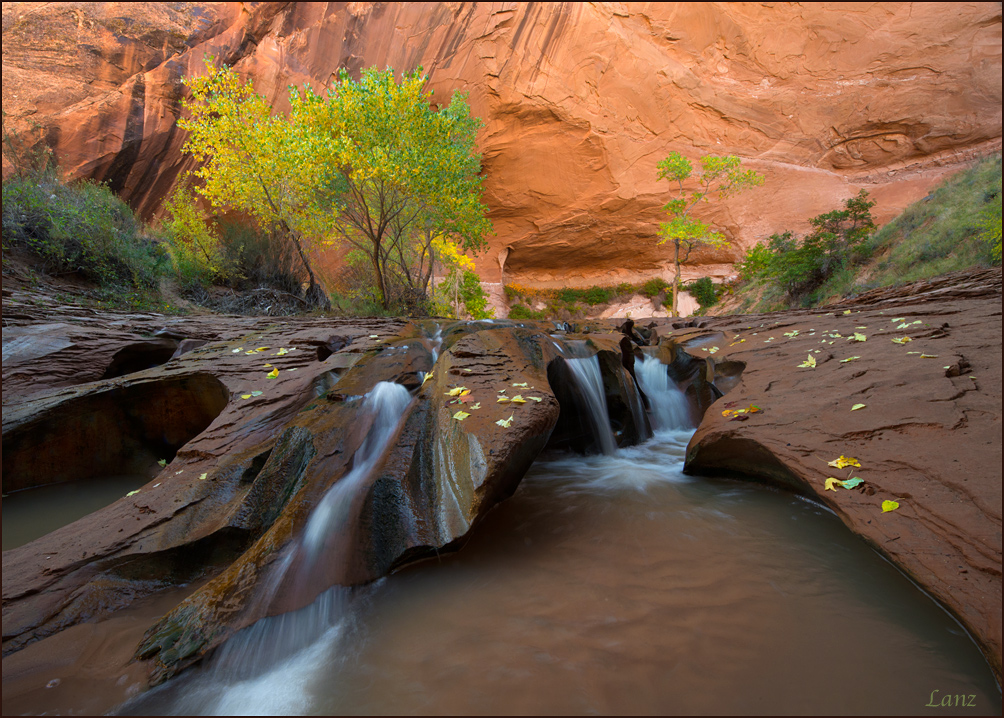
I put this scene on my personal to-shoot list when I first saw a photo of it at a slideshow presentation in Ohio about 15 years ago by a well known photographer. I finally got to photograph it on my backpack a couple weeks ago. I spent probably an hour and a half shooting this little waterfall, and had the place to myself the entire time. Original comps are difficult, but I am happy I got the shot. D600, 14-24 @ 14, cpl, .3, f22, iso 400. Thanks for looking. Comments, questions,and suggestions welcome. :wavey:

Comments

18 comments
Comment posted by scott lanz on November 16, 2014 at 9:21 AM
Here's an alternate, closer shot for comparison. Basically same techs (14-24 @14).
Registered on November 14, 2003, 840 Posts, 12902 Comments
Comment posted by Harley Goldman on November 16, 2014 at 9:25 AM
I like the first post best. In the second, the waterfall on the left feels a bit cut off to my eye. Beautiful image, with great color and fine composition.
Registered on November 19, 2003, 586 Posts, 11271 Comments
Comment posted by Paul Breitkreuz on November 16, 2014 at 9:39 AM
Very impressive look from this site, Scott. I do like both takes here, but notice the second a bit brighter and you might lift the first in that area slightly too. Regardless, very fine images overall. :cool:
Registered on February 25, 2006, 525 Posts, 8448 Comments
Comment posted by Ian Cameron on November 16, 2014 at 10:31 AM
They are both very nice I like the slightly more muted brightness and tones of the first but much prefer the composition of the second which because of its ability to suck you into the pictures from the corners of the frame makes it feel more dynamic. A slightly more subdued version of no.2 would definitely get my vote.
Registered on August 6, 2004, 1125 Posts, 3318 Comments
Comment posted by Joel Hazelton on November 16, 2014 at 11:20 AM
Number 2 definitely feels more dynamic. Well done!
Registered on August 6, 2008, 194 Posts, 1315 Comments
Comment posted by Nancy Lea Sandy on November 16, 2014 at 11:46 AM
I like the laid back feel of the first post better than the higher energy #2. Feels like I can explore at my leisure. You caught some nice fall color which looks great against the sandstone.
Registered on January 24, 2011, 576 Posts, 6942 Comments
Comment posted by Mark Pelton on November 16, 2014 at 12:14 PM
Beautiful, Scott. I agree with Ian; I like the 2nd comp better and would prefer an exposure halfway between the two.
Registered on November 25, 2003, 380 Posts, 4647 Comments
Comment posted by Allen Brooks on November 16, 2014 at 12:35 PM
Great composition and contrasting colors. I like the first version for the sense of space, but in the second version I like the close up of the waterfalls on the right. I wonder how the second would look with the waterfall on the left cropped out. Anyway, your time was well spent on some beautiful images. :toast:
Registered on July 27, 2011, 262 Posts, 2597 Comments
Comment posted by Chet Dowell on November 16, 2014 at 12:53 PM
The first image is more powerful for me Scott. I think somehow it shows more respect for the scene as if it were a fine gift and I guess it was. Anyway I like this a lot. Well done. Chet :toast:
Registered on December 3, 2012, 237 Posts, 1171 Comments
Comment posted by Nick Bristol on November 16, 2014 at 1:33 PM
Scott, You really did a nice job capturing this place and I like the comp you came up with a lot. The first version works much better for me overall. I like that it is a bit darker and the wider view just feels better to me. Great colors too! :toast:

Nick Bristol
Lone Rock, WI
Registered on February 1, 2004, 752 Posts, 14140 Comments
Comment posted by Jim Greenwood on November 16, 2014 at 2:22 PM
Both compositions are outstanding, and both have their merits. The first one feels more serene, which is nice. The second one feels more dynamic, which is also nice. I have a couple of questions. Why ISO 400? The scattering of leaves are different between the two compositions. Did you arrange the leaves in one or the other or both? Not to be critical, but I find that most of the time when I arrange leaves in a scene, they look arranged.
Registered on November 9, 2003, 229 Posts, 1523 Comments
Comment posted by scott lanz on November 16, 2014 at 2:49 PM
Thanks for the comments. Jim, I used iso 400 because I did not want to use a ss slower than .3 so as to retain texture in the water. I find images at iso 400 with the d600 (sensor upgraded via the recall) to be practically indistinguishable from 200. As for the leaves - yes, you caught me! I scattered most of the leaves. I first shot it as I found it, but I thought the rock seemed a bit bare, so I gathered fallen leaves from several trees immediately downstream and spread them around. The dark red leaves in the center between the two waterfalls in the second post were actually present when I came upon the scene, but I suspected they had been placed and I thought they didn't look like they belonged, so I removed them and reshot the scene. As I said, I had the place to myself, which was quite nice, and I shot this multiple ways.
Registered on November 14, 2003, 840 Posts, 12902 Comments
Comment posted by Jim Greenwood on November 16, 2014 at 3:50 PM
Like I said, I didn't mean to be critical of the practice. Everybody does it. But speaking for myself, more often than not when I arrange leaves in a scene, and by that I mean adding leaves into a scene, they just look too "arranged" to my eye when I view the image. In fact, this happened to me on my last day in Zion. I photographed a nice scene with a large rock in the foreground and some yellow and orange maples in the background. Then I thought that the composition would be improved with some leaves scattered on the rock. So I gathered some leaves, and sort of held them over the rock and let them fall as they may, and then I tried to pretty them up a bit. But the resulting image just didn't look right to my eye. Maybe it's just a matter of perception. Since I saw and photographed the scene initially without the leaves on the rock, the same scene with the leaves on the rock just doesn't look right to me. But if I were to post the photograph of the scene with the leaves on the rock, even if I were to say that I arranged the leaves, other photographers viewing the image might be less inclined to think that the leaves look arranged.
Registered on November 9, 2003, 229 Posts, 1523 Comments
Comment posted by Dan Kearl on November 17, 2014 at 4:37 AM
I prefer the OP. Excellent work, the leaf arrangement doesn't bother me, it works well.
Registered on September 2, 2013, 209 Posts, 1514 Comments
Comment posted by Ryan Shain on November 17, 2014 at 1:07 PM
I like both of these fine images Scott,

I do enjoy the comp in the first image because it conveys a sense of openness, and I enjoy the darker tones. The feeling to me is just better in the first.

Beautiful capture
Registered on February 20, 2007, 226 Posts, 4571 Comments
Comment posted by Mark Seaver on November 17, 2014 at 3:07 PM
This is lovely and very inviting, Scott. I really like the scattering of leaves in the foreground and how the dark foreground rock is set off by the warm walls and trees in the background. I slightly prefer the second post because of the added emphasis on the foreground leaves, but both work very well.
Registered on January 23, 2011, 1103 Posts, 17270 Comments
Comment posted by Mark Zelinka on November 17, 2014 at 4:40 PM
It's a great scene. The color contrasts are very effective.
Registered on August 20, 2007, 206 Posts, 998 Comments
Comment posted by Holger Streu on November 19, 2014 at 4:54 PM
Another beautiful captured photo from Coyote. Well done, I like the colors from the first and the comp from the second.
Registered on September 19, 2011, 50 Posts, 113 Comments