Gallery: LandscapePosted November 2, 2014172 views13 comments
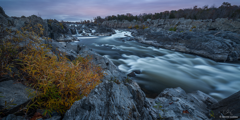
Yesterday at Great Falls National park. Do you prefer this pano presentation or the 2:3 as shown here(Or maybe one at 2:3 that crops the leaf on the bottom right)
Nikon d800, 14-24 at f/8, two images for focus
Comments
13 comments
Comment posted by Jim Gavin on November 2, 2014 at 1:46 AM
The 2:3 that includes the leaf. Quite spectacular.
Registered on August 14, 2008, 293 Posts, 1250 Comments
Comment posted by Ronald Murphy on November 2, 2014 at 8:25 AM
Great view of the falls, but I prefer a little more detail in the moving water. Put me down for the 2:3 and I LIKE the leaf. If you are willing to share, what is your technique for blending the two images? That's a very sharp boundary between them.
Registered on March 13, 2012, 279 Posts, 975 Comments
Comment posted by scott lanz on November 2, 2014 at 9:10 AM
I think I also prefer the 2/3 view. The far right of this image does not add anything. However, my opinion may be influence by the overall presentation, including dark bg and larger view, on flickr. I also would include the leaf. Very nice image with pleasing subtle color.
Registered on November 14, 2003, 840 Posts, 12902 Comments
Comment posted by Mark Seaver on November 2, 2014 at 11:04 AM
Interesting comparison, Navin. I don't think it's particularly a fair comparison because the Flickr image seems notably brighter and more contrasty. Both of those make the Flickr more attractive. I like the long sweep of the river in this one, but do wonder about alternate crops... a bit off the left to move the falls off center and maybe a bit from the bottom although I'm uncertain about the latter. Both views are excellent, especially with that hint of color in the sky.
Registered on January 23, 2011, 1103 Posts, 17270 Comments
Comment posted by Gary McGhee on November 2, 2014 at 11:45 AM
Beautiful rugged landscape Navin, if I had to choose I would pick the 2:3 but both are excellent.
Gary.
Registered on April 15, 2010, 142 Posts, 2416 Comments
Comment posted by Dan Kearl on November 2, 2014 at 12:23 PM
I like the 2:3 the best. Really nice processing, sort of a surreal look.
Registered on September 2, 2013, 209 Posts, 1514 Comments
Comment posted by gary phillips on November 2, 2014 at 1:09 PM
I like both, Navin, but the 2:3 wins out. Love the mood presented here and for this shot I like the SS. The silky flow really accentuates the S curve of the river. Nice work.
Registered on October 24, 2013, 185 Posts, 4136 Comments
Comment posted by Harley Goldman on November 2, 2014 at 2:41 PM
Definitely the 2:3 for me. Real sweetly done!
Registered on November 19, 2003, 586 Posts, 11271 Comments
Comment posted by Preston Birdwell on November 2, 2014 at 5:41 PM
It's the 2:3 for me, as well--that composition gets to the heart of the scene. Both are nicely done, Navin.
--P
Registered on November 1, 2003, 471 Posts, 5188 Comments
Comment posted by Jim Greenwood on November 2, 2014 at 7:34 PM
How to choose? ... How to choose? I can't choose. Both are great! One nitpick about the image on Flickr is that the leaf you mention is right on the edge of the image. I don't know ... maybe you could clone the leaf to move it up just a smidgen.
Registered on November 9, 2003, 229 Posts, 1523 Comments
Comment posted by Navin Sarma on November 3, 2014 at 10:17 AM
Thanks, all for your very helpful perspectives. I have gone with a 2:3 with a little more room at the bottom to let the leaf breathe.
@Ron - you could determine the optimal sharpness for each lens, much like Mark Metternich has done, and blend 2 or maybe several more images to obtain the best sharpness possible in an image. I think on the canon 14mm L2.8 it's somewhere at f/5.6 and I believe it's similar for the 14-24 (someone please correct me if I am wrong). Instead of going for the best possible sharpness, I decided for something better than f/18-22 ish which was what would work well for a scene as deep as this (the foreground rock was about 8 inches from my lens). So, I went with an aperture (f/8) that would adequately cover large parts of the fore and backgrounds without a significant difference in sharpness that would be hard for PS to blend.
After taking both images into Photoshop (performing RAW functions respectively for the sky and foreground images, and selecting a similar WB), I auto-aligned, then auto-blended for focus. PS gave me a draft mask that I used only for the foreground rock and its edges towards the water, then I cleared out the mask in the water. Hope that all makes sense.
@Mark - the pano and 2:3 presentations are the exact same image save the crop. Perhaps the contrast is a function of NPN vs. Flickr (i know size is)
Registered on July 17, 2011, 233 Posts, 1373 Comments
Comment posted by Ryan Shain on November 3, 2014 at 12:57 PM
I would like to vote for the 2:3 image.
I really like the interesting foreground, and how the curve and texture in the water bring you through the rest of the image. I love the mood you have captured here Navin.
I really dig this one
Registered on February 20, 2007, 226 Posts, 4571 Comments
Comment posted by Bill Reid on November 4, 2014 at 1:32 PM
Both are great Navin but the 3:2 by a nose. Great job on your blending and very nice tones, colors, and comp. Really nice job on this.
Registered on January 27, 2013, 65 Posts, 2460 Comments

Comments
13 commentsGary.
--P
@Ron - you could determine the optimal sharpness for each lens, much like Mark Metternich has done, and blend 2 or maybe several more images to obtain the best sharpness possible in an image. I think on the canon 14mm L2.8 it's somewhere at f/5.6 and I believe it's similar for the 14-24 (someone please correct me if I am wrong). Instead of going for the best possible sharpness, I decided for something better than f/18-22 ish which was what would work well for a scene as deep as this (the foreground rock was about 8 inches from my lens). So, I went with an aperture (f/8) that would adequately cover large parts of the fore and backgrounds without a significant difference in sharpness that would be hard for PS to blend.
After taking both images into Photoshop (performing RAW functions respectively for the sky and foreground images, and selecting a similar WB), I auto-aligned, then auto-blended for focus. PS gave me a draft mask that I used only for the foreground rock and its edges towards the water, then I cleared out the mask in the water. Hope that all makes sense.
@Mark - the pano and 2:3 presentations are the exact same image save the crop. Perhaps the contrast is a function of NPN vs. Flickr (i know size is)
I really like the interesting foreground, and how the curve and texture in the water bring you through the rest of the image. I love the mood you have captured here Navin.
I really dig this one